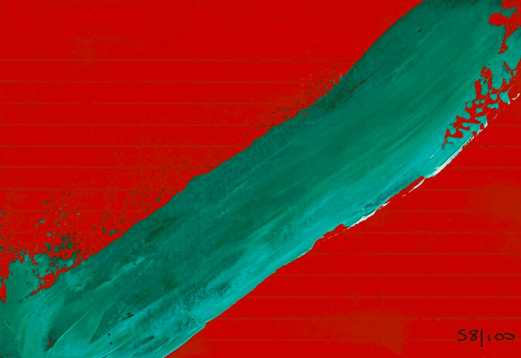
Again, too red & too opaque – this is lighter & brighter in real life! Dervan vermillion and Reeves violet mixed with Golden titanium white.

Again, too red & too opaque – this is lighter & brighter in real life! Dervan vermillion and Reeves violet mixed with Golden titanium white.
I’ve been inspired by Niamh Baly on YouTube lately and she’d been making windows in her Dina Wakley art journal. Ok then!! I’ve just got some new Dina Wakley MEdia paints and stencils – okay okay – and collage tissue and glass sprays – from Fiona at Create in Auckland so was all set for some playtime. It was fun linking the three pages together by making sure the window on the burlap page worked with the layouts on either side. It’s something I can see me doing more of, especially with the burlap pages.


This is wonderfully bright! Winsor & Newton Opera Rose and Daler Rowney lemon yellow. The pink is a wee bit more fluro than the scan shows – it’s a very translucent paint.

This is more muted than I normally like but I like this one too. Winsor & Newton Opera Rose and Reeves pale olive. The pink is a wee bit more fluro than the scan shows – it’s a very translucent paint.

I love this colour scheme too (I seem to be on a roll) – Winsor & Newton Opera Rose and Reeves pale powder blue. The pink is a wee bit more fluro than the scan shows – it’s a very translucent paint.