
This is wonderfully bright! Winsor & Newton Opera Rose and Daler Rowney lemon yellow. The pink is a wee bit more fluro than the scan shows – it’s a very translucent paint.
This is wonderfully bright! Winsor & Newton Opera Rose and Daler Rowney lemon yellow. The pink is a wee bit more fluro than the scan shows – it’s a very translucent paint.


This is more muted than I normally like but I like this one too. Winsor & Newton Opera Rose and Reeves pale olive. The pink is a wee bit more fluro than the scan shows – it’s a very translucent paint.

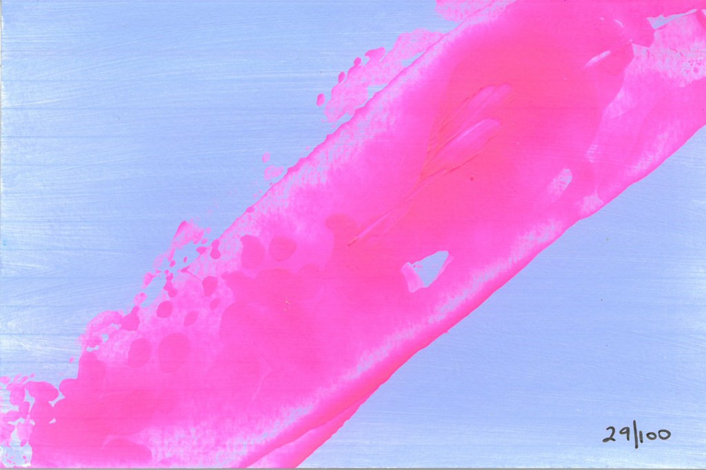
I love this colour scheme too (I seem to be on a roll) – Winsor & Newton Opera Rose and Reeves pale powder blue. The pink is a wee bit more fluro than the scan shows – it’s a very translucent paint.


I love this colour scheme, like yesterday’s one but lighter and brighter – Winsor & Newton Opera Rose and Liquitex brilliant yellow green. The pink is a wee bit more fluro than the scan shows – it’s a very translucent paint, and the green is more lime green.


I love this colour scheme – Winsor & Newton Opera Rose and Daler Rowney Emerald. The pink is a wee bit more fluro than the scan shows – it’s a very translucent paint.

