I haven’t blogged since March. It’s taken me all that time to figure out why WordPress wasn’t working properly. Once I figured it out, the solution was easy! Sigh…
Pen and I are between exhibitions at the moment. I’ve got a few things I’m playing with but, so far, nothing has grabbed me enough to turn into a series or even hold my interest for long. I know to just keep playing – it’ll come. Helen Wells talked about this recently on YouTube Vrbo YouTube Occasions Wins & Losses NZ EN 16×9 15s
I’m teaching a basic Dylusions art journal class. We’re meeting one night a week for 10 weeks. It’s lovely watching people have that “aha” moment when they realise how freeing an art journal can be.
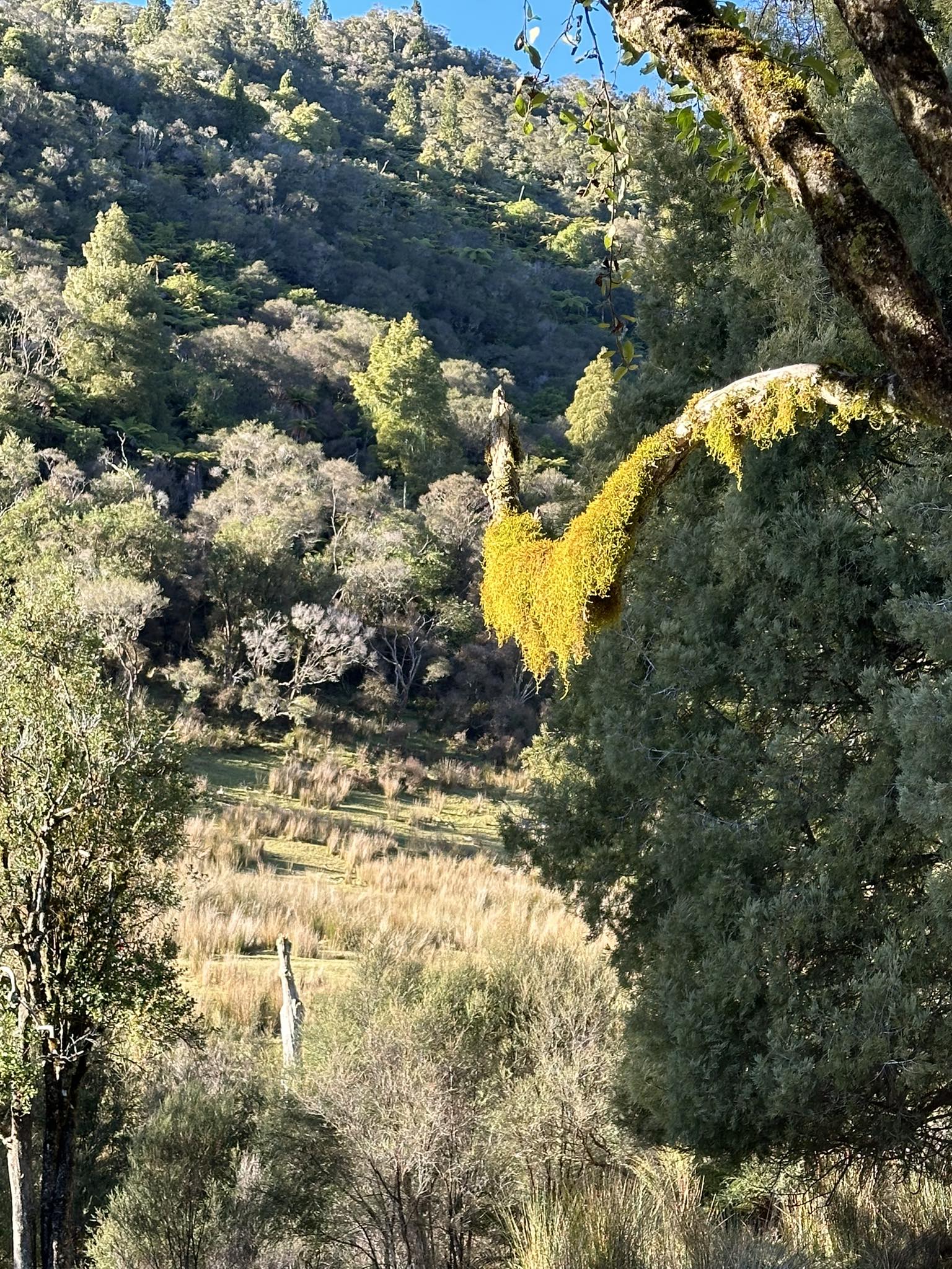
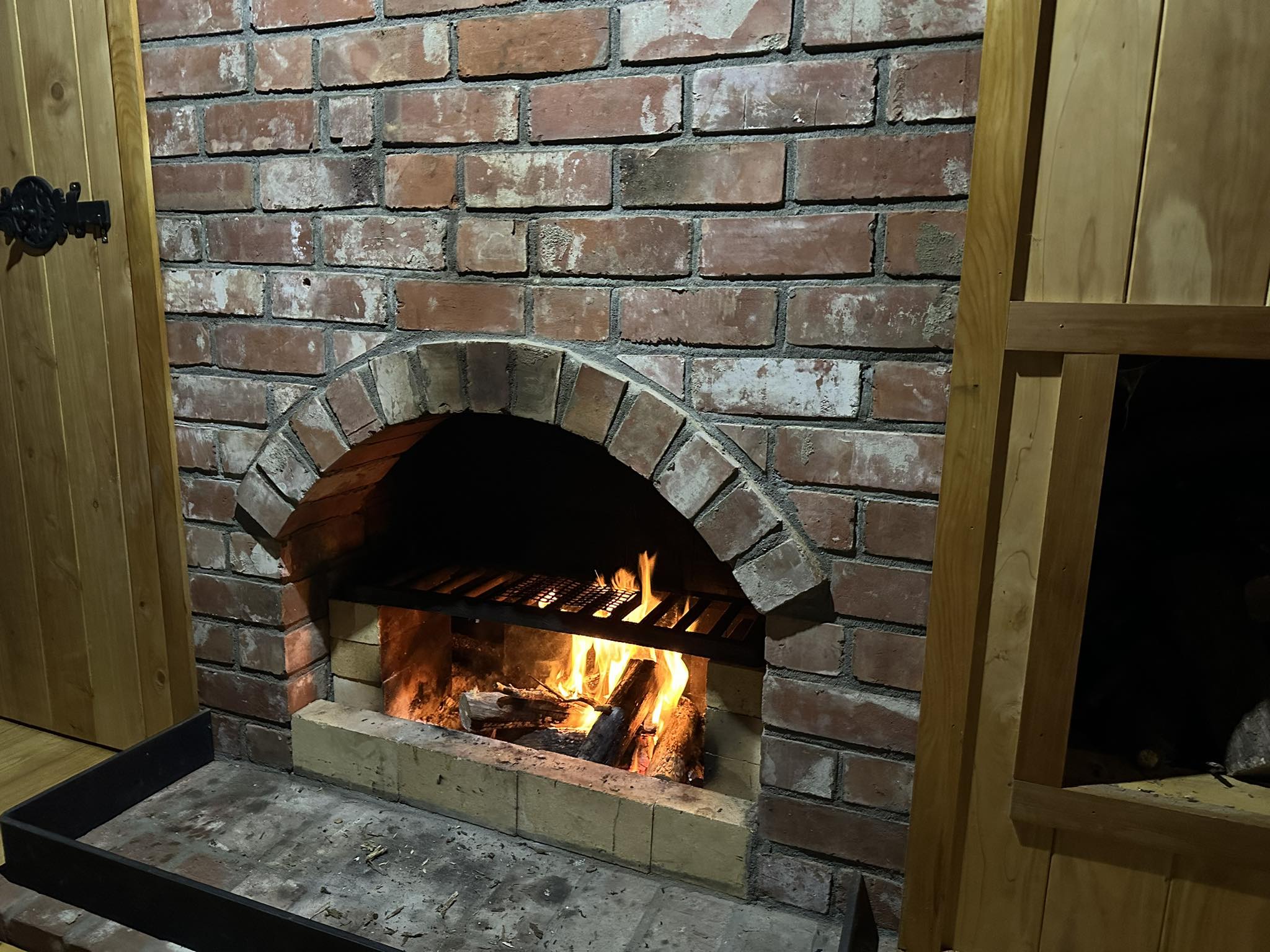
Alan and I have been out into the back blocks of Eltham twice recently, staying in a cabin well away from the world. Log fire, no noise or light pollution, surrounded by steeps bush-covered hills and deer, with the sound of a stream nearby. Bliss!
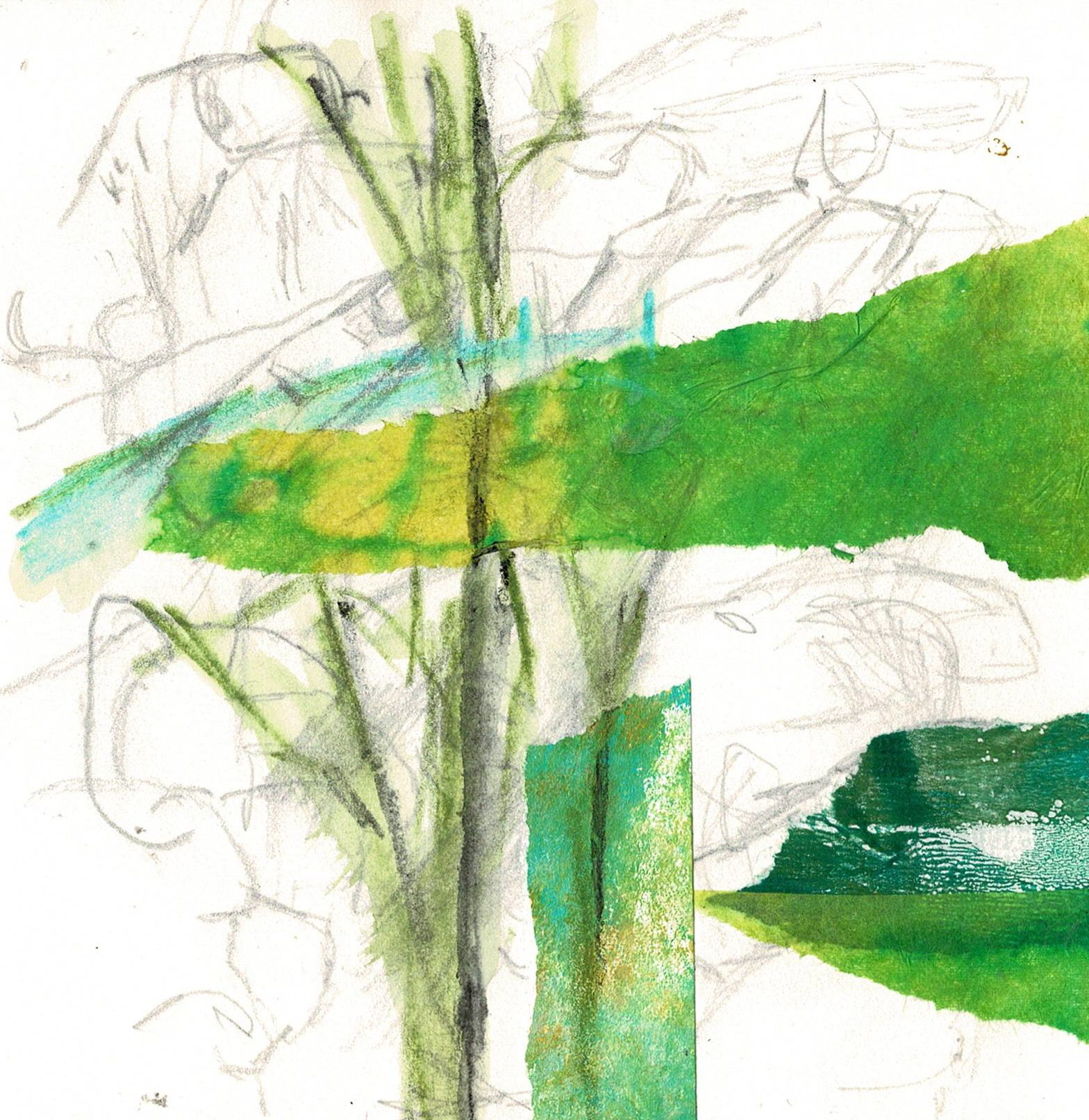
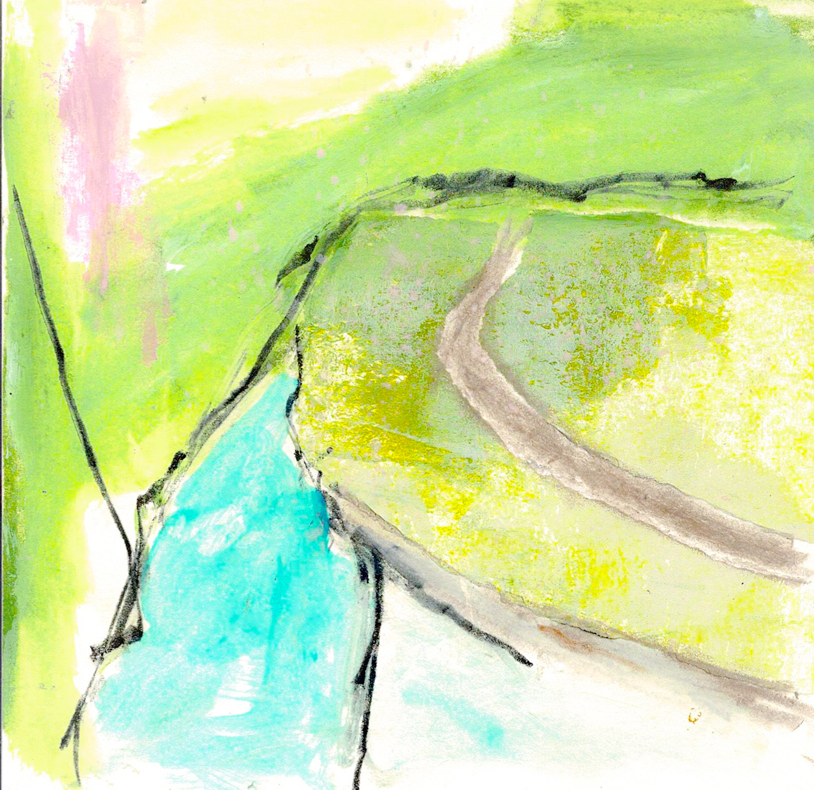
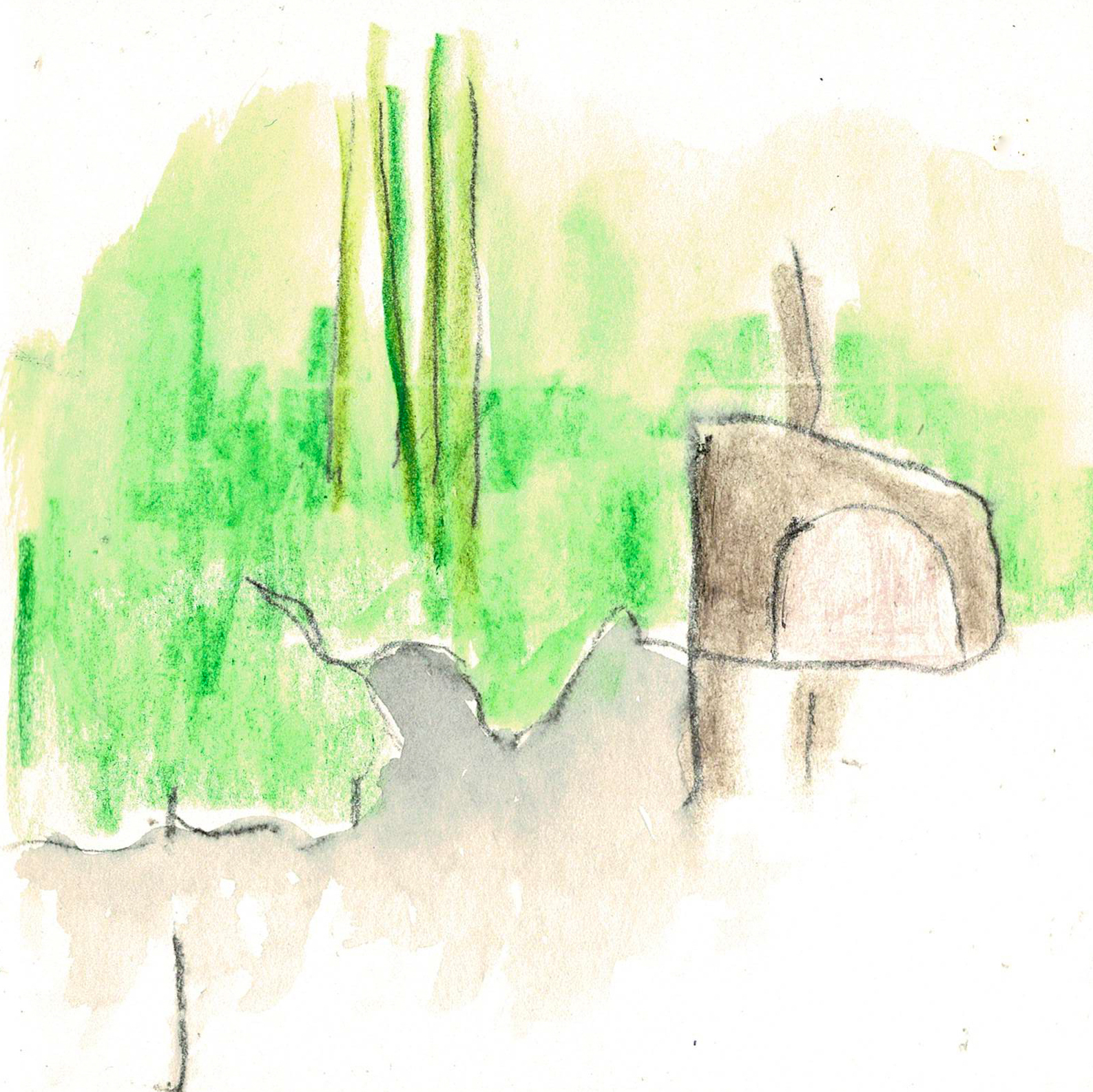
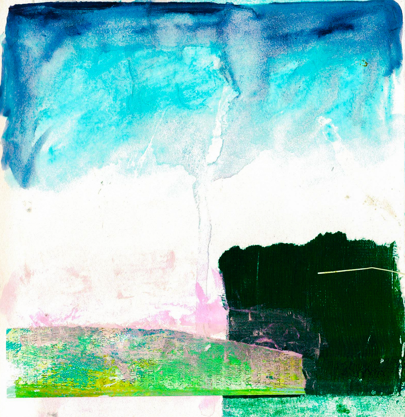
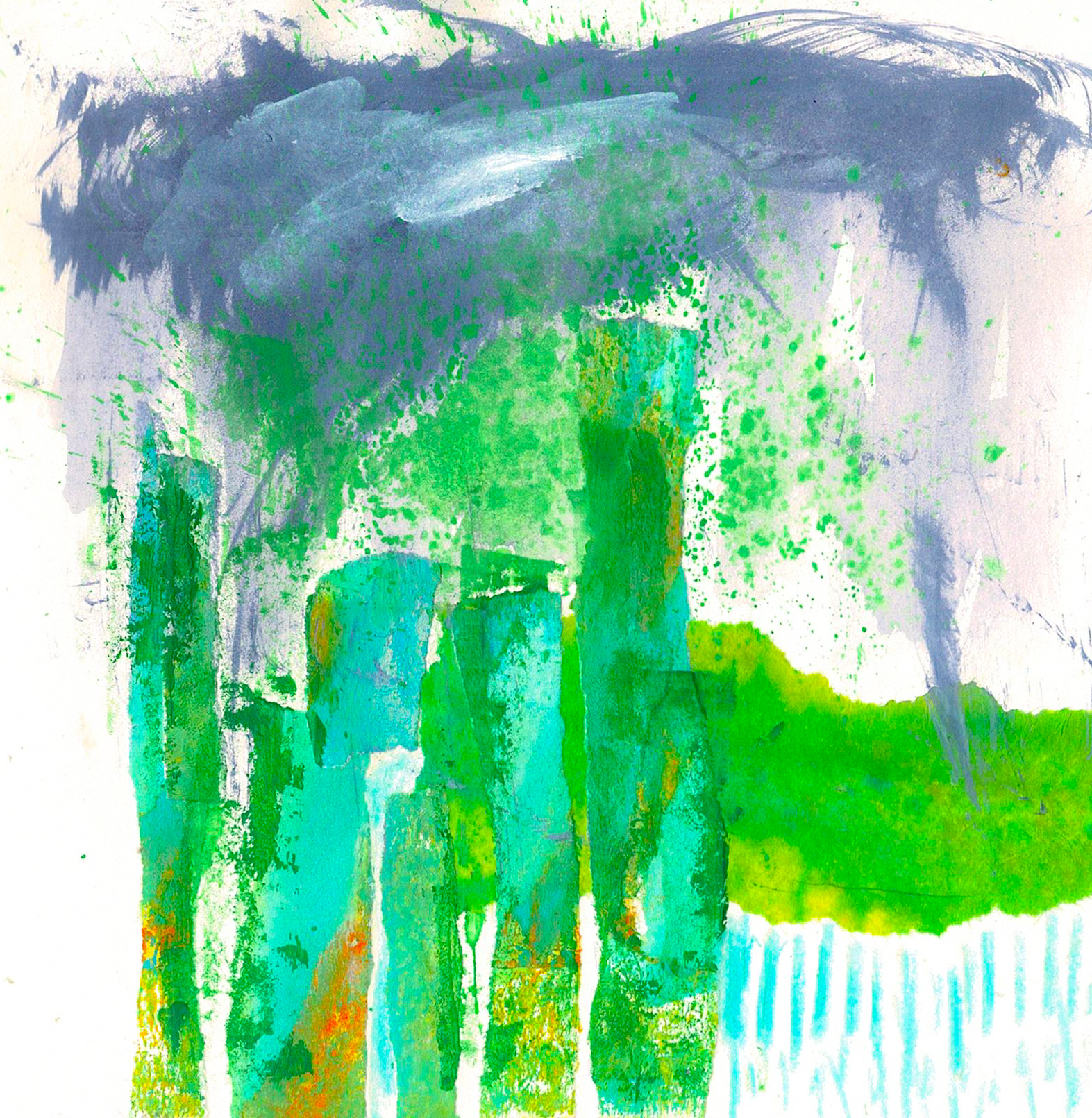
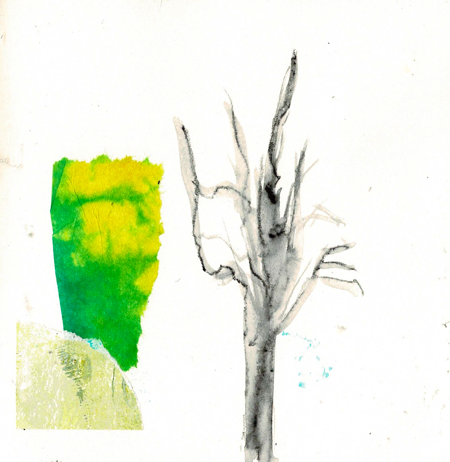
I’ll share a of few photos of where I’ve been and what I’ve been creating. There’s no real rhyme or reason to the art at this stage, and that’s exactly the point.
On Saturday I posted on bsky that “I’ve just taped the edges of about a dozen pieces of paper. I love a nice, clean white edge on the finished works. The fact I’ve prepped so many is a good sign. My subconscious must think I’m ready to start a new series”.
I had an idea of what I wanted to create, starting with fluro pink or orange paint scraped onto the paper so it was textural. I painted 8 small pieces of paper, mainly in the fluro pink, and let it dry. So far, so good.
Then … nothing. Hmm, looked at the inspiration photos on the wall, and the couple of trial works I’d done. Ok, the direction’s pretty clear. Put some paint out and started working across four of the prepped surfaces.
Nothing worked as expected. Not just in a “well, these need a lot of refining” way, or even a “well, some collage and mark making will help” way either. More of a “can I light a bonfire” way?” 😉
It means I prepped the surfaces too soon. I need to spend more time in my art journals, more time playing with colours and shapes, and just let it simmer. The paper I prepped won’t go to waste, but it’ll probably be a few weeks at least before they appear on my art desk again.
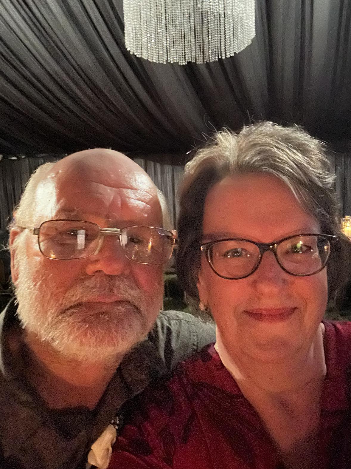
Alan’s daughter Debbie and her fiance Jason got married in Ashburton recently, and we were fortunate to have friends Cushla and Kevin join us. Friday night was the rehearsal, Saturday morning was hair etc, then the wedding itself was mid-afternoon. It was held in the stunning gardens of his parent’s property – they had done so much work to create a beautiful setting. I didn’t take any photos, which is unusual for me, but the wedding was just so lovely that I was concentrating on the ceremony. Debbie looked beautiful, Jason and his son Dante looked handsome; even the two dogs looked great in their wedding bibs.
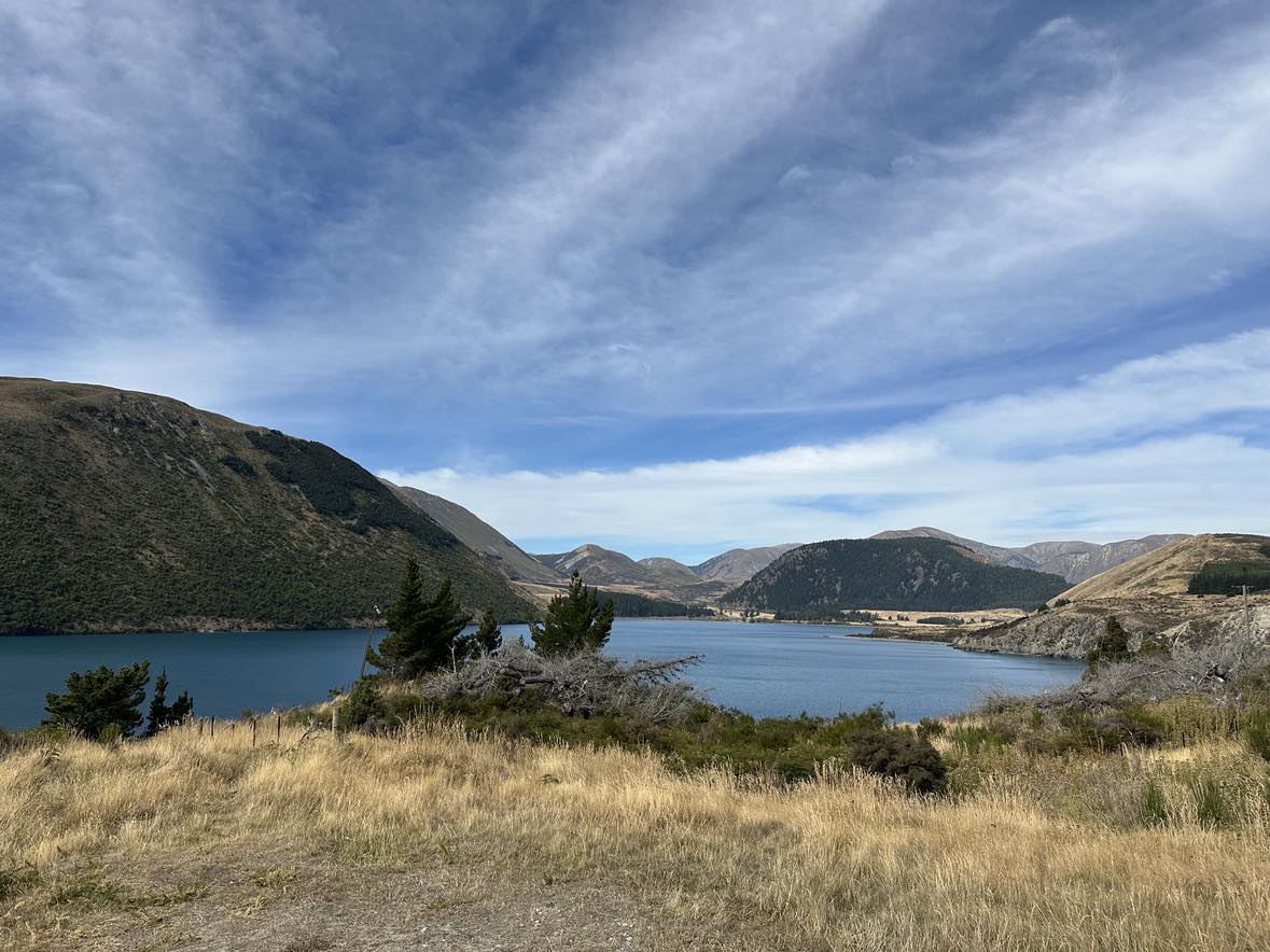
Sunday morning we had a lovely walk round the Ashburton Domain before heading back to Jason’s parents for brunch with everyone. Later in the day we drove to Lake Tekapo and spent the night with Maryrose. Lake Tekapo is beautiful; the three of us walked into town for dinner and it was lovely in the evening air. On the way out the next day we braved the queues and it was worth it because now we both recommend the pies at the bakery in Fairlie – so good! We drove back to Hokitika via Lake Coleridge, way up a gravel road so we could see Mt Algidus which had featured in Mona Anderson’s book “A river rules my life”.
We were fortunate to have the use of an off-grid beach bach for two nights, about an hour from Hokitika. It was a bit of adventure getting there as we had to ford a river a few times, towing the boat, and the final crossing didn’t quite go to plan. That’s enough about that 😉 He did some fishing, we watched a South Island Robin come in and roam the bach to clean up any insects, Alan went out at night watching the deer and … I provided a tasty snack for the local sandfly population!
We’d stayed an extra night with Kevin and Cushla before heading to the beach so when we got back we stayed with Scott and Helen, which meant Alan could do some farm work too. I caught up with Pen Kirk for lunch so we could start planning what comes next for our collab art. We’re not working towards another joint exhibition for now, but we do have a mission, which feels good. There’s something magic about collaborating with an artist you trust so you both have freedom to create without fear.
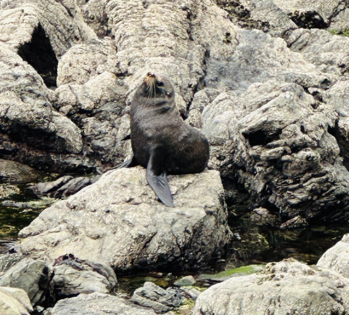
We had lunch in Kaikoura – the seals are majestic but smelly.We were fortunate so see a large pod of dolphins on the move; this is just a few of them.At the wedding reception.The Lake Coleridge area.This is the path to the toilet at the bach – the area is so pretty.
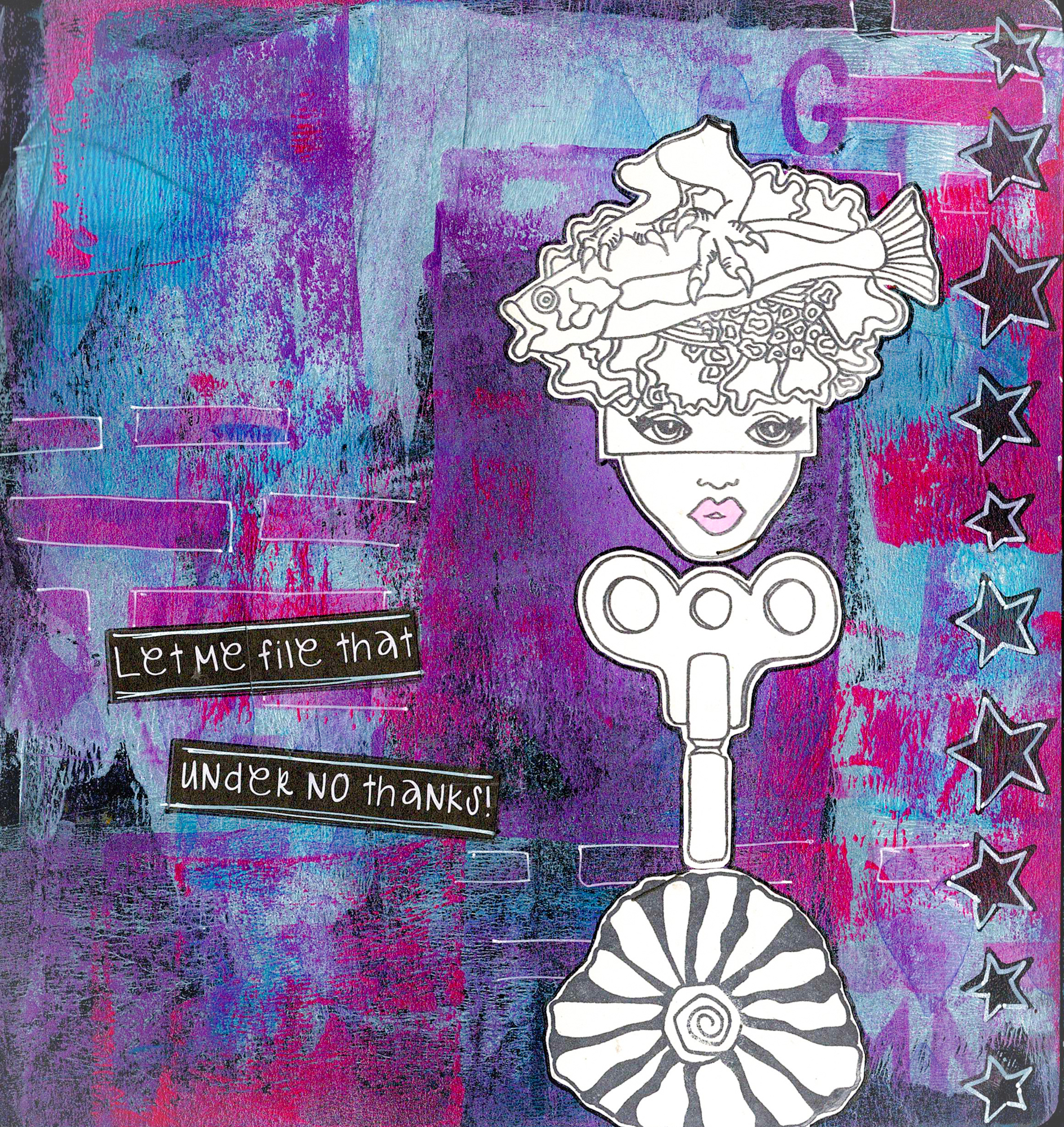
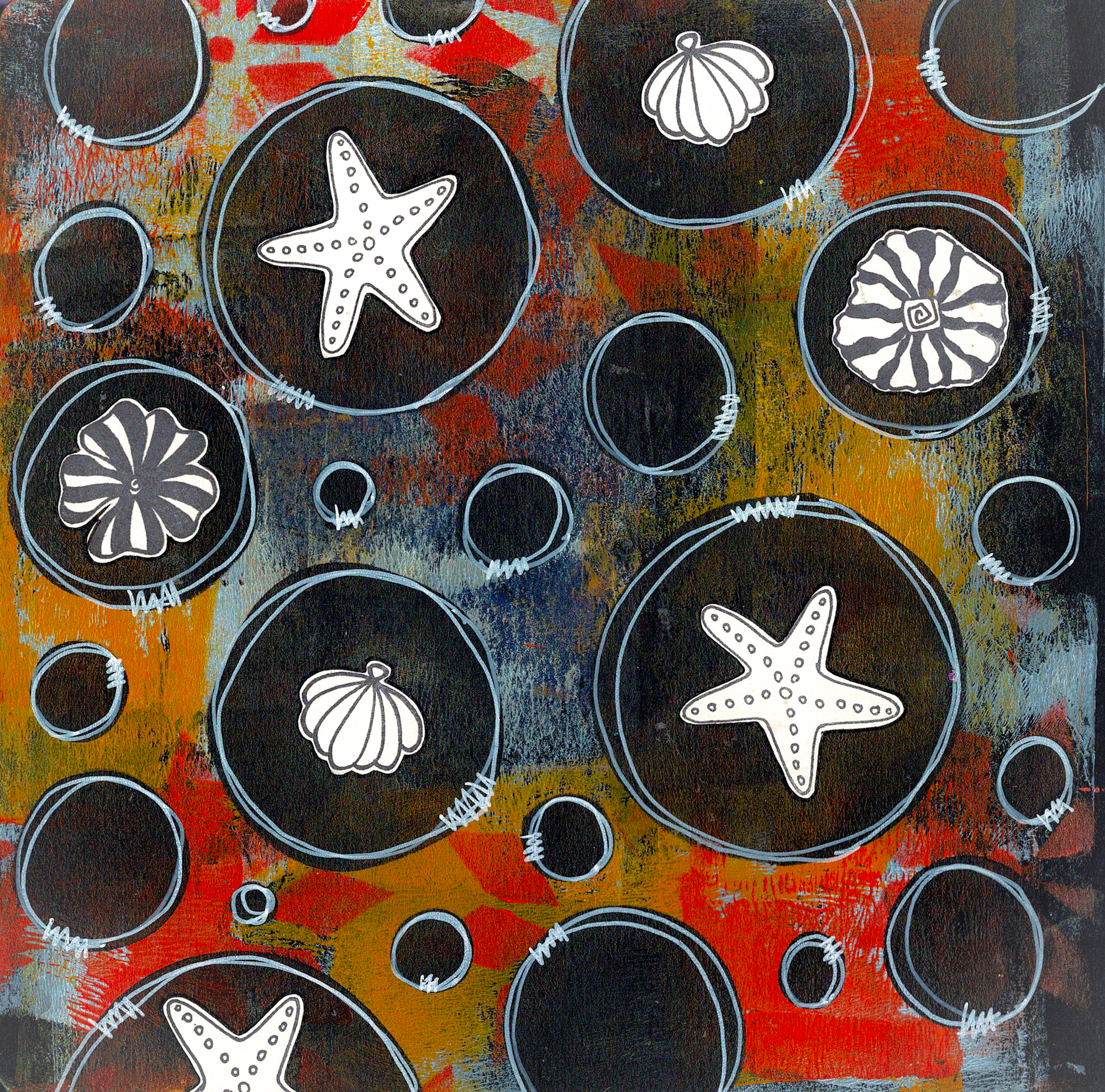
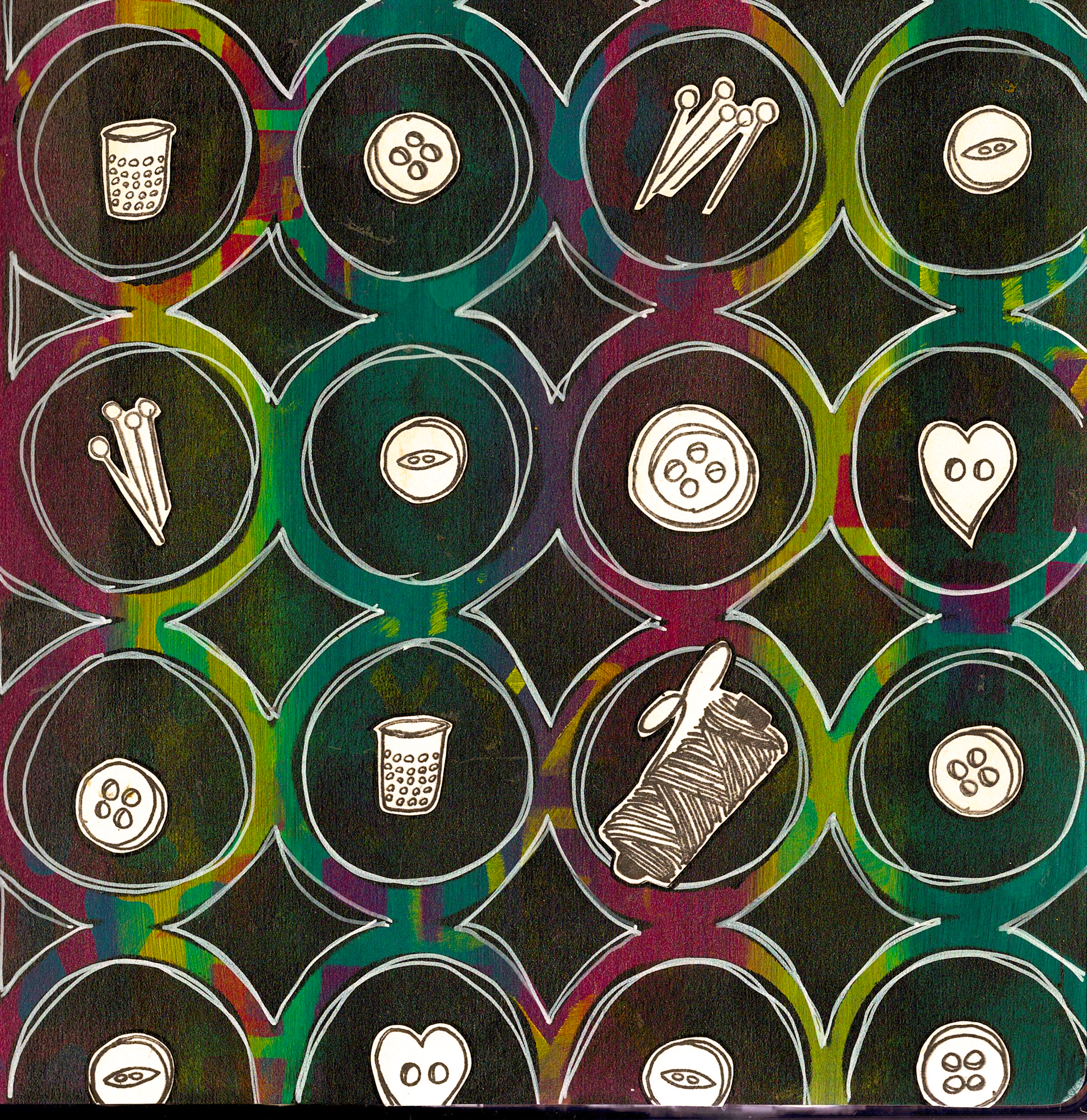
One of my YouTube favs is the wonderfully talented Claire Stead (Art_Journal Love). The other day she made a page using ArtStacks and I just had to check them out. They offer themed paper packs, so three sets somehow ended up in my cart. Got to love a quick digital download!
I’ve used them in my 6×6 Dina Wakley Media Kraft journal, with DWM paints and stencils. I had printed them on 160gsm white paper, so they’re a bit sturdier, which I prefer. The colours are bright and the images are, mainly, easy to fussy cut. I’m thrilled with them and will no doubt be buying more.
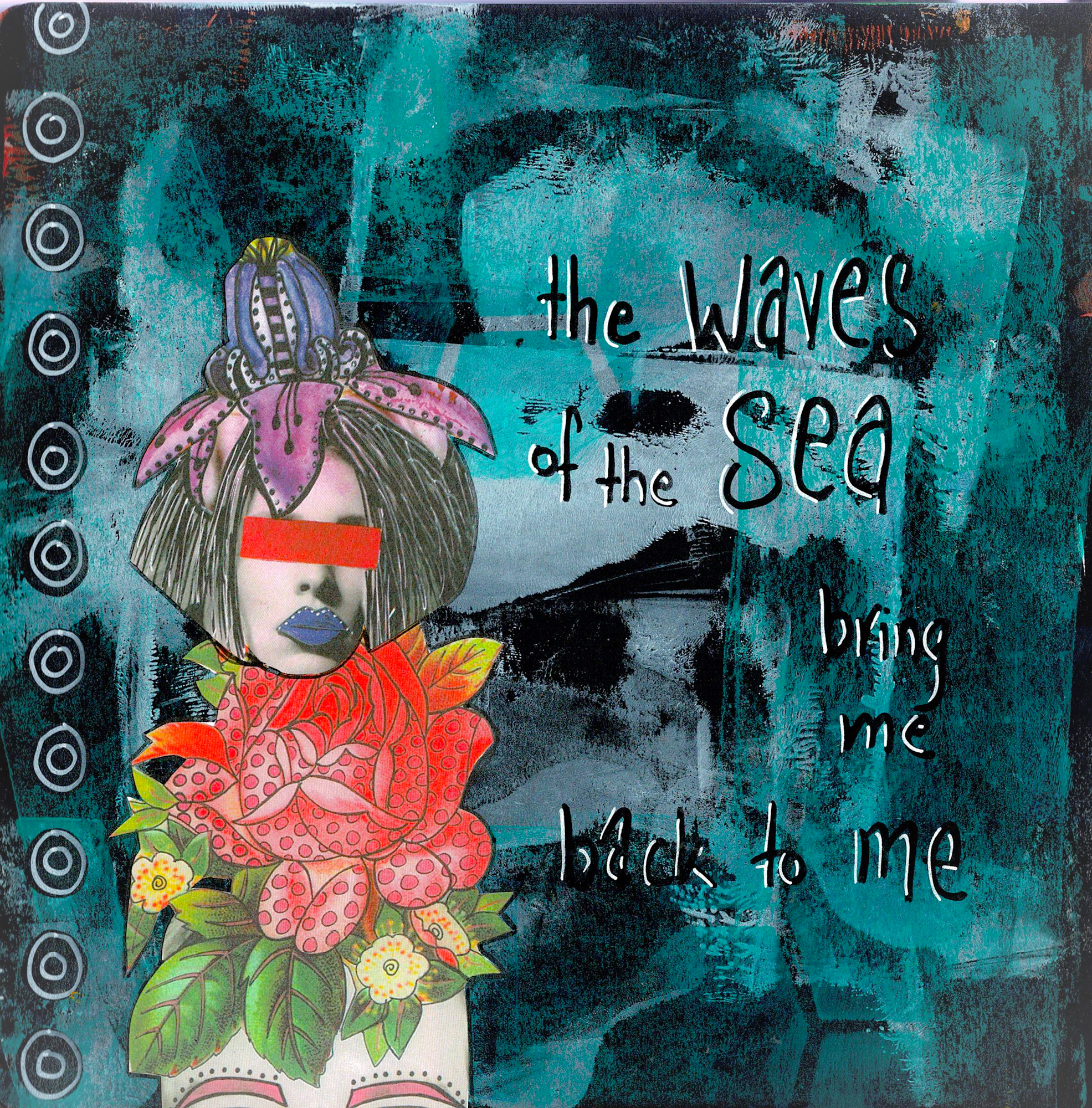
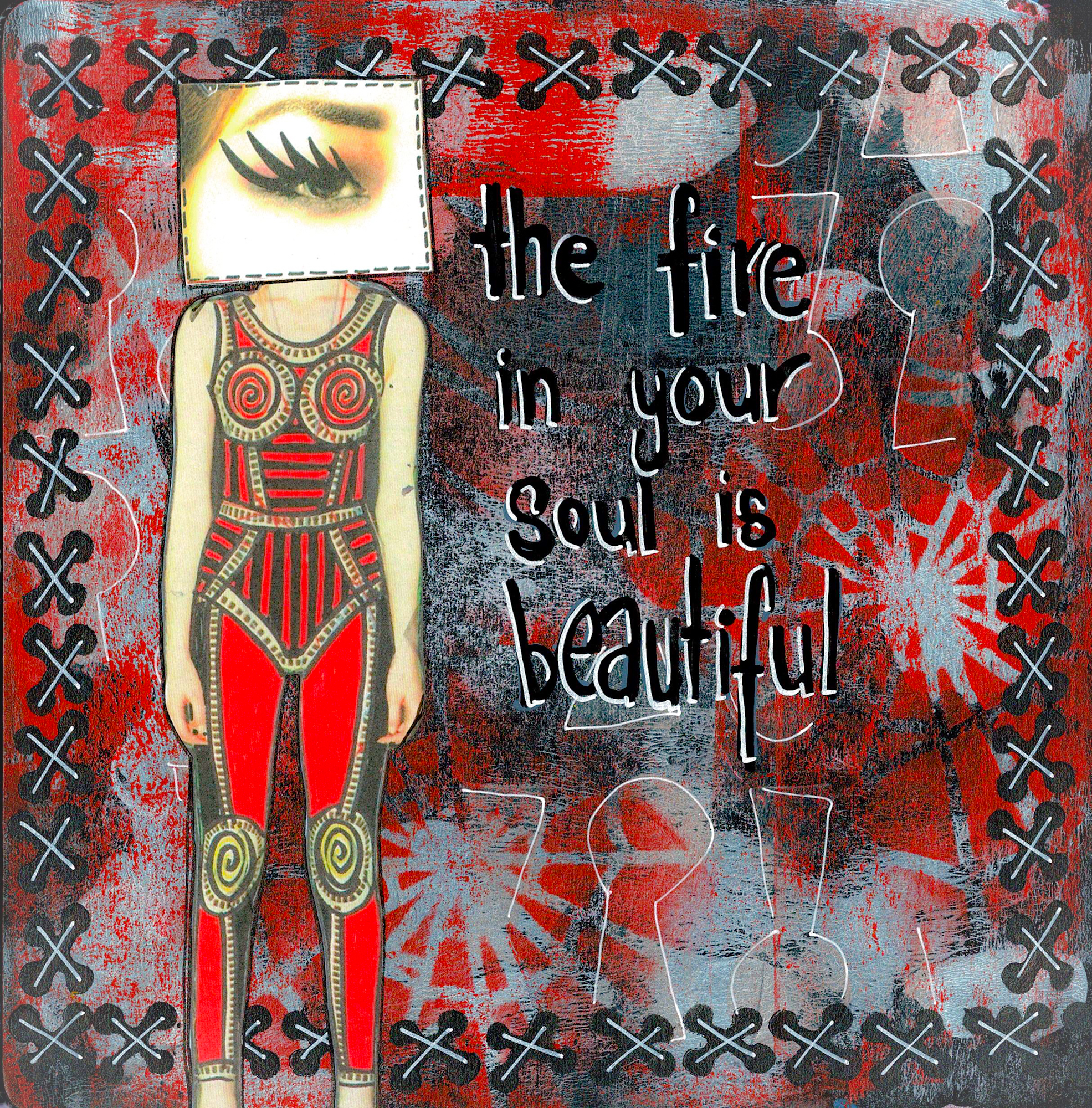
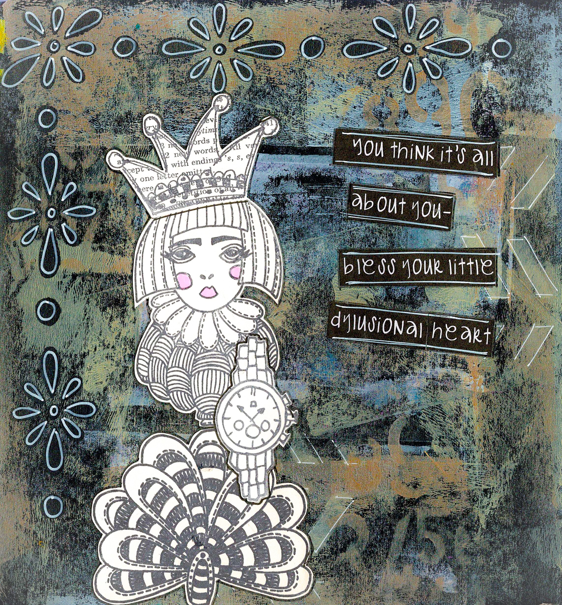
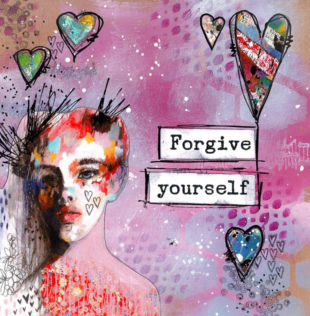
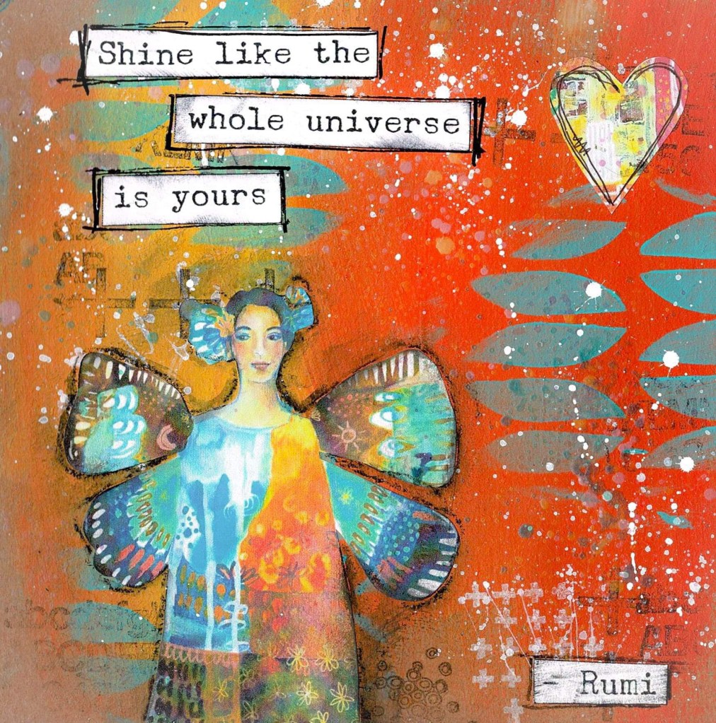
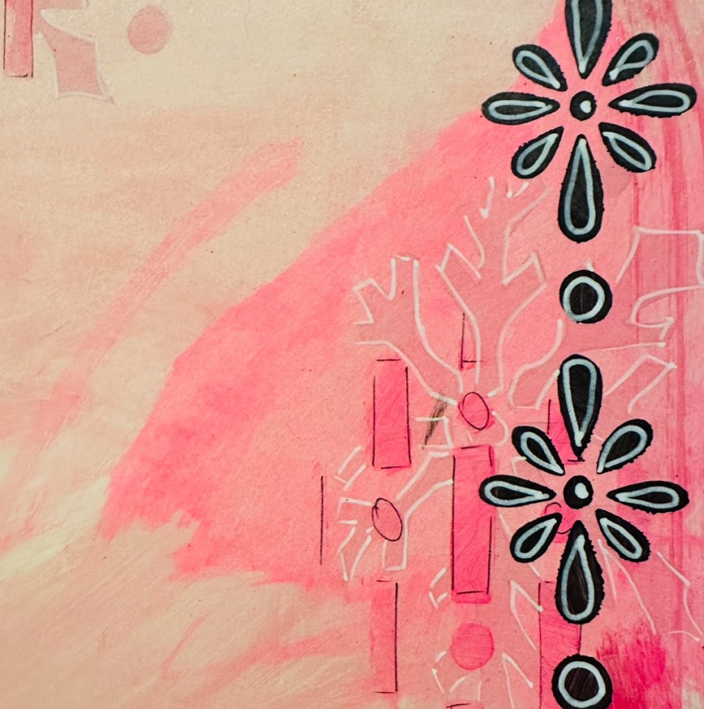
I’m going through a “strictly Dylusions” phase; my Dina Wakley journals haven’t been touched for a couple of weeks. Sometimes I work in both, using their products plus a few others such as Tim Holtz and Claire Stead. Other times, I feel compelled to just do one thing.
I’ve been painting or inking, then stencilling dozens of pages in three journals. Once they’re dry I add borders with stencils, washi tape or collage. In the evenings I sit in the lounge doodling with black and white Posca pens while Alan watches tv or we listen to music.
I outline all the collage, add stitch lines round some elements, doodle round the stencilling, and so on. I’m not fussy about it – if the line is wonky or goes over the collage it doesn’t matter.
All of this means that, although I’m using products designed by someone else (a lot of the collage is straight from Dyan Reaveley’s own journals), the final pages are mine – they clearly show the hand of the artist. I love that!
The pages below are sections from some of the ones I’m working on. I flip back and forth in the three journals, so I don’t have to wait for the pen work to dry.