We don’t create in a vacuum, rather we’re influenced by what we see, read, hear, do. We might look at art online, visit a museum, or sit and watch the sea. Of course it’s not just art that inspires; it’s jewellery, news, gardens, the colour of people’s clothes, and so much more.
Today Alan and I went to an orchid show in New Plymouth. The flowers were amazing, we had a nice lunch then visited a friend. I don’t paint flowers very often, but the colour of the blooms was inspiring, especially the ones where the inner and outer petals were strikingly different colours.
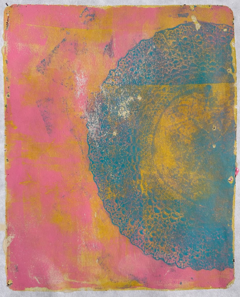
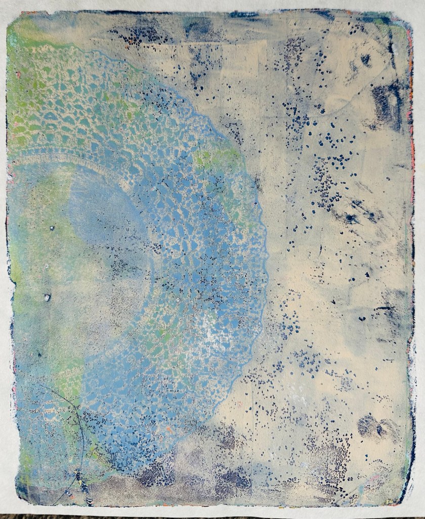
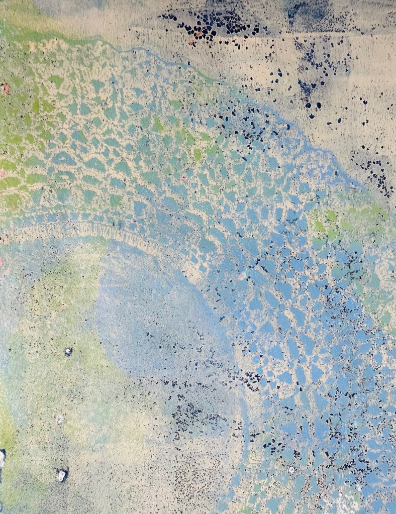
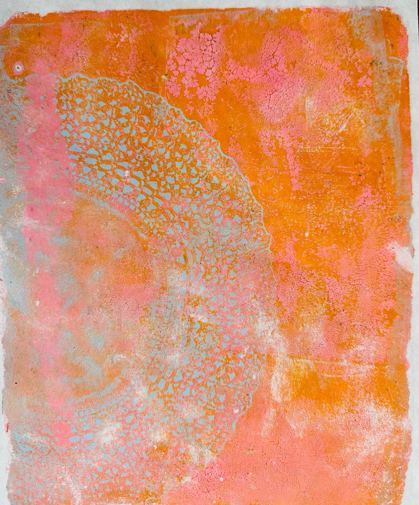
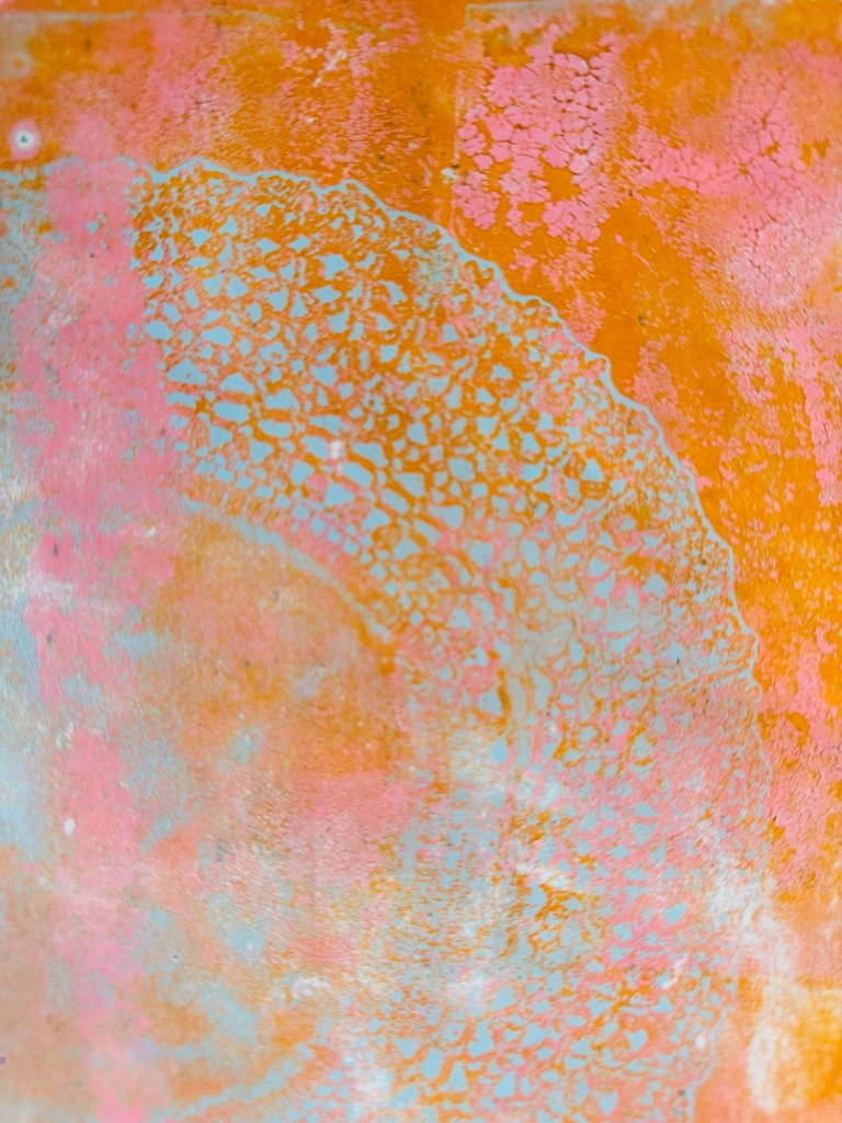
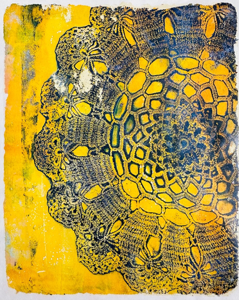
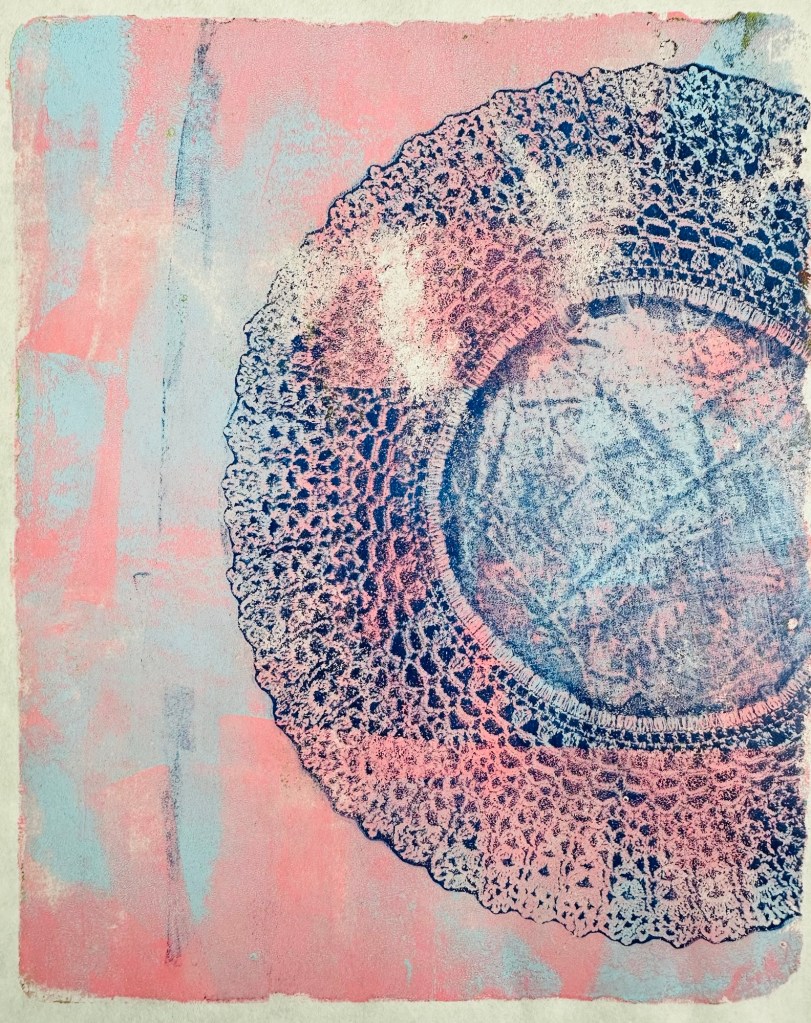
Today I popped into Ethel Anne Antiques in Hāwera in search of more old music books, as I’ve had so much fun with the ones I got a couple of weeks back. I bought some but, even more exciting, are the old lace doily.
I knew straight away they’d be interesting on the gel plate. Sure enough, they were. The heavy lace one isn’t much use, but the finer ones are amazing. I used mainly Golden Fluid Acrylics and Hahnemuhle Sumi-e paper to print on because it lifts the prints beautifully. I definitely prefer the softer colours for these over the brighter ones.
I’m not sure what I’m going to do with these yet. I’ll probably use them as collage in mixed media works. I’m tempted to create some multi layer prints that are complete in their own right.
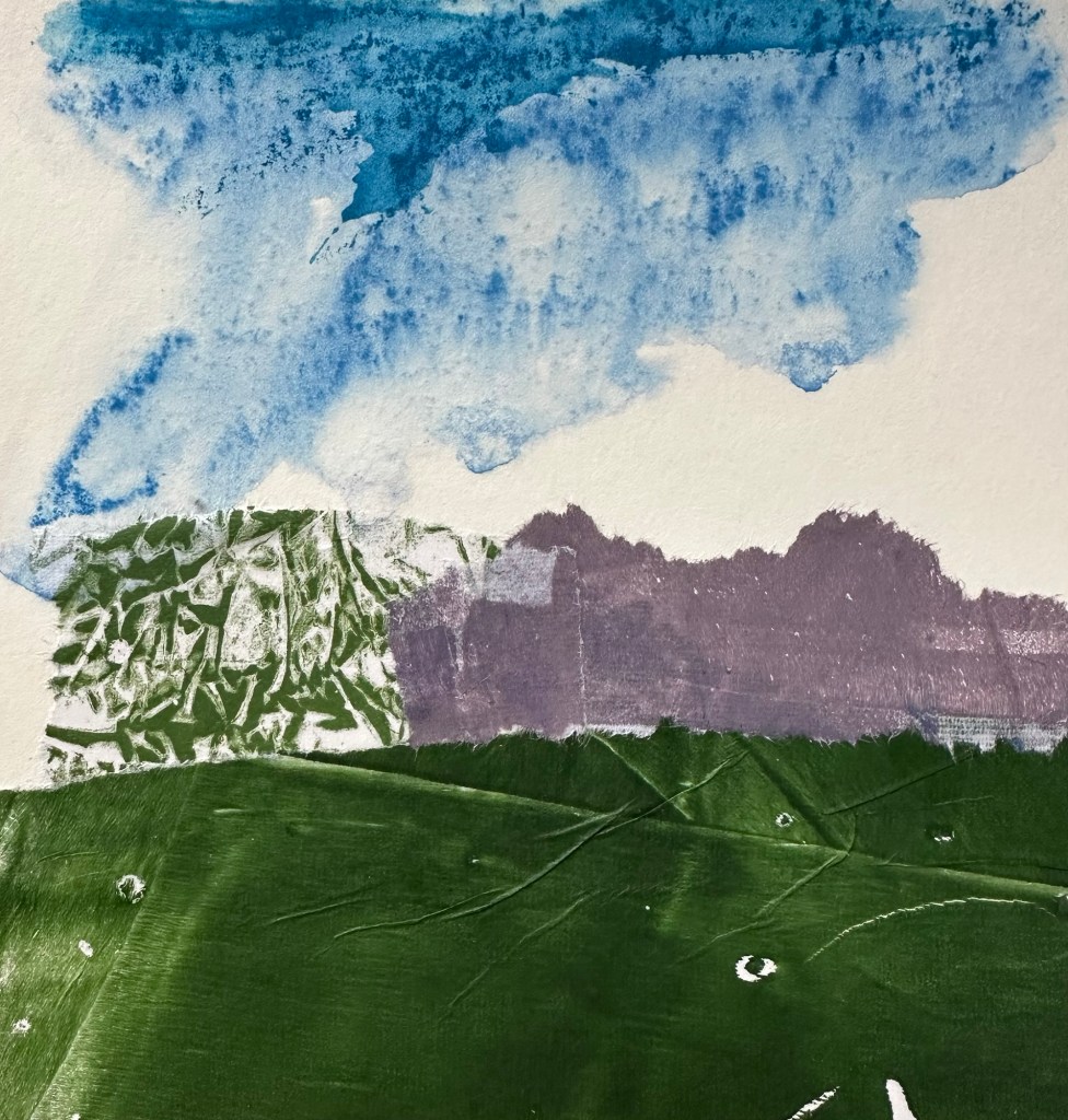
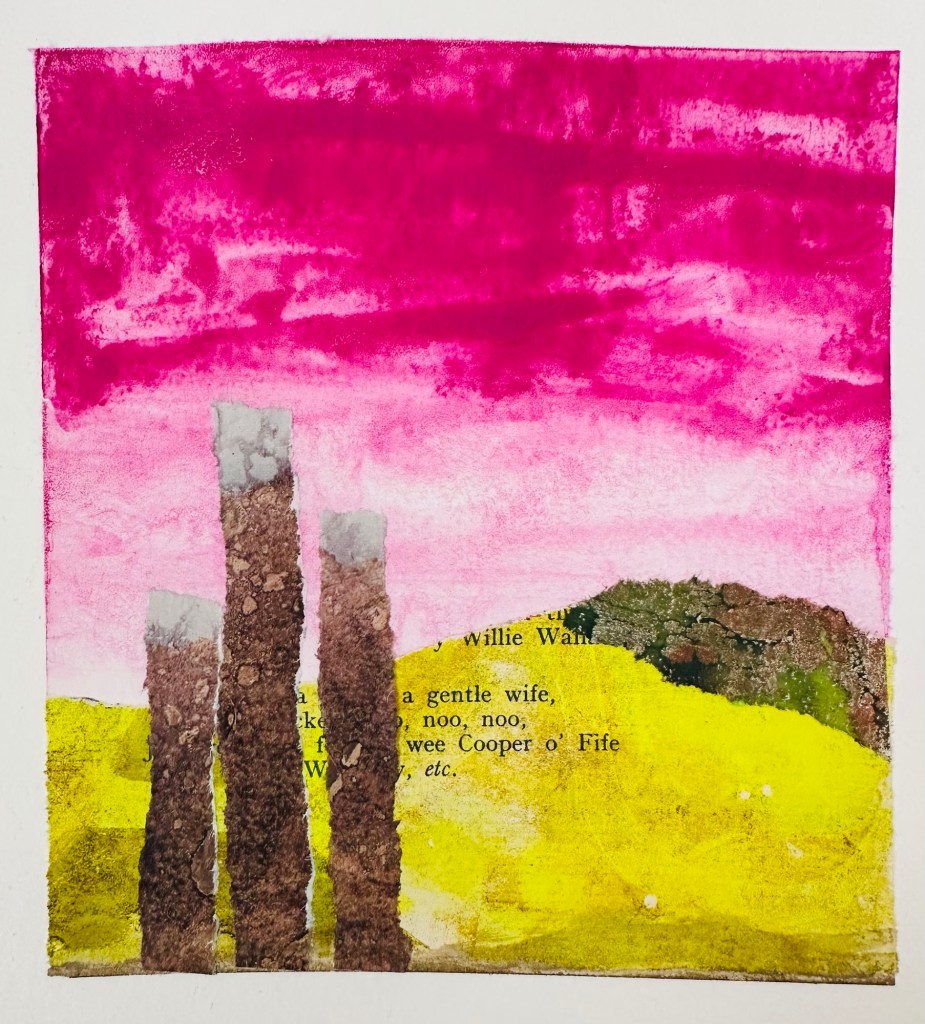
Here’s what I have done so far, including a couple of close up shots.
I haven’t had a lot of time for creating finished pieces recently – life got in the way. I always find time to create though, even if it’s just a bit of colour mixing and things like making backgrounds. I’m using the Sarah Renae Clark Color Cube 2 for inspiration.
I was excited to get a couple of Stillman & Birn Delta journals on sale – they’re expensive here in New Zealand so had high hopes. I chose 7×7” Delta because they have heavy weight 270gsm which the website says is ‘ideal for wet and dry media, including watercolour and ink’.
I taped every second page because I like a clean border, but also enjoy a more organic edge sometimes. I want to love my new journals, but don’t. The paper pills easily when you use water, so washes have spots in them. Even with heating the tape prior to pulling it, the paper tears easily. They’re just not great for the way I work, and at that weight I expect the paper to be more robust.
Putting that aside, I visited Ethel Anne Antiques in Hāwera today. They’re running a pop-up shop with 60% off. I picked up four music score books for just $12. I’ll be going back to find maps, more music and maybe an old textbook or two. The owner is lovely, and was happy to chat about what I’d be doing with the music. Like me, she loves seeing old things given new life, rather than ending up in the rubbish.
I came home and gelli printed on a few pages to get started, then grabbed one of my collage landscape journals. New papers inspired me and I completed about 8 pages in a row. I can see some themes emerging, as is often the case when I work in a hurry.
I’ve talked about this before, but didn’t get any forward momentum … until now.
My art journals were always a combination of the ‘craft’ side of art journaling that grew out of scrapbooking, and a place to learn about materials and develop ideas. For lots of reasons, they became almost solely product-based; Tim Holtz, Dyan Reaveley and Dina Wakley.
I miss the part of art journaling that’s internally driven, and know the habit was good for my art practice. Projects such as the tiny squares help, but the scale is limiting.
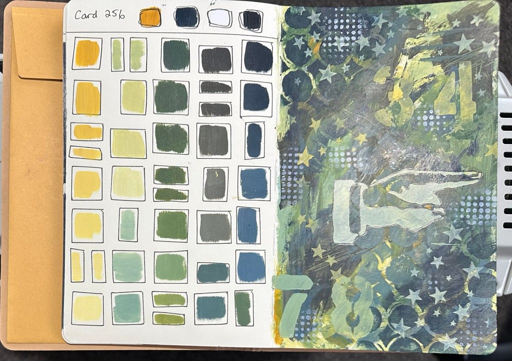
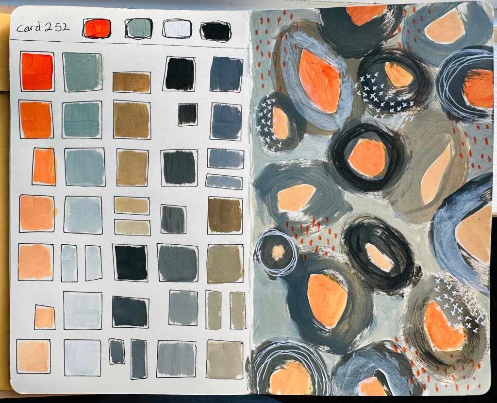
I started following Denise Love on YT recently. I like what she creates but I *love* her art practice. After a few weeks of watching, I had an aha moment (no one can accuse me of being a quick thinker!). I ordered a Color Cube from Sarah Renae Clark – I’ve been seeing a lot of artists use them and knew it would help.
I’ve started two new art journals, both my fav small Dylusions ones, and am doing seperate but connected projects. I’ve set an additional rule that, aside from setting up the colour swatch pages, I can only use my neglected StencilGirl or other stencils. No reaching for my Dina Wakley or Dylusions ones as they’ll take me back to my usual post-scrapbook style again.
In the first I pick a card then choose two of the colours and swatch them onto pages I’ve prepared with Dylusions stencils or Dina Wakley Stamps so there’s a framework to work in. On the right hand page I do a small piece using just those colours.
In the second journal I choose a card, and record the six colours on the left hand side then do a small on the right.
My aim? More practice with colour mixing, developing my mark making, exploring my interests in shapes and composition, and hopefully working looser.