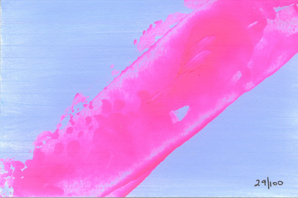
I love this colour scheme too (I seem to be on a roll) – Winsor & Newton Opera Rose and Reeves pale powder blue. The pink is a wee bit more fluro than the scan shows – it’s a very translucent paint.
I love this colour scheme too (I seem to be on a roll) – Winsor & Newton Opera Rose and Reeves pale powder blue. The pink is a wee bit more fluro than the scan shows – it’s a very translucent paint.


I love this colour scheme, like yesterday’s one but lighter and brighter – Winsor & Newton Opera Rose and Liquitex brilliant yellow green. The pink is a wee bit more fluro than the scan shows – it’s a very translucent paint, and the green is more lime green.


I’m ambivalent about this one. It’s Golden fluid acrylics Benzimidazolone medium yellow and Quinacridone red. I like how vivid it is but the red is my least-used Quin colour – it always seems a bit harsh to me.


This is Golden fluid acrylic Quinacridone magenta then Benzimidazolone medium yellow wiped back through a stencil with a damp babywipe. I thought there’d be more orange tones than I ended up with.


I love this colour combination! I started with Golden fluid acrylic Quinacridone nickel azo gold, then added Quinacridone magenta and Turquoise (phthalo) and let them mix in the middle. The result is a little more dense than this shows, but it does make a nice quite transparent dark.

