Tag: collage

  • Practice decision making

    Art is about colour, line and form, but it’s also about decision making and trusting your instinct. Perhaps it’s not even so much about trusting your instinct as your unique creative voice.

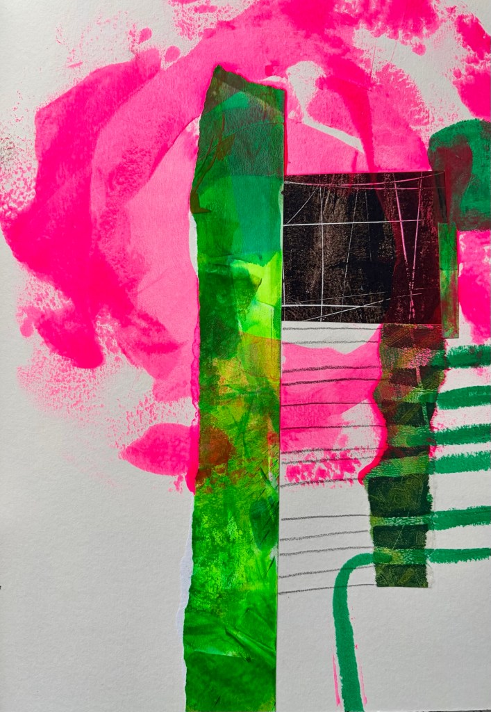
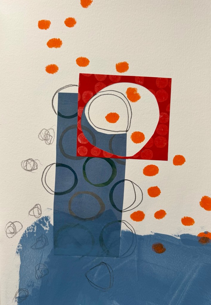
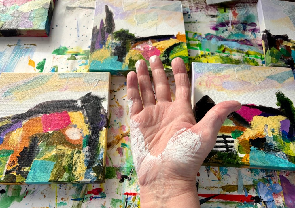
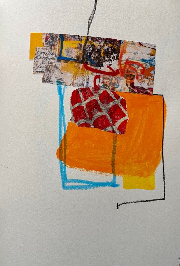
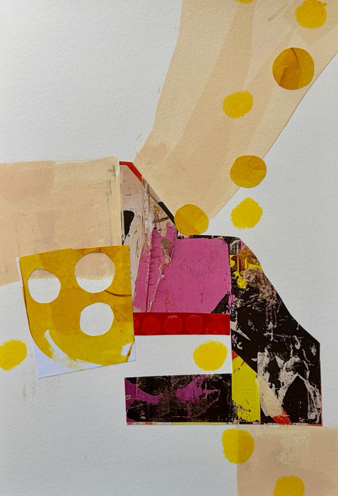
    One of the ways you can understand your creative voice is through practice. Practice mark making, choosing colours, deciding which piece of collage paper goes where. That’s the magic of a sketchbook. It’s not finished art; it’s playtime. A sketchbook lowers the stakes, freeing you to play and experiment.

    Playing doesn’t waste time or materials; it’s the work of being an artist. Finished pieces that feel authentic, whatever finished means to you, are the result of time spent playing. Some artists worry they’re wasting paint, or only use cheap materials when they’re playing. The trouble with that is you practice with cheap materials, then when you swap to your “good” ones, you don’t have an in-depth understanding of them – the variations in handling, texture, colour and tone that matter so much. Buy the good things, use the good things!

    The pieces shown below are exercises inspired by a Jane Davies class, and are about practicing my decision making as an artist.
  • Seeking clarity

    Seeking clarity

    I’ve blogged before about my decision to take this year off from selling my work, to play with no outcome in mind and see what happens. Giving myself the space to heal from the emotional and physical exhaustion of losing Tony. I said I’d revisit the decision if it felt right.

    I’m not ready to start marketing and selling. I am ready to start thinking about making a body of work – what might the theme be, do I want a limited colour palette, work on paper or canvas, what materials to use? Not making, initially anyway, just thinking and getting clarity about my goal…

    It’s good to be at this point, to know I have some emotional space already. It took two years to get to this point after Mum died, and Tony’s only been gone six months. I’ve thought a lot about why it’s quicker this time. It’s certainly not about the depth of love. I think it’s because I’d been there before and knew how to look after myself better, knew how and when to seek support.

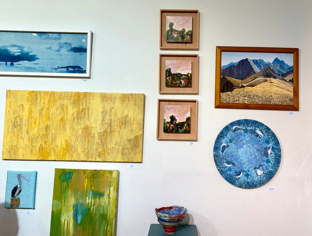
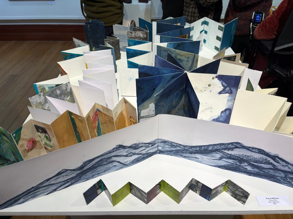
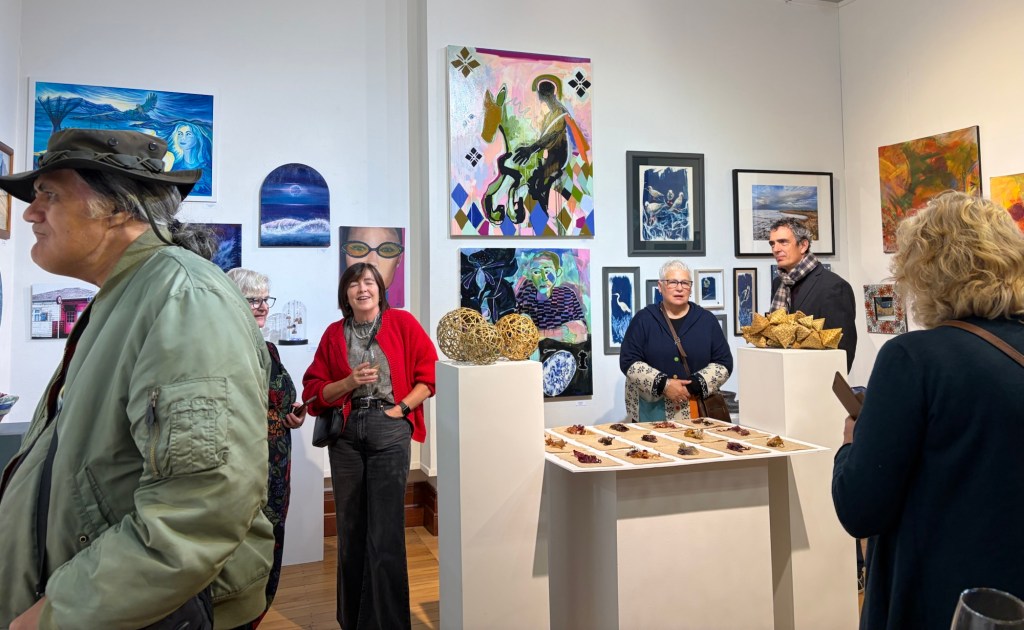
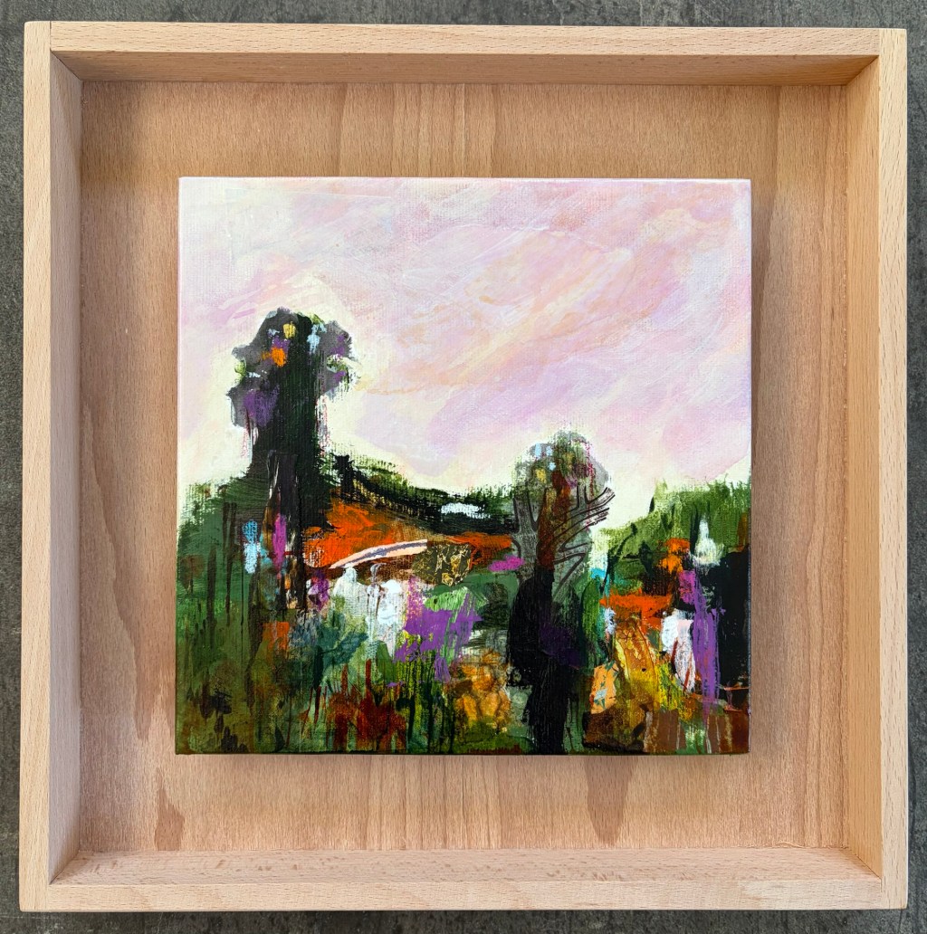
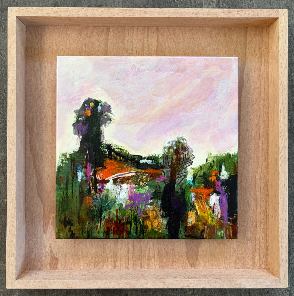
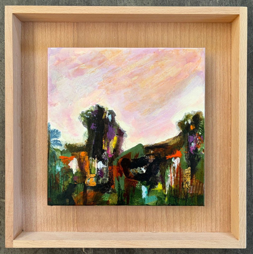
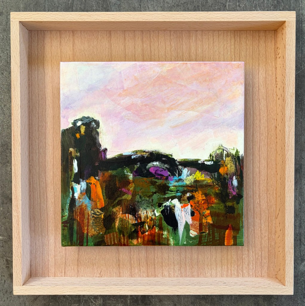
    In the meantime, I attended the ‘Sum of all the parts’ exhibition opening at Left Bank Art Gallery in Greymouth. I have three small landscapes in pale wooden floater frames in the show. It’s a group show with some fabulous work.

  • Art reflects the world

    Art reflects the world

    My art is usually about my inner landscape, the seen landscape, and the remembered landscape, reshaped into a unified whole. Except at the moment there’s not a lot of unity.

    The world is a bit of a bonfire. Ok, more than a bit. In many ways it more like a giant dumpster fire, with an endless fuel supply. There’s little unity between people, countries, regimes…

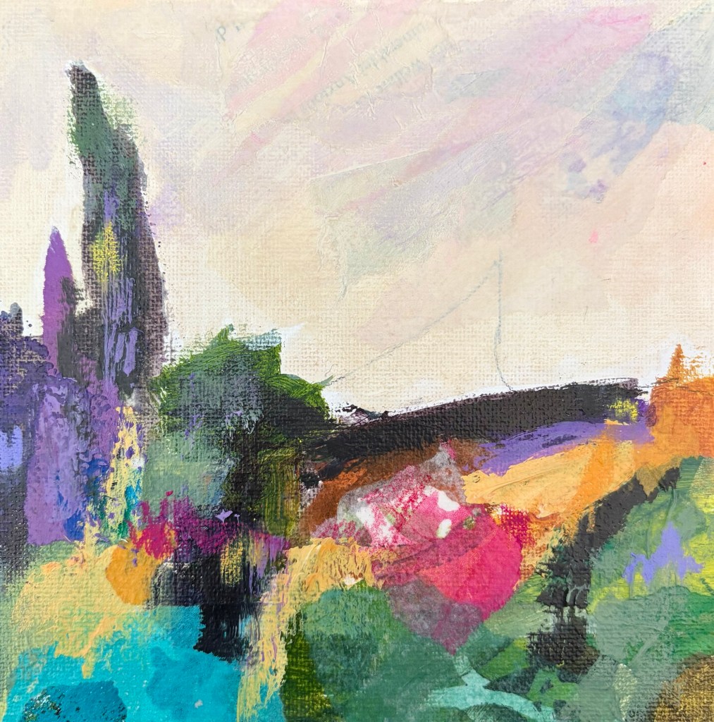
    What does that mean for my art? I’m still creating semi-abstract landscapes but there’s a chaotic energy about them. The land is fractured rather than peaceful. The landforms are bitsy and broken. I’m testing out using a limited triad colour palette, and that’s helping to create a little unity.

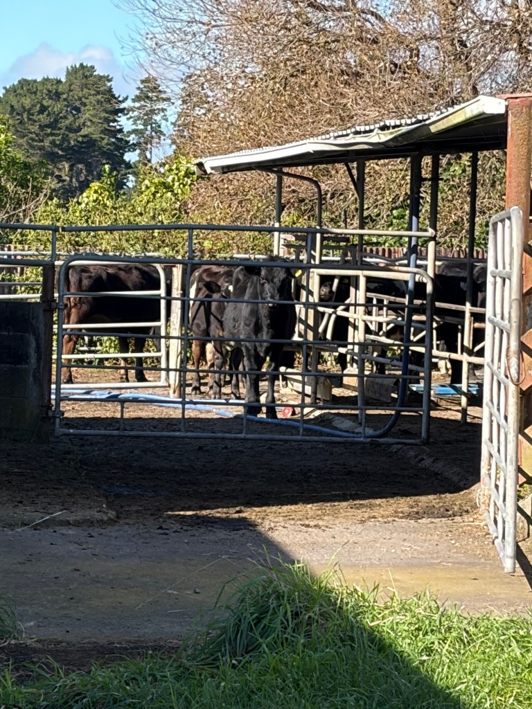
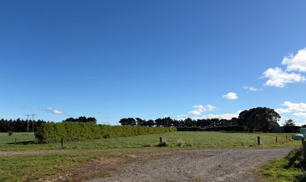
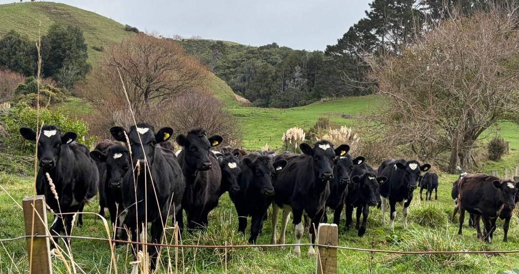
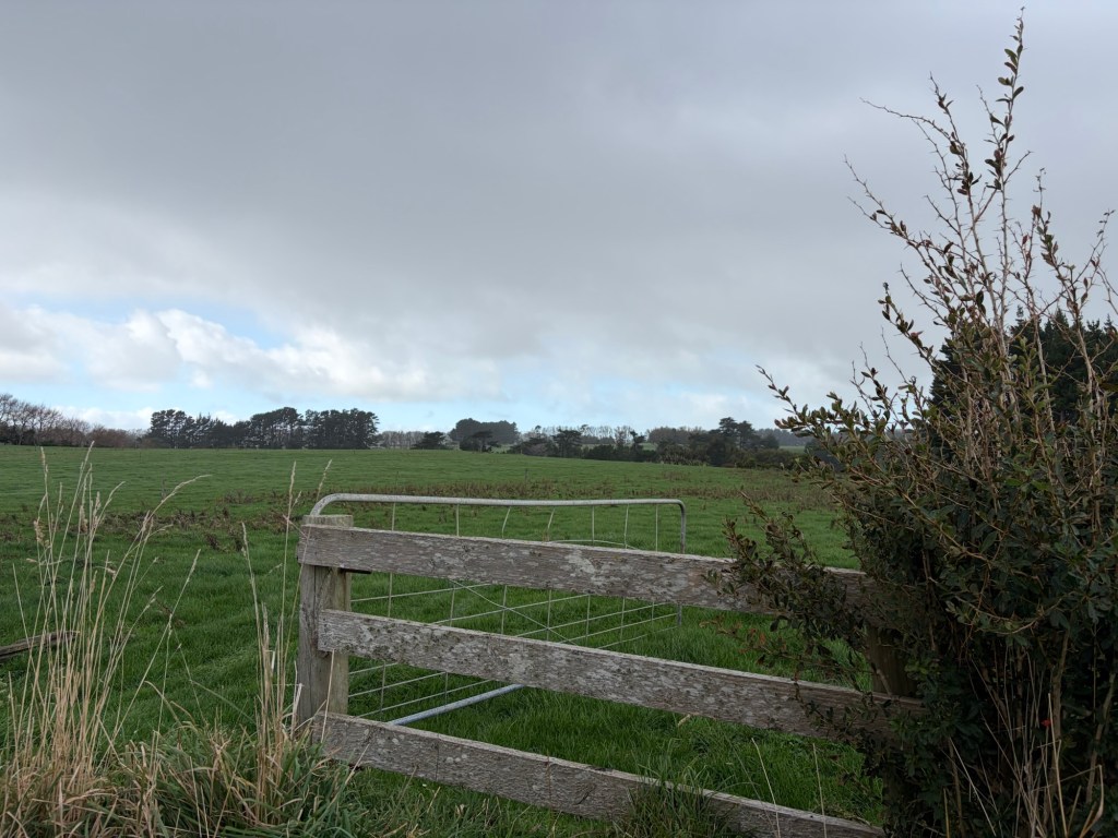
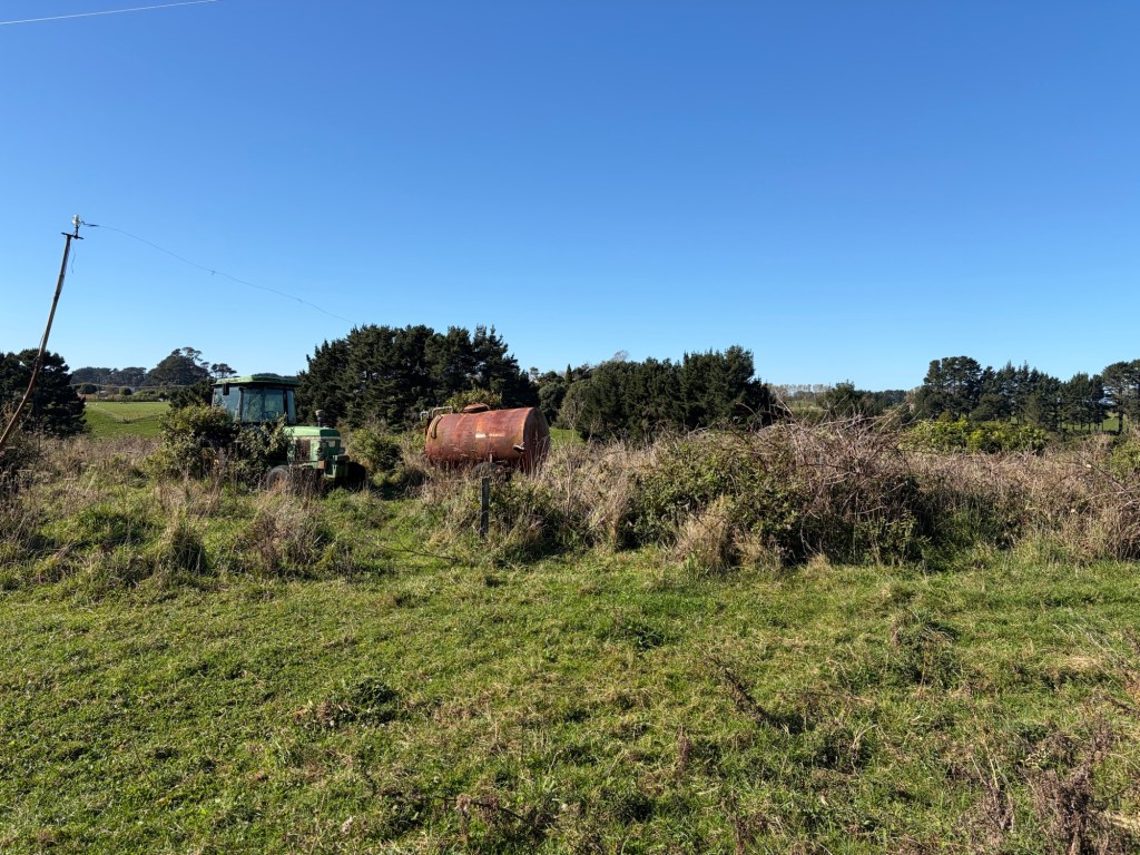
    On own land, on the other hand, is an oasis of calm … green paddocks, dense bush, a river, and contented cows. Is it out and out idyllic? No. There’s a lot of work to be done, and that’s ok. We have time, and it feels good to be out in nature away from the chaos of the world.

  • Find inspiration

    As artists, I think we have a choice. We can wait to be inspired, or we can seek inspiration. Inspiration doesn’t have to come from something incredible. It can be found in ordinary moments, in things we see as we drive to work, in our own garden, and the people and places we see.

    Recently, Alan and I bought a dairy grazing block. It’s 43 hectares with flat land, some native bush and rolling hills. There are around a hundred cows on the property, a stream, and some deer wander through … or perhaps live in the QEII area within the farm.

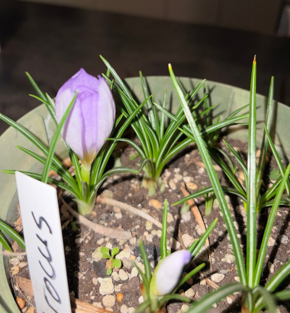
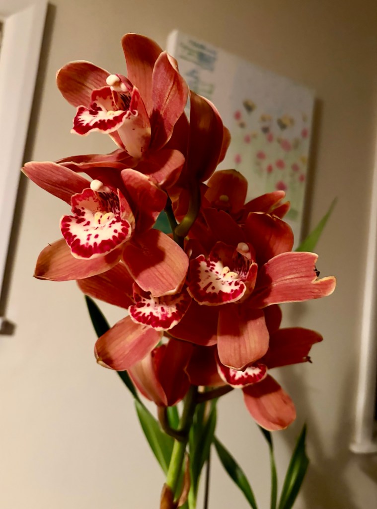
    For now we’re still living in my house, with messy gardens and a greenhouse. As the orchids start to flower, we bring them inside and enjoy seeing the blooms, which often last for weeks. In the last couple of days, the crocus have also started to flower in a small pot. The flowers are a pale lilac, and they’re delicate and beautiful.

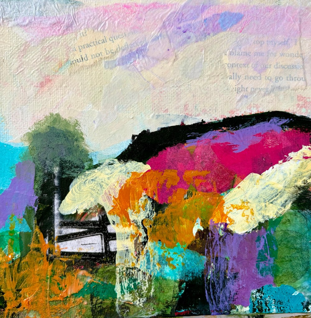
    It’s not very often I paint flowers. I tend to be a semi-abstract landscape painter, using mixed media. Recently I’ve been exploring a limited color palette using 3 colors plus black and white. Although I don’t generally paint the flowers Alan grows, I know they inspire me in my color choices.

    One of the triad palettes I’m exploring at the moment is red-violet, blue-green, and Indian yellow. When I mix the red-violet with white, it’s the color of the crocus, and that’s no accident. Looking around me, there’s plenty to be inspired by, even as winter starts to bite. As artists, I feel part of our job is to mirror the beauty we see around us, particularly when the world feels dark and not so beautiful.

  • Landscapes for exhibition

    Landscapes for exhibition

    Left Bank Art Gallery has a member’s exhibition coming up, ‘The sum of all parts’. I’m entering 3 20x20cm paintings floating in 30×30 wooden frames. It’s the first time I’ve used the floating frame set and love them.

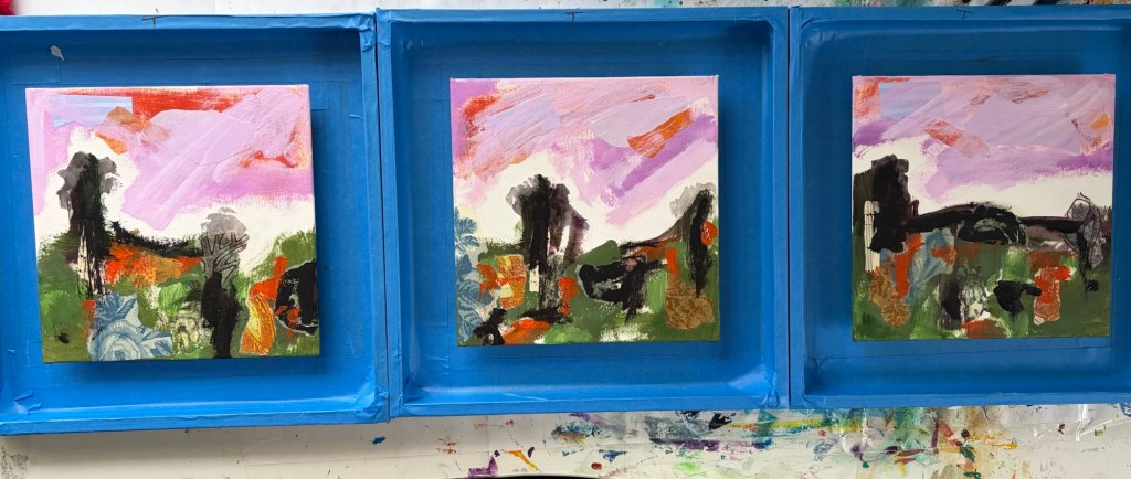
    I’m a messy painter so covered all the wood in painter’s tape before I picked up a crayon or brush. It stayed clean, so was worth the effort.

    The process I used for the works was my standard semi-abstract process; paint, collage, more paint, more collage, mark making, (rinse and repeat) and final touches.

    I’ve been reading colour theory books and testing some limited colour palettes. I settled on orange, deep violet and sap green for this trio. I’ve also been playing with red violet, blue green and Indian yellow.

    The advantage of a limited palette is really understanding what the colours can do. Once you settle on one or two limited palettes, you can buy those six colours in all the materials you like – acrylic, watercolour, ink, oil pastels, crayons, pencils… You get the idea!

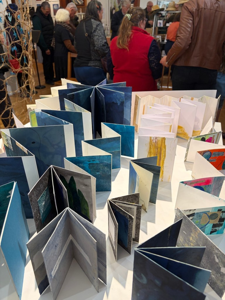
    Working with so much blue around them was disconcerting!