Tag: colour mixing

  • The magic of colour mixing

    The magic of colour mixing

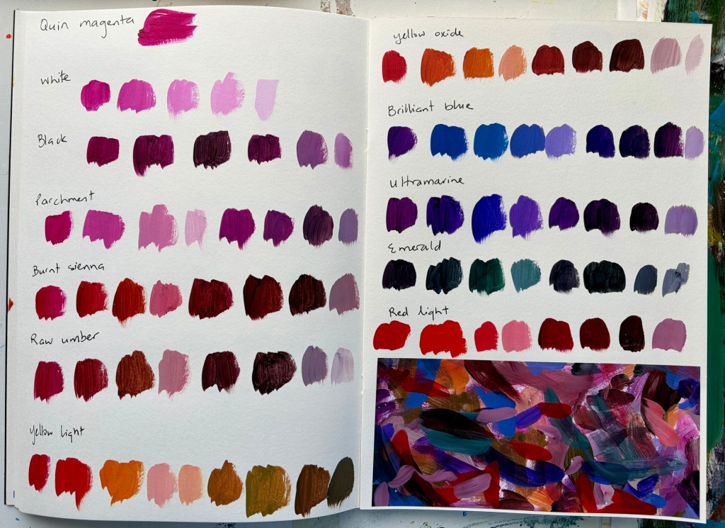
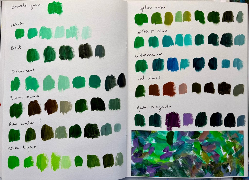
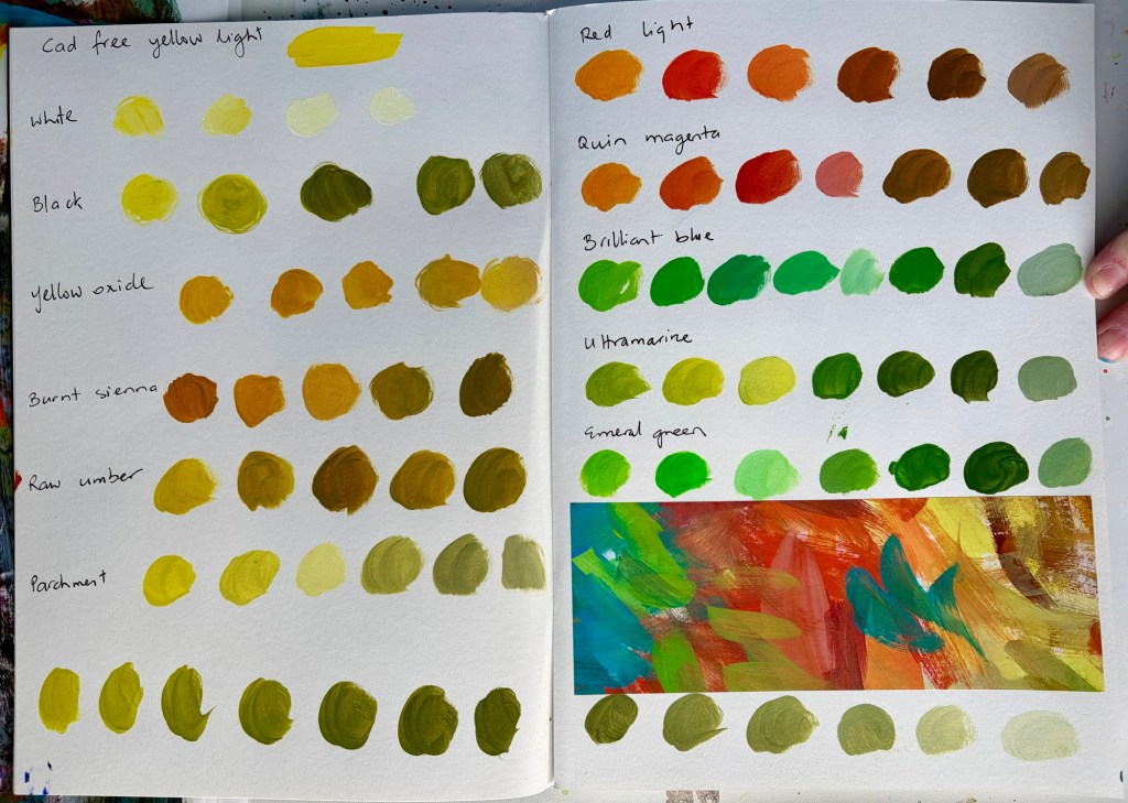
    I’m trying out a new colour palette and, inspired by Sandi Hester on YouTube, added a couple of colours I don’t usually reach for.

    The colour palette is:

    – Cadmium-free yellow light

    – Yellow oxide

    – Cadmium-free red light

    – Quinacridone magenta

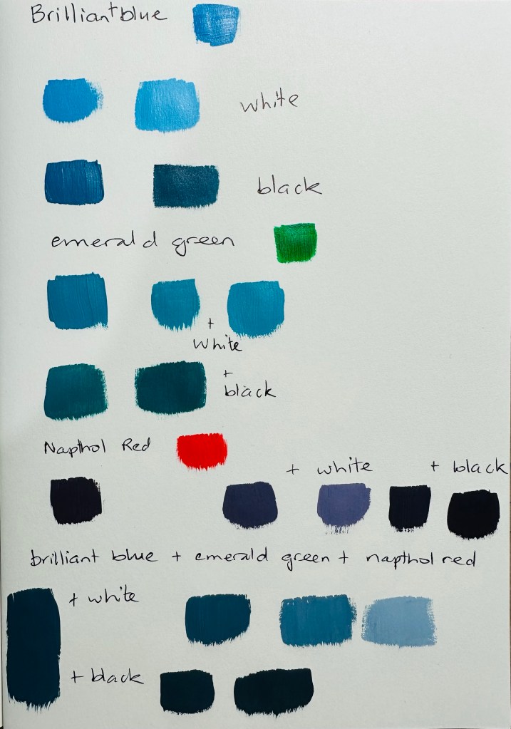
    – Brilliant blue

    – Ultramarine blue

    – Parchment

    – Burnt sienna

    – Raw umber

    – Emerald

    – White and black

    The new colours are emerald, brilliant blue and cad red which, for some reason, I’ve normally avoided.

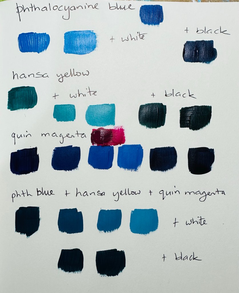
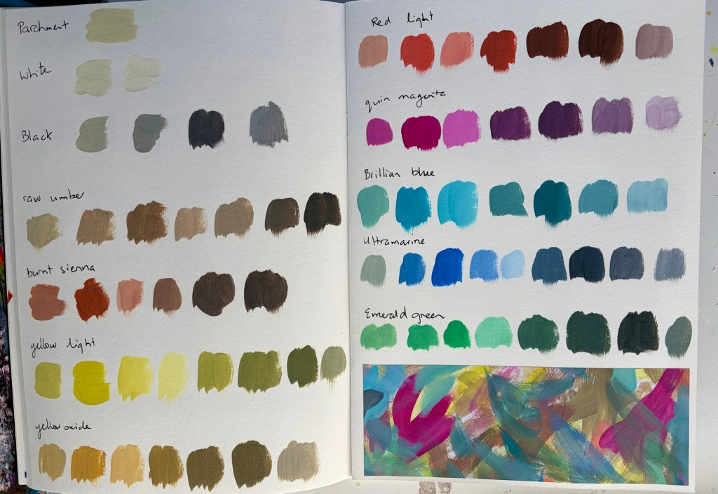
    I’m using one of the Gordon Harris A4 mixed media sketchbooks to colour swatch in. I’ve mixed each colour with each colour, and then added black and white to those mixes to see what it creates.

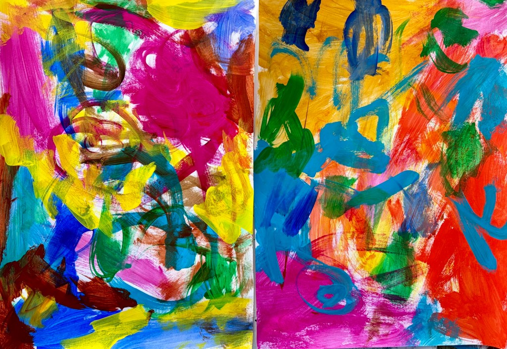
    As I go, I clean my brush off randomly onto copier paper. I glue a section of that paper to the page so I can see what the colours look like together. The rest of the painted paper goes into my collage folders.

    When I look through those dozen pages and at the sections of painted papers, you can really see the different feel each colour brings. It’s a great way to see the variety of colours you can create.
  • Refilling my art cup

    Every year I do an art course to grow my skills and refill my cup. It’s a nice way to start the year. Last year’s course didn’t work out, because I got overrun with Tony, and never finished it.

    I’ve long admired the work of American artist Marabeth Quin. Recently I found a new YouTuber, Hannah L Harris. She was talking about doing one of Marabeth’s online courses, and it’s one I’d looked at before. Decision made!

    Part of the course involves choosing a colour palette with three colours, plus black and white. Marabeth suggests some colour combinations and I swatched out 6 of them before deciding on one. Doing the swatches made me realise I prefer a palette that includes blue or teal, and provides some light brights.

    The journal I’m using to keep all the information and work in is the new Gordon Harris Mixed Media 220gsm A4 booklet. At $8 for 60 sheets I think they’re excellent value.

  • Practising the basics

    It’s always useful to practice basic skills like colour mixing, composition and mark making. I’ve been slowly coming to the realisation that I’ve lost some of my own style, especially in terms of mark making. There’s a couple of reasons for that, which it’s probably not useful to document.

    How to fix it? De-influencing myself through less time watching other artists online. Looking at other artist’s work is fine but, for me anyway, watching them work is often detrimental unless it’s a specific technique I want to learn.

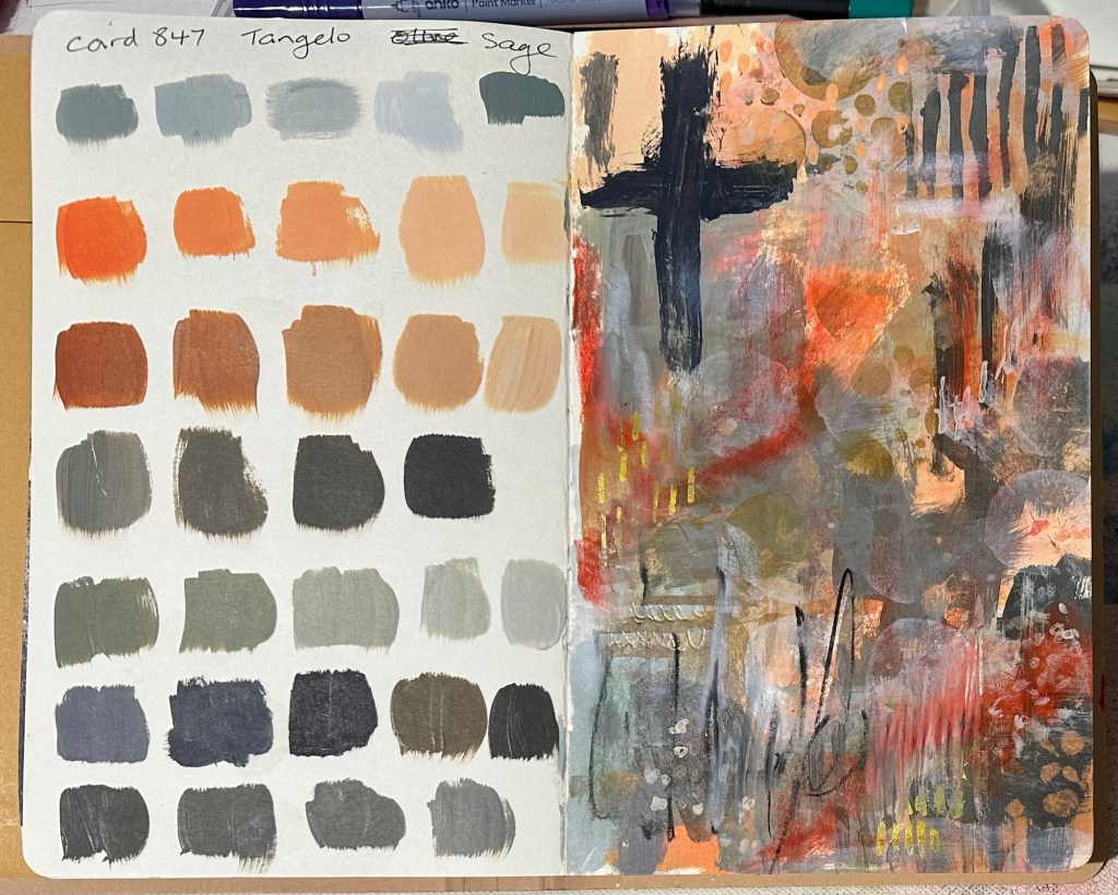
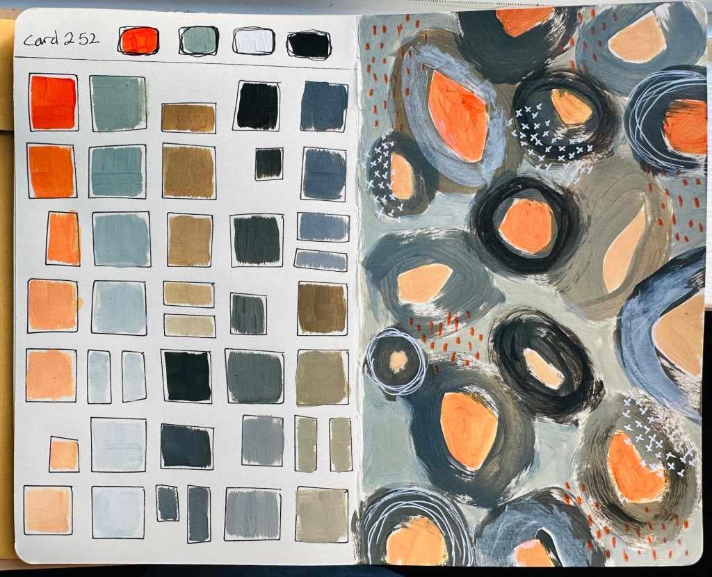
    The other thing I’m doing is practicing the basics by colour mixing, inspired by Sarah Renae Clark’s Colour Cubes, then doing a small piece in those colours, an idea I got from Denise Love. That said, I’m making a conscious effort to use my brush strokes and my marks to ensure the hand of the artist shows.

  • Going back to go forward

    I’ve talked about this before, but didn’t get any forward momentum … until now.

    My art journals were always a combination of the ‘craft’ side of art journaling that grew out of scrapbooking, and a place to learn about materials and develop ideas. For lots of reasons, they became almost solely product-based; Tim Holtz, Dyan Reaveley and Dina Wakley.

    I miss the part of art journaling that’s internally driven, and know the habit was good for my art practice. Projects such as the tiny squares help, but the scale is limiting.

    I started following Denise Love on YT recently. I like what she creates but I *love* her art practice. After a few weeks of watching, I had an aha moment (no one can accuse me of being a quick thinker!). I ordered a Color Cube from Sarah Renae Clark – I’ve been seeing a lot of artists use them and knew it would help.

    I’ve started two new art journals, both my fav small Dylusions ones, and am doing seperate but connected projects. I’ve set an additional rule that, aside from setting up the colour swatch pages, I can only use my neglected StencilGirl or other stencils. No reaching for my Dina Wakley or Dylusions ones as they’ll take me back to my usual post-scrapbook style again.

    In the first I pick a card then choose two of the colours and swatch them onto pages I’ve prepared with Dylusions stencils or Dina Wakley Stamps so there’s a framework to work in. On the right hand page I do a small piece using just those colours.

    In the second journal I choose a card, and record the six colours on the left hand side then do a small on the right.

    My aim? More practice with colour mixing, developing my mark making, exploring my interests in shapes and composition, and hopefully working looser.

  • Swatching new paints

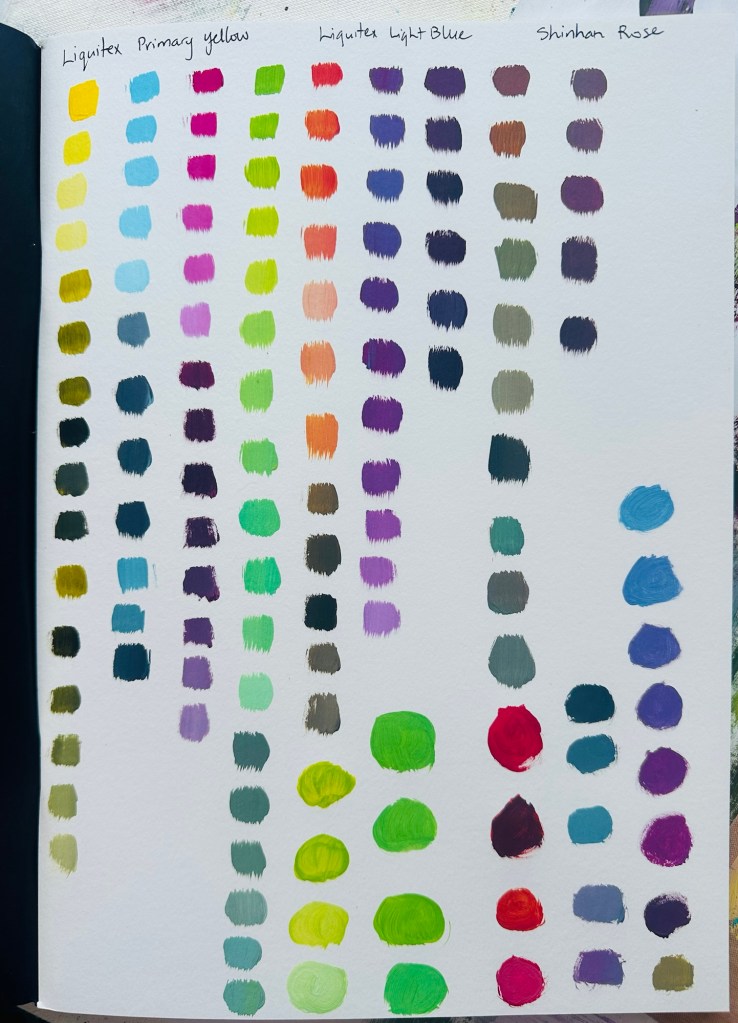
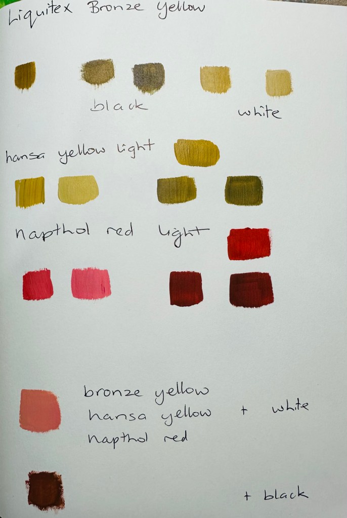
    I was fortunate to win a lovely set of Liquitex heavy body acrylic paints in a raffle run by TWB Framing & Art Supplies. They’re based in Feilding, have good stock at reasonable prices, and are lovely to deal with.

    I don’t always swatch new paints but thought I’d have a play and see what I could come up with. I’m pleased with the lovely soft greys in particular. Now I just have to remember to use them; I might keep my swatch notebook on my desk for a while.