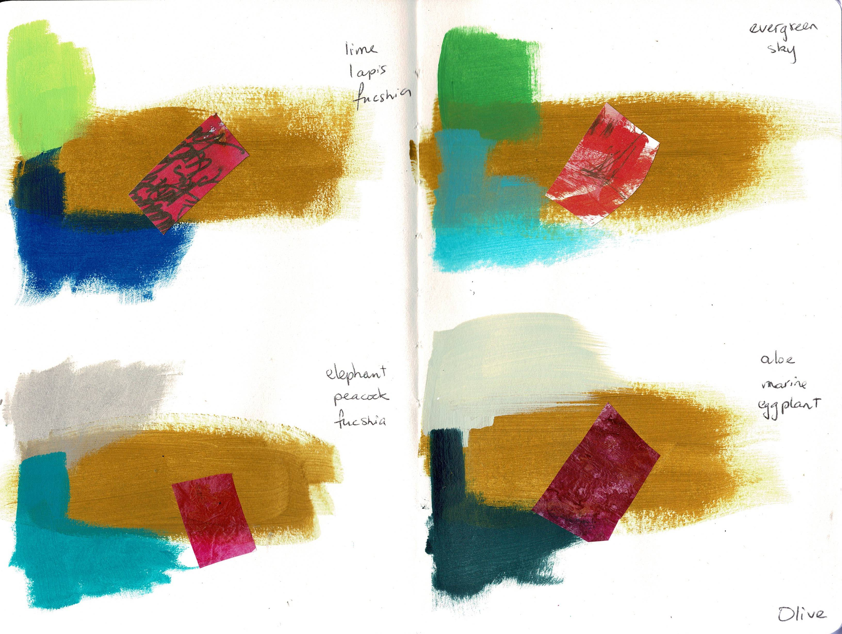
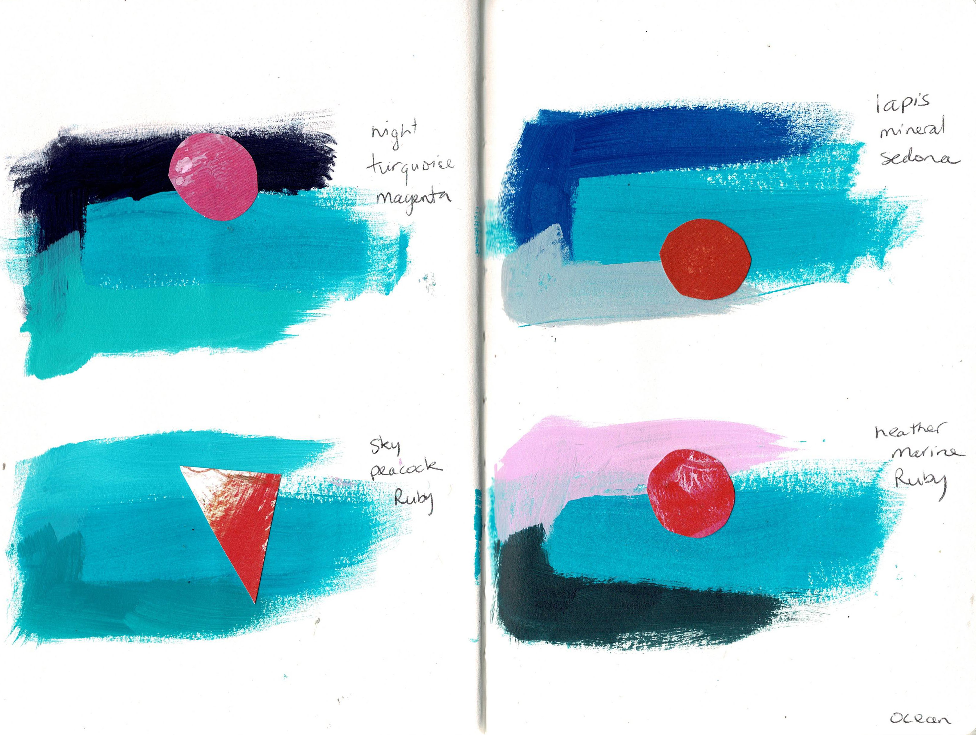
One of the Dina Wakley art tutorial videos I watched recently suggested making a reference file of all your Dina Wakley paints, showing the analogous (neighboring) colours and the opposite or near opposite colours. It’s a fun exercise and a good way of finding new colour combinations to use in your artwork. I bought a new notebook and worked my way through each paint in my collection, adding the analogous colours from her colour wheel, then using pieces from the Collage Collective to glue on small accents from opposite on the colour wheel. I found some combinations I absolutely love! Here’s a sample of the pages I’ve made.
Tag: colour theory
-
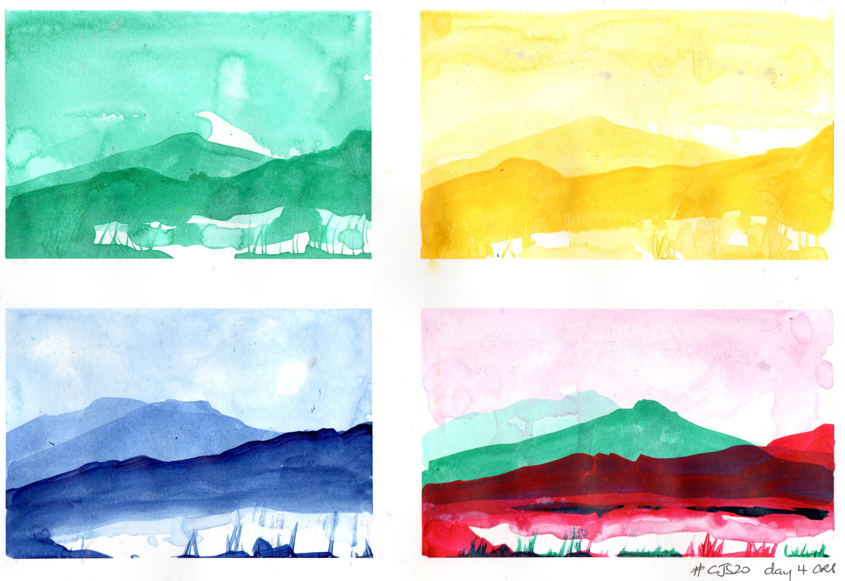
#cjs20 day 4
Today’s artist is Andrea Gomoll, whose work I often check out on YouTube – so, as with Jane LaFazio yesterday, it was great to see her name pop up as the featured artist on #cjs20. Her video was about colour theory essentially.
I don’t have watercolours any more so used watered down fluid acrylics on Bristol paper that I’d taped down with washi tape. The washi tape had black dots on it and some of them transferred to the paper, which was odd. My favourite is the red and green, Tony’s favourite is the blue (possibly because it’s the most realistic).
Share this:
-
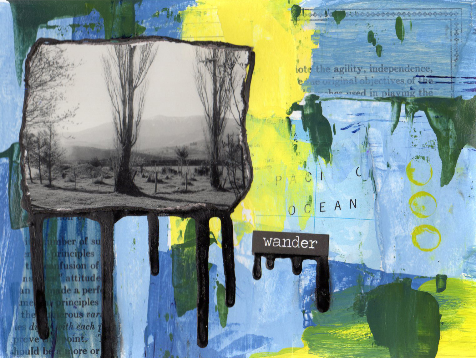
cjs18 day 23 Kasia Avery
Kasia Avery was talking about colour mixing today – this was fun and I ended up with something that feels substantially different to my normal layout, even if it looks quite similar.
Share this: