A long weekend means extra play time. My best friend and I went to Star Wars: the Mandalorian and Grogu, and loved it! Alan and I went to a 70s themed 50th birthday party. I made scones, pikelets, and sultana biscuits so there are snacks for Alan while he’s out at the farm. I did all the usual housework … and still had plenty of art time.
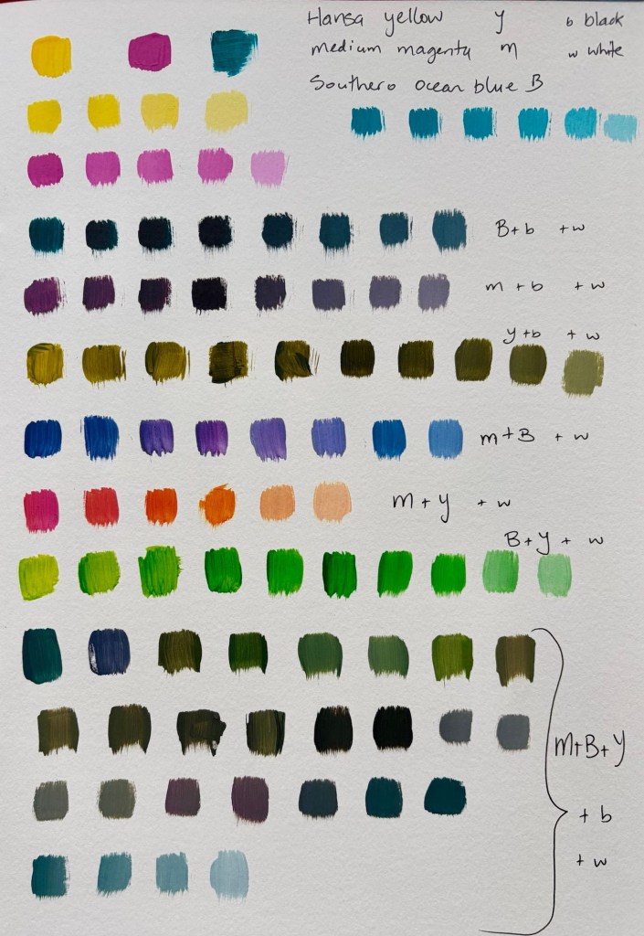
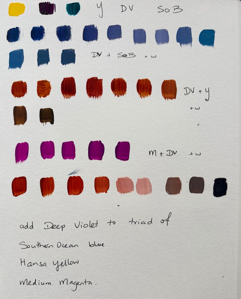
I’ve been trying to nail down a triad colour scheme for a series of work I’m creeping up on slowly. I think I’ve settled on Hansa yellow, Southern Ocean blue and Medium magenta. The struggle has been that I love Deep Violet with a little yellow for a warm rust red, but the Deep Violet doesn’t give me the other mixes I want.
Today I realised I can use my preferred triad for the mix of clear brights and muted tones I want, and add Deep Violet when I need it. The colour scheme is a guide, not a prison cell.
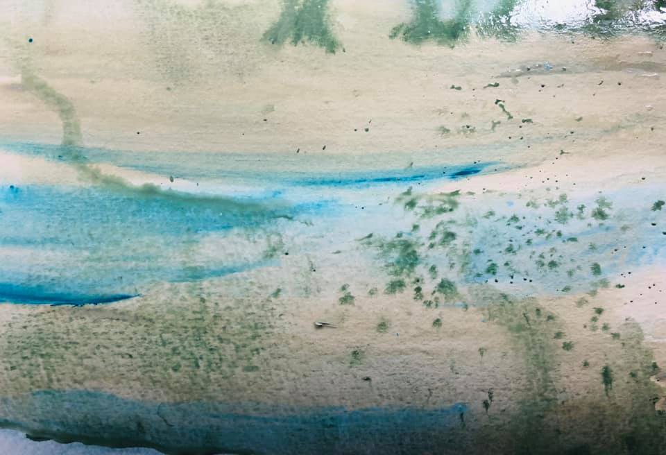
Colour mixes from Hansa yellow, Southern Ocean blue and Medium magenta This is what happens when I add Deep Violet to my preferred triad.
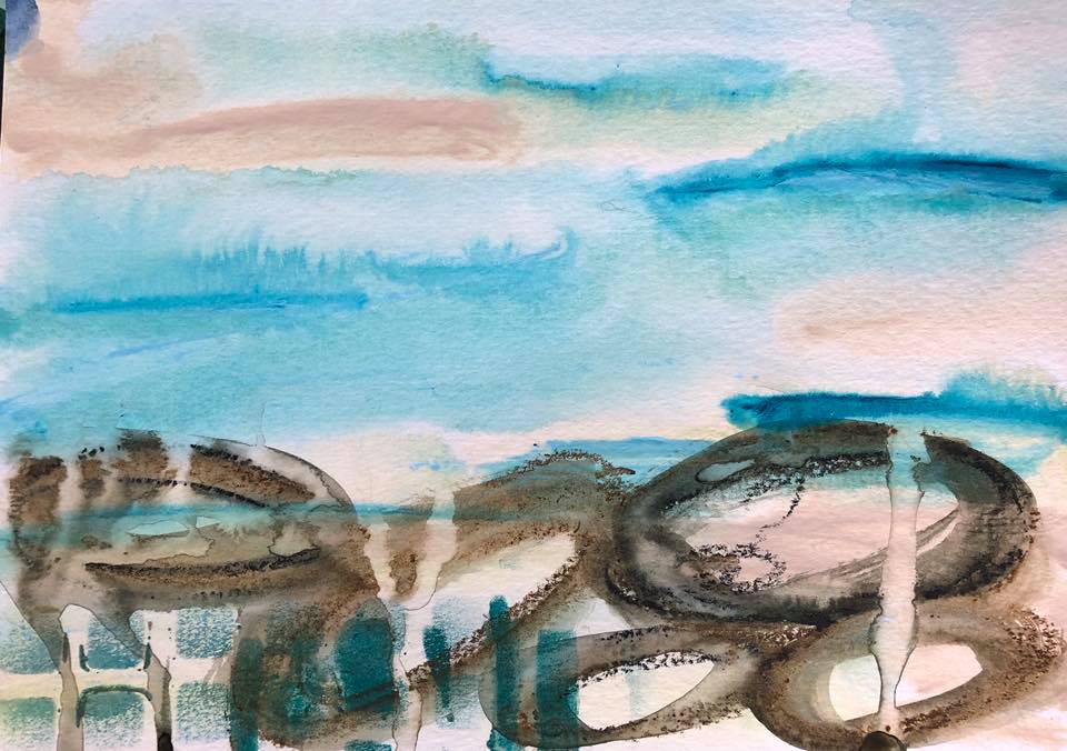
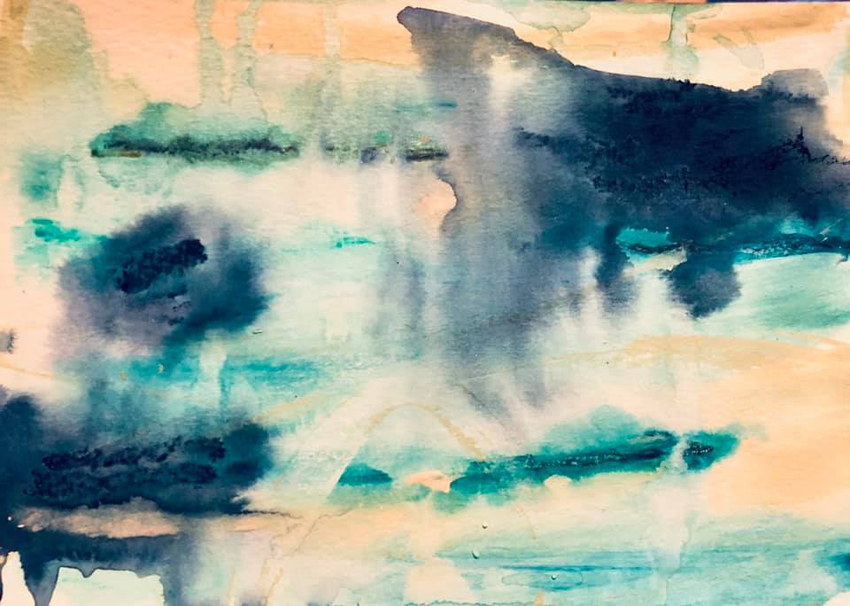
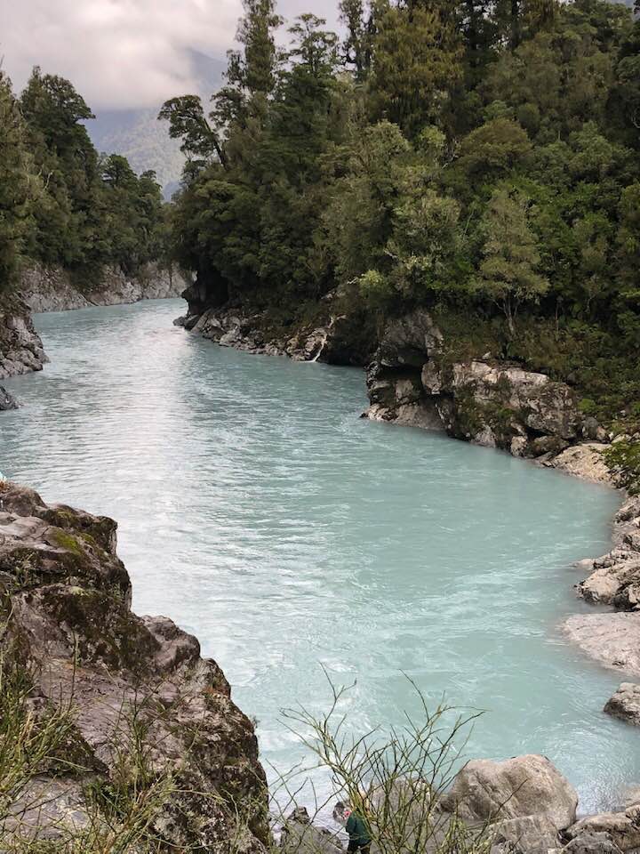
In November I visited the Hokitika Gorge and fell in love with the clear blue water so it quickly became the subject of a joint exhibition I have planned for this November. The works will show the iterative process I use to get to the final works.
Recently I had the chance to visit the Gorge again. In packing art supplies I chose my basics – Phthalo turquoise, cobalt teal, gold, white Heavy Body Golden acrylics. I kept reaching for Golden Fluid Titan Pale Green – an odd pale green grey beige. Not the colour of the works I’ve been doing at all. I put it away, then got it out again; in the end I decided it was such a small bottle I’d take it with me.
I started doing small backgrounds before I went back to the Gorge and kept using that colour. My brain was saying it was wrong – my hand, and my intuition – were determined though.
I stayed with Alan Fowlie, a family friend, and before he took me to the Gorge he warned me the water might not be that amazing blue because of floods 3 weeks prior. Ok, sure. When we got to the gorge and I got my first fresh glimpse of the water I was stunned. Yes, you guessed right … the water was the exact colour I’d been creating.
Incredible! That’s what happens when I am fully tuned into a subject and immerse myself in creating without overriding my intuition. It’s a lovely place to be, and involves letting go of control.
In my last post I talked about how I selected the colours for this series – a combination of the local light, the colours of our land and probably most importantly the colours that describe how I feel about the Freezing Works.
I don’t normally work in such a high key palette but in working through Confident Colour, Nita Leland’s book, I realised that on many ways I prefer high key even though I tend to paint quite dark. I made a conscious decision to lighten up. It has been a tiring week and work, then this morning I got up and did 3 loads of washing and ironed 5 ambulance shirts, made our lunches, loaded the dishwasher etc then headed for my art room.
Remember I said that the colours I am using are partly an expression of how I feel in my memory about the freezing works? Turns out they are also a reflection of who I am feeling at the time, which is no great surprise I guess. How do I know this. Because I painted for a couple of hours then roamed off to get a cold drink. When I came back to my art room – oh my goodness!
This afternoon’s effort is dark and gloomy, despite using the same few tubes of colour as before. It is my use of them that has changed. Grey sky, gloomy buildings, dark shadowed land. Dreadful…so tomorrow it gets gessoed over and I start again.
I did the only sensible thing I could do when I realised what I had done. I went into Mum’s room, where she was doing a crossword as always, and got into her bed for a nap in the sun (giving her strict instructions to wake me after 30 minutes). It’s amazing what a quick nap can do for your day. It’s funny, at the weekend I often have a wee nap on or in her bed while she reads or does the crosswords. Some of us never get over needing our Mum no matter how old we are…
In the meantime, here is one I finished a couple of days ago now. It’s 16×16″ in acrylic on canvas and called Bare Bones IX. It’s for sale on my website here.