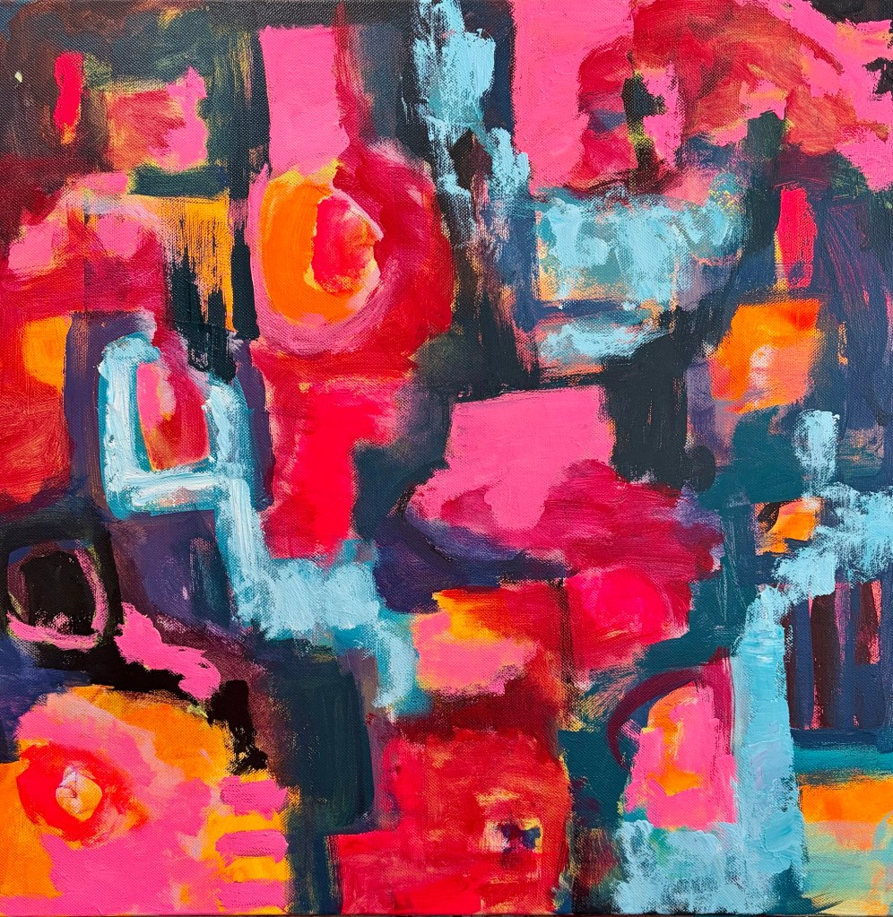
Much of my art starts with fluro pink or orange, and is high key. The bright colours bring me joy, and I hope they bring joy to the people who own my art.
Occasionally I’m drawn to a gentler, quieter palette. Sometimes it reflects a particularly calm patch in my own life, other times it’s a search for calm in a chaotic world. This weekend’s works are definitely in the latter category.
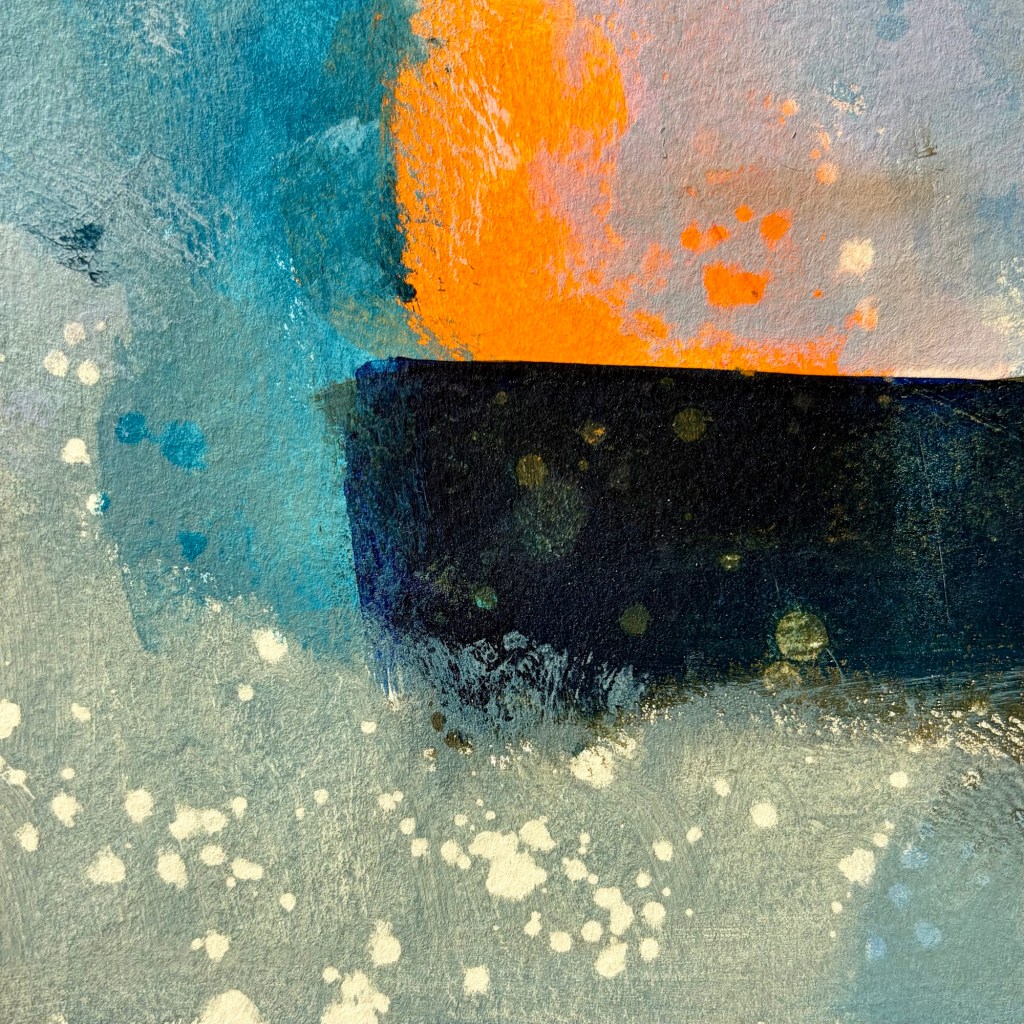
The world is chaotic and not very nice just now … so my art is calmer, more soothing. I used Liquitex quinacridone blue violet, burnt umber, indanthrene blue and parchment, with vivid red orange as my bright contrast.
I seem to be back to the sea wall, cliffs, sea foam, crashing waves … tempestuous? Yes, but the sea is always a moment of calm for me.
Prior to mark making with NeoColour IIPrior to mark making with NeoColour IIPulling the tape off after final mark making is always a revelation
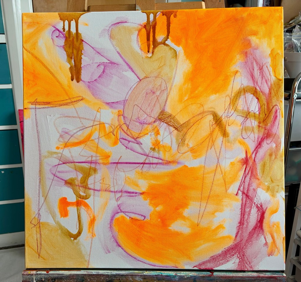
When I started this painting, it was light and bright: fluorescent orange, pale yellow, plenty of white. I really liked it, but I knew it needed more layers and interest. I’ve been finding the world a bit dark and difficult. There’s so much going on, and it can be hard to shut off from the news or even just from the news headlines.
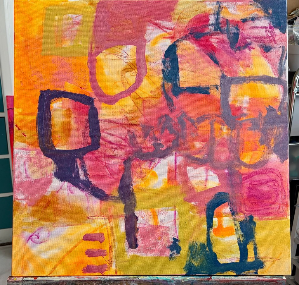
The more I painted, the more all of those feelings came out onto the canvas. By time I’d done my second or third pass, it was looking dark and ugly. It was nothing like the light, bright painting I’d started with. I stopped for the night and decided to let it dry because if I continued, it was going to turn to mud.
What was on the canvas reflected my mood at the time, but what would happen if I painted a light, bright mood instead? Would it impact how I was feeling?
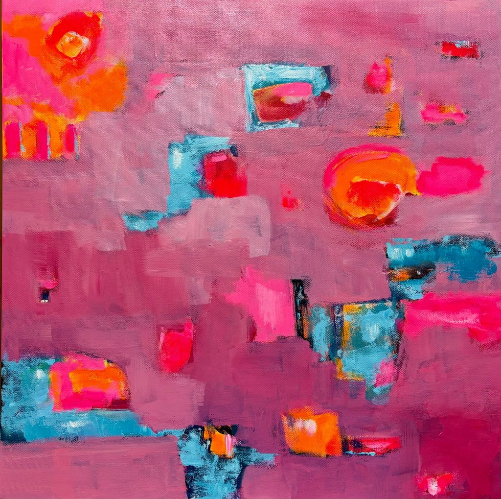
Tonight I got out fluorescent pink, fluorescent orange, blue, and white and started layering back over the top. I simplified the composition, took out fiddly details, and lightened the overall feel. Once I’d redone the pink, I adding very pale blue and some white highlights.
By the time I’d finished, the painting looked better and, to be honest, I felt better too. Does my mood influence my art? Yes, of course it does, but does my art also influence my mood? Absolutely. It’s a good reminder that it’s worthwhile painting out my feelings, but also that I can alter my mood through the art I produce. (The piece probably isn’t finished yet, but I’ll sit with it for a day or two)
The first layerThe second layer and still looking ok The third or fourth layer … looking dark and angryThe current layer – lighter and brighter.
I can talk to library customers about anything they need info on. I can write fairly easily but, when it comes to tricky emotional stuff, speaking often eludes me. I’ve been known to text or Viber people if I can’t get the words out.
I started watching the Dr Gabor Matè movie “The wisdom of trauma” this week but emotionally can’t deal it at the moment. I’ll come back to it though, because his thinking on trauma and addiction speaks to me.
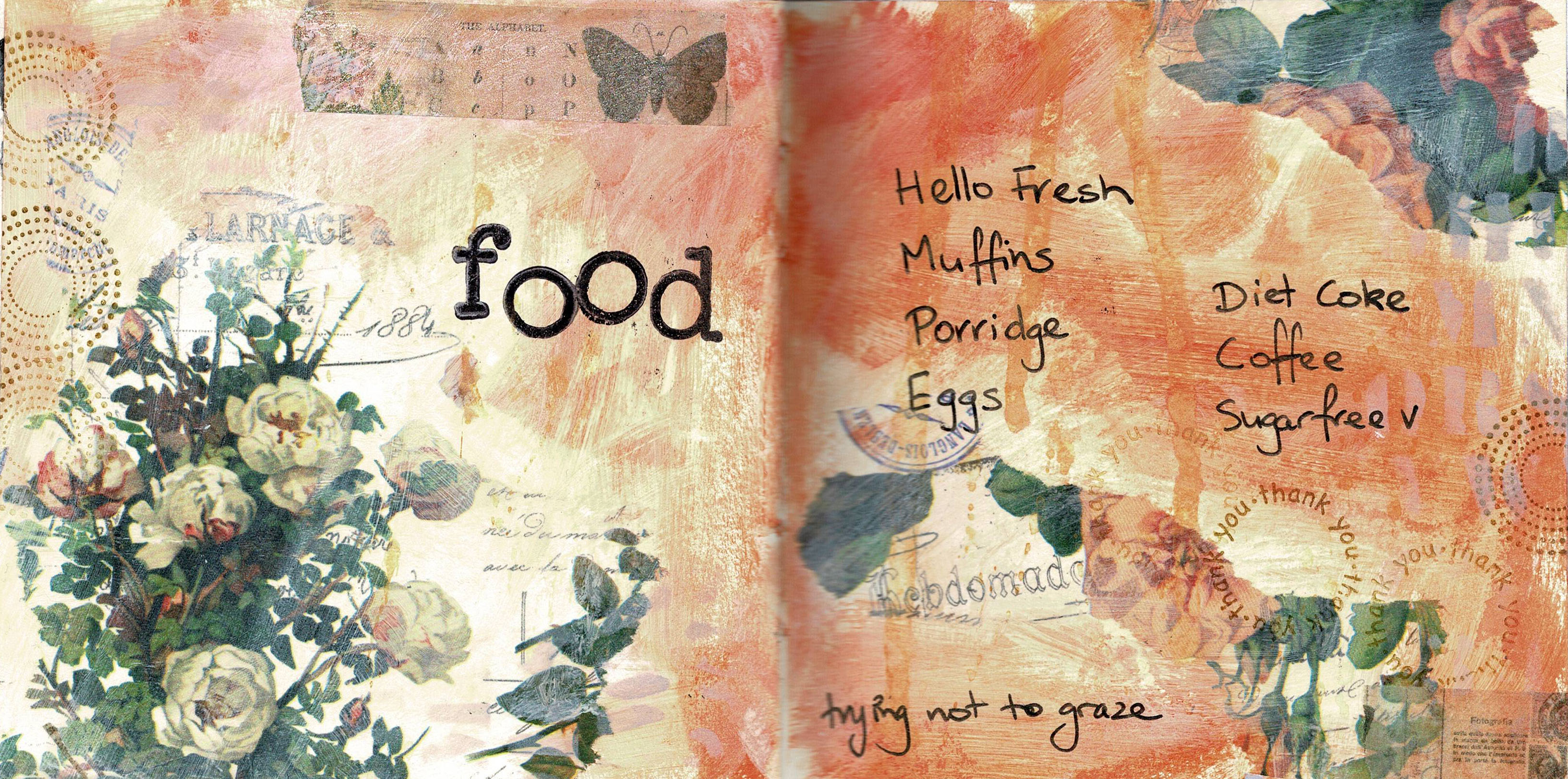
One of the ways I deal with emotions, and addictive personality, is through my art journals. I can say anything in my journals without fear of judgement. I often share my work, so make the writing illegible if I need to, or cover up the writing.
This is a Dylusions Dyalog that’s almost ready for me to start writing in. I’ve used Shimmer paint and spray on the pages, then added collage. I like the small format as it’s quick to work in when I just want to get some thoughts down.
Sometimes all I need in my art journals are the bare bones in order to remember an event or feeling. Other times I write a lot; how readable it is depends on the content. I’m generally very open with what I share, but there are times when I can’t have other people reading the text. The ‘feeling let down’ page was one of those rare moments, so the story behind the page is on the back of a tag. I can lift it up and read if I want to, but probably won’t. Getting it written down was enough. Cathartic!
I’m still recording the music I love in my art journals. I enjoy the process, but also it tells people a lot about me. Music is a huge part of my life; I listen at home, in the car, at work, while I cook…
This is P!nk’s Courage. It speaks to me because maintaining my weight loss means having the courage to face all the reasons I overeat. The courage to dig deep emotionally, face my fears, feel emotions instead of smothering them with food.
This page is in my large Dylusions journal. Inks: Peony blush, Bubblegum Pink. Postbox red & White Linen. Paints: Peony blush & Funky fuschia. Stencils: Teardrops, Star struc & Diamond in the rough. Stamps: Dy’s alphabet. Other: Archival ink, Distress ink, white gel pen.