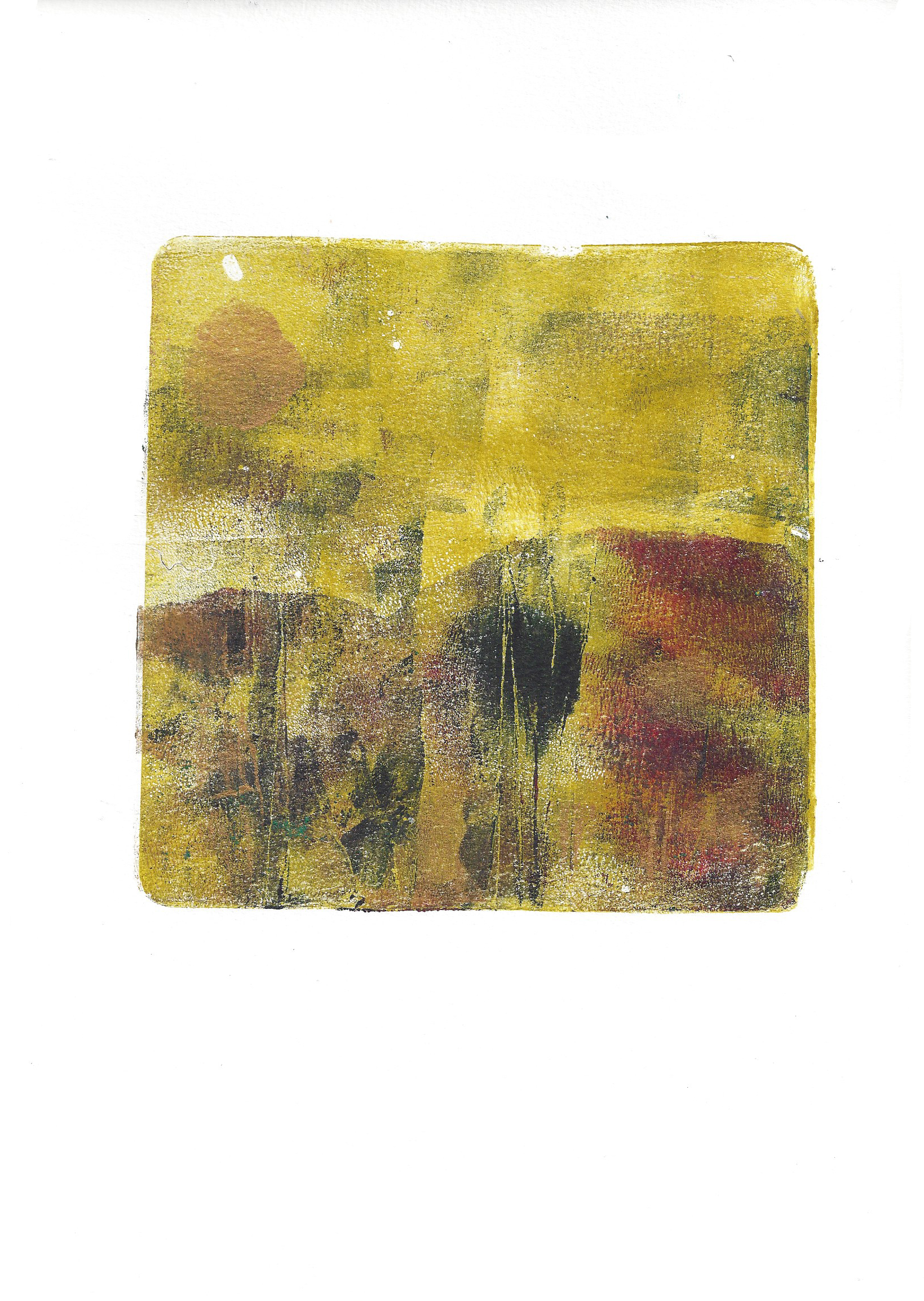
Lately my art has taken a distinct change in direction. I worked my way very quickly through two art journals, using water soluble pencil, paint and collage. At one point I even said to my good friend, and fellow artist, PenKirk https://www.facebook.com/halfpennynz that I needed to “step away from the journal”! I didn’t of course, I just kept creating.
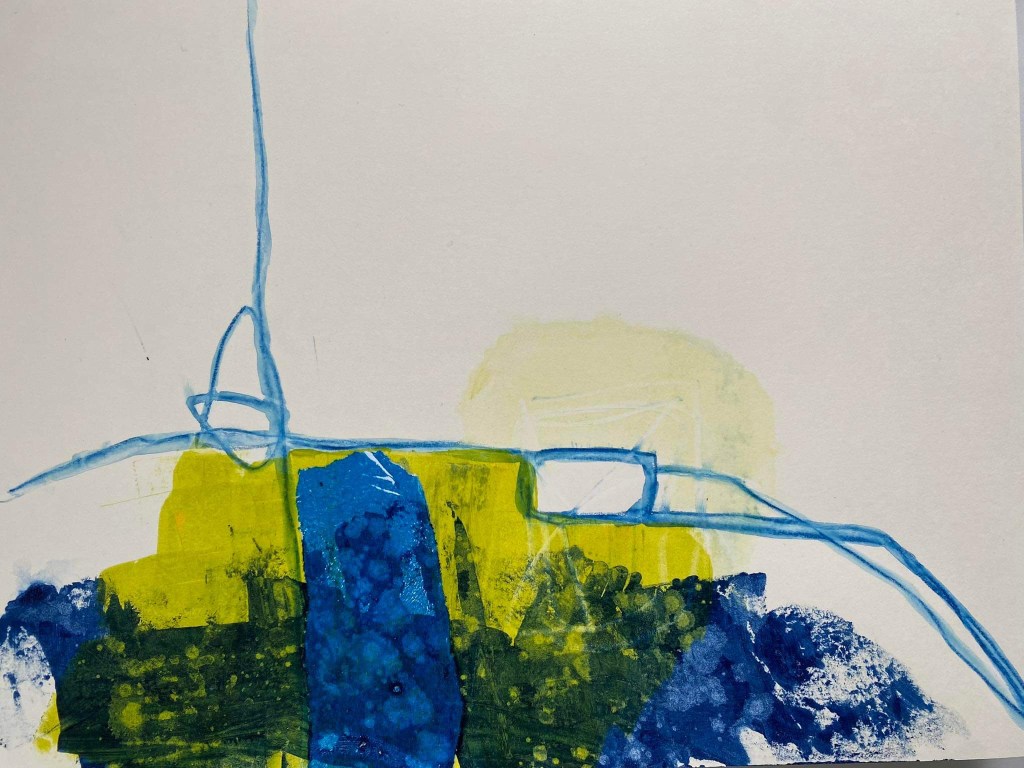
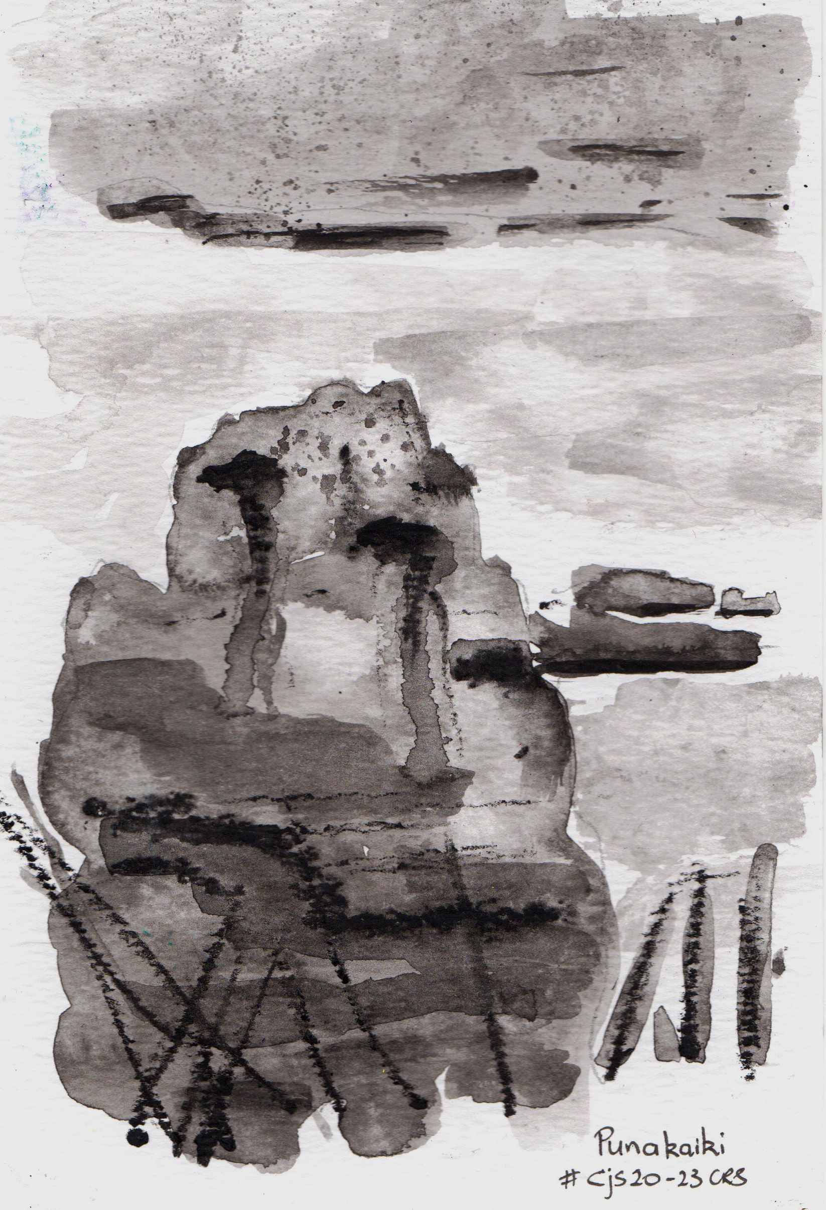
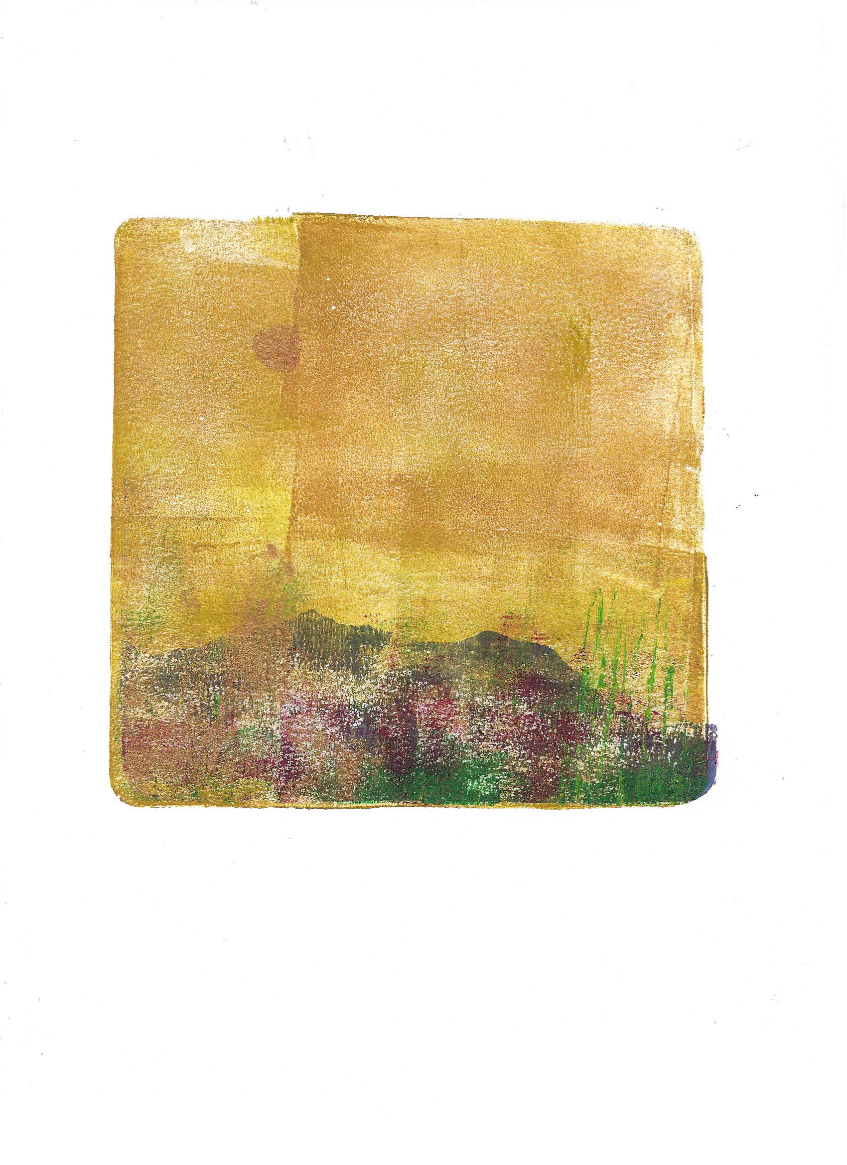
About three quarters of the way through the first journal I realised the shape I was trying to create, over and over, was the island at Waverley Beach. It’s very different today; time, tide and climate change have destroyed most of it.
Dad used to fish off the far side of the island. My friends and I would climb up the side and dive into the waves. Then, dripping wet, we’d clamber back up the papa rock and do it all over again. Looking back, I realise we could easily have been hurt because papa rock gets very slippery when it’s wet. We didn’t get hurt, but we did have a lot of fun.
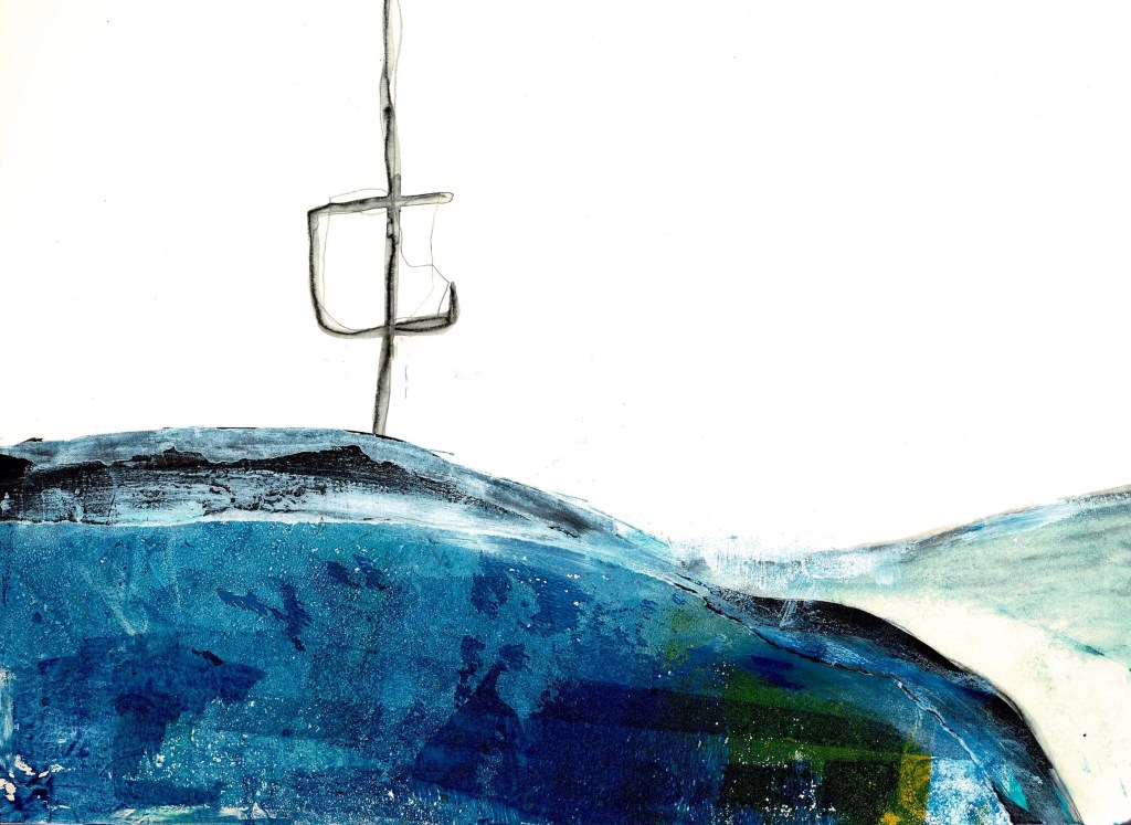
I’ve been doing a lot more mark making, using water soluble media. There’s a shape that keeps appearing and I’m not sure what it is yet. I seem to be using a lot of blue, deep green and white. I’m starting to wonder if the lines are masts. If it turns out they are masts, I’ve no idea where the imagery is coming from.
At The Learning Connexion I did a lot of mark making, particularly in my 4th year, and still do in my art journals, but over recent years haven’t done as much in art pieces. I’m not sure what’s made the difference, perhaps some of the artists I’ve watched on YouTube including Jackie Schomburg https://www.youtube.com/@jackieschomburgart/about, but I’ve gone full circle and am doing a lot of mark making and drawing.
Where’s all this leading? Goodness knows, but I’m enjoying the process and trust there will be an “aha! So that’s what I’ve been trying to get out of my head “ moment.