I’m still on a florals kick – exploring materials, styles, mark making, scale… Just playing with ideas to see what sticks.


I’m still on a florals kick – exploring materials, styles, mark making, scale… Just playing with ideas to see what sticks.

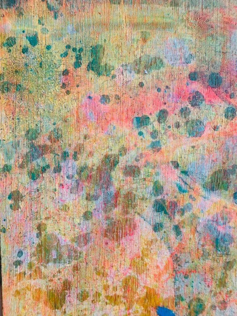
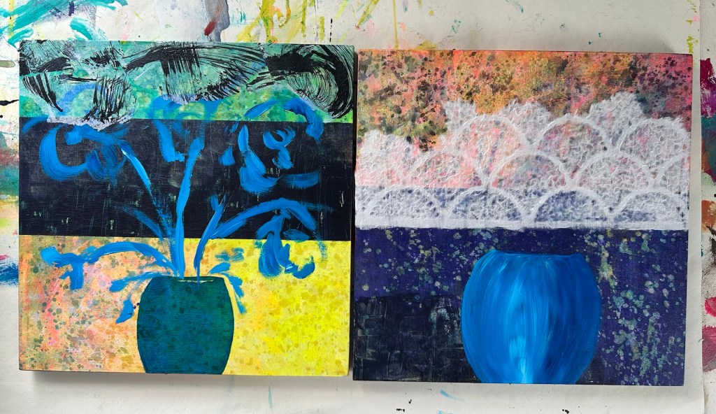
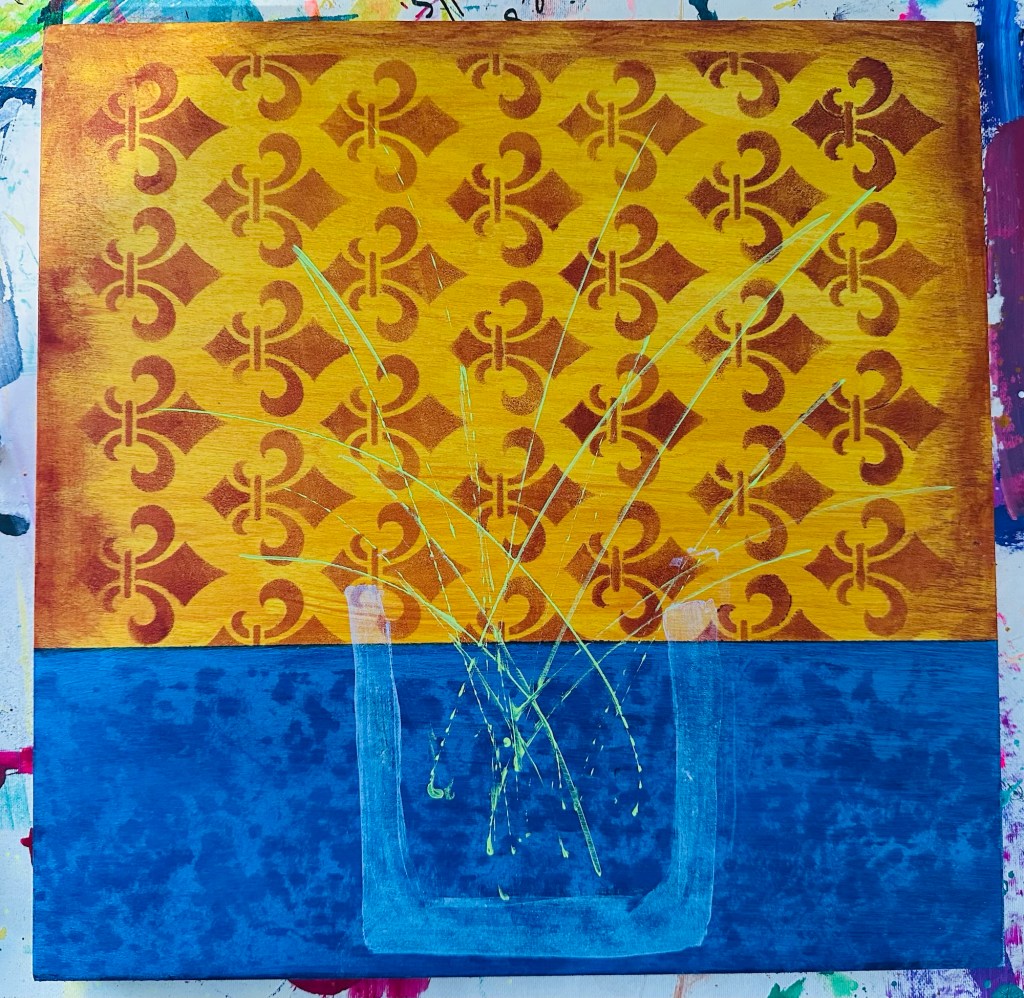
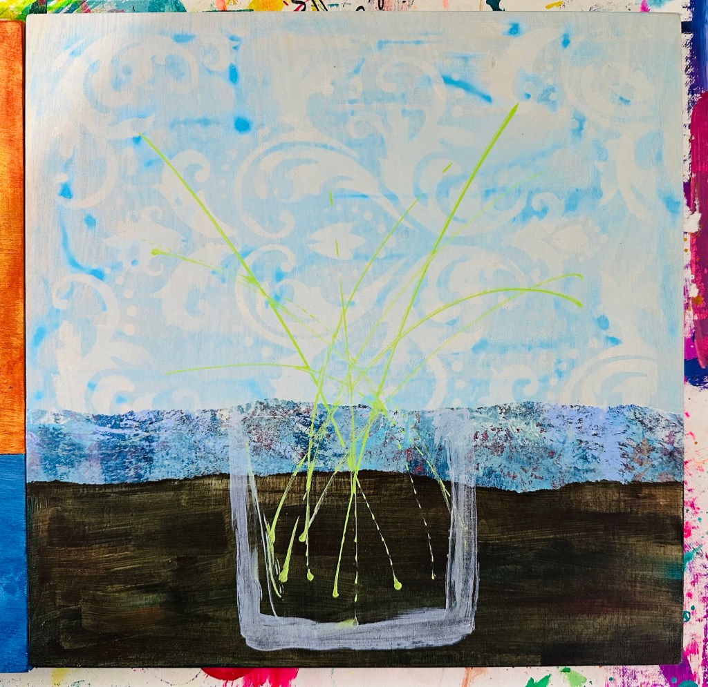
Months ago I started two 8×8 wooden panels. I’d created multi layer backgrounds, in two or three sections. They were nice, but what next? They sat, and sat…
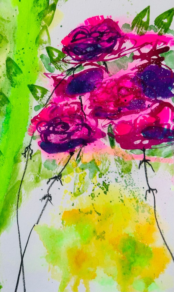
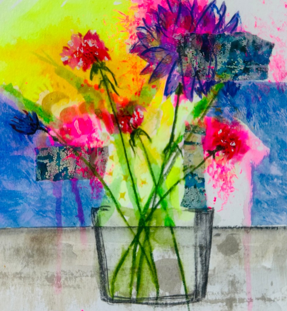
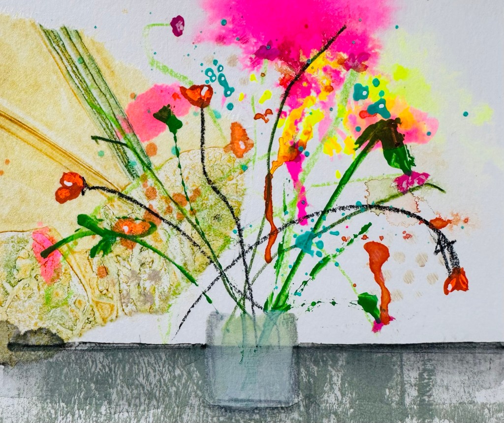
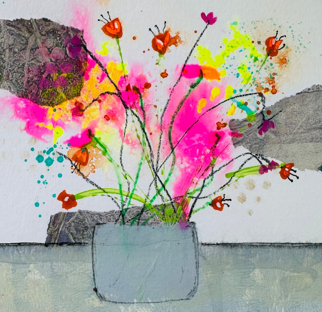
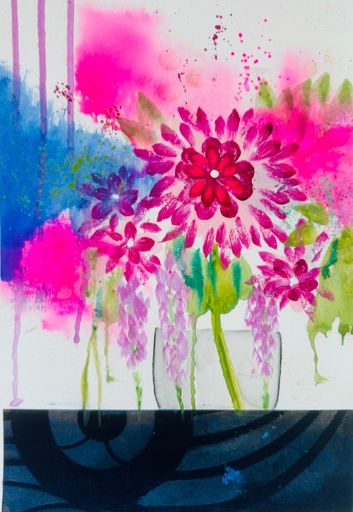
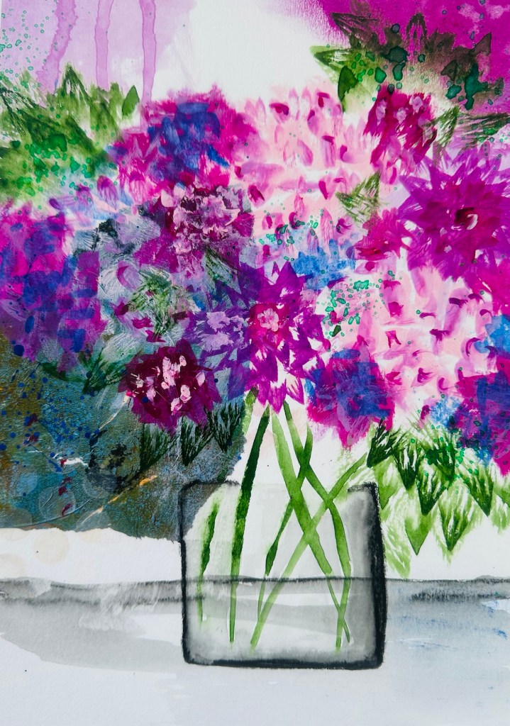
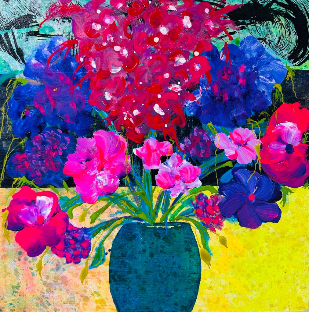
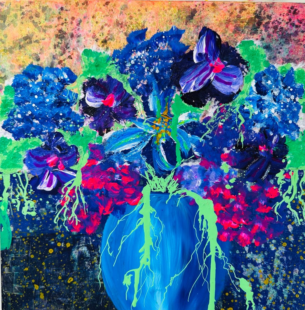
I’ve been watching art videos as part of my Christmas break. There’s maybe 20 artists I subscribe to, and it’s been a chance to binge watch their play lists. I was watching Gaynor Pattle create vibrant, over the top florals, and had an aha moment. What if I created florals over the top? Very different to my normal semi-abstract landscapes, but maybe a significant change is what I need.
Wow, did I have fun! They are fairly abstract, incredibly bright and far from my usual more minimalist approach. I love them, and loved the process – I don’t have a good photo of the finished pieces yet, but will take one in the daylight.
Last night I started two more 8×8 wooden panels. Tonight I grabbed two huge sheets of Art Spectrum Colorfix paper out of my stash and started another work. What’s shown below is just the starting layer. I don’t know how long this idea will hold me, but I have a feeling it might be a while!


My journals are a safe place to play but also somewhere for ideas to prove themselves or die… Sometimes an idea isn’t sustainable for practical reasons, perhaps because of the materials or energy required.
Other times I start to play with an idea and, 2 or 3 iterations along, I’m getting bored with it. If an idea is going to become a series, even a small one, it’s needs to hold my attention for a sustained period of time.
There’s been a couple of things recently I’ve tried and dropped for the above reasons. So I’ve gone back a bit to go forward – relooking at ideas that have captivated me in the past, and putting a fresh twist on them.
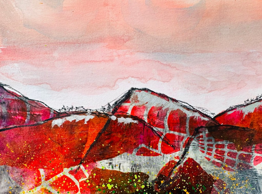
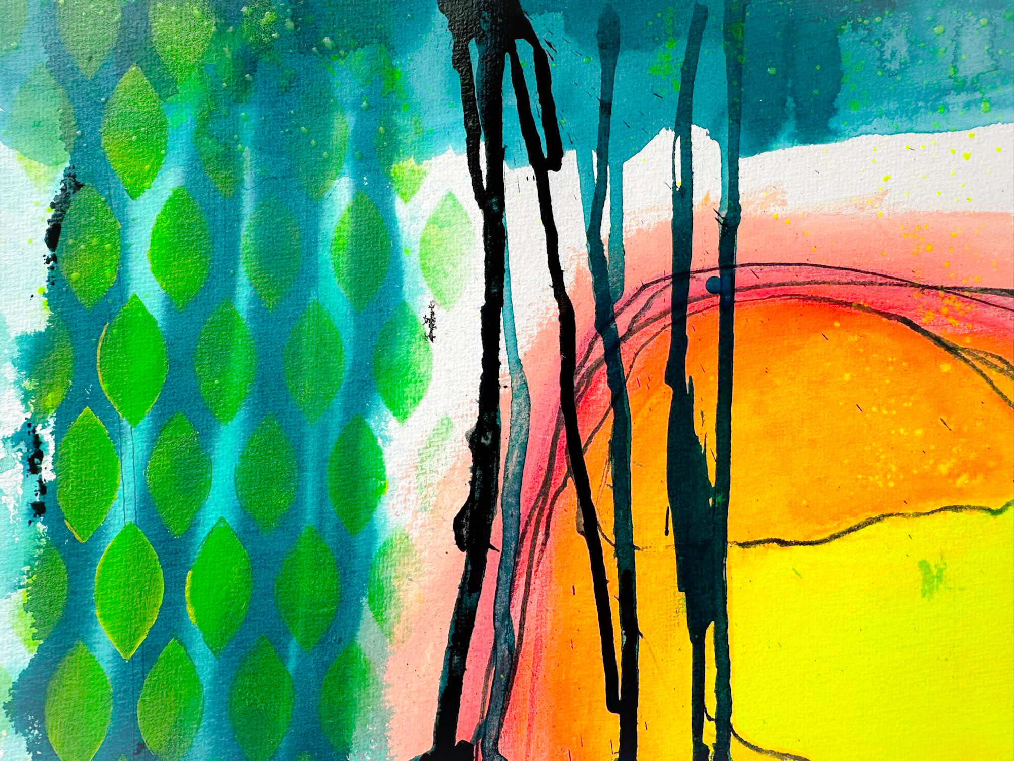
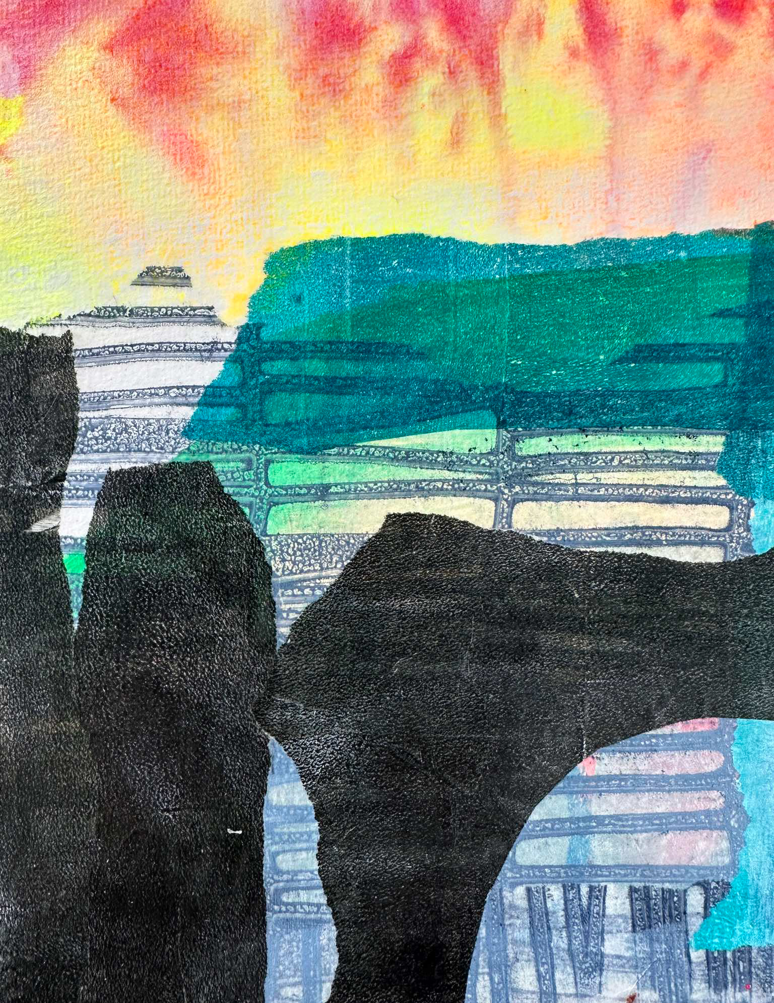
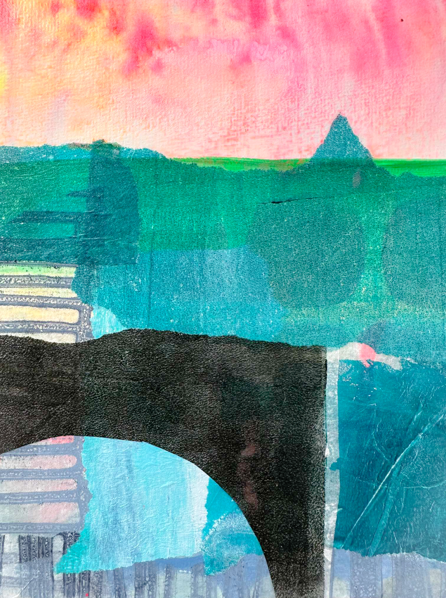
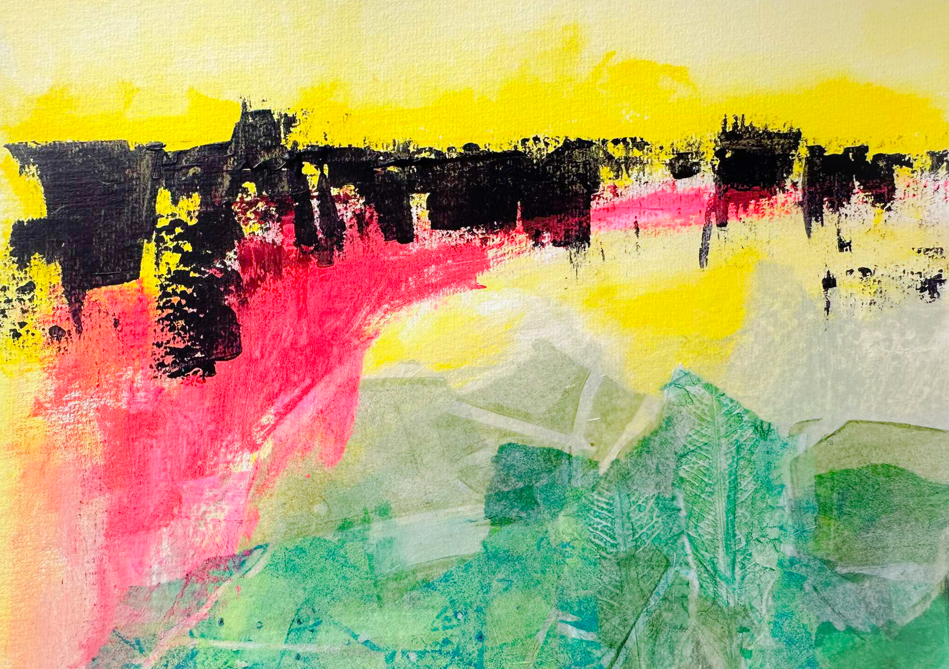
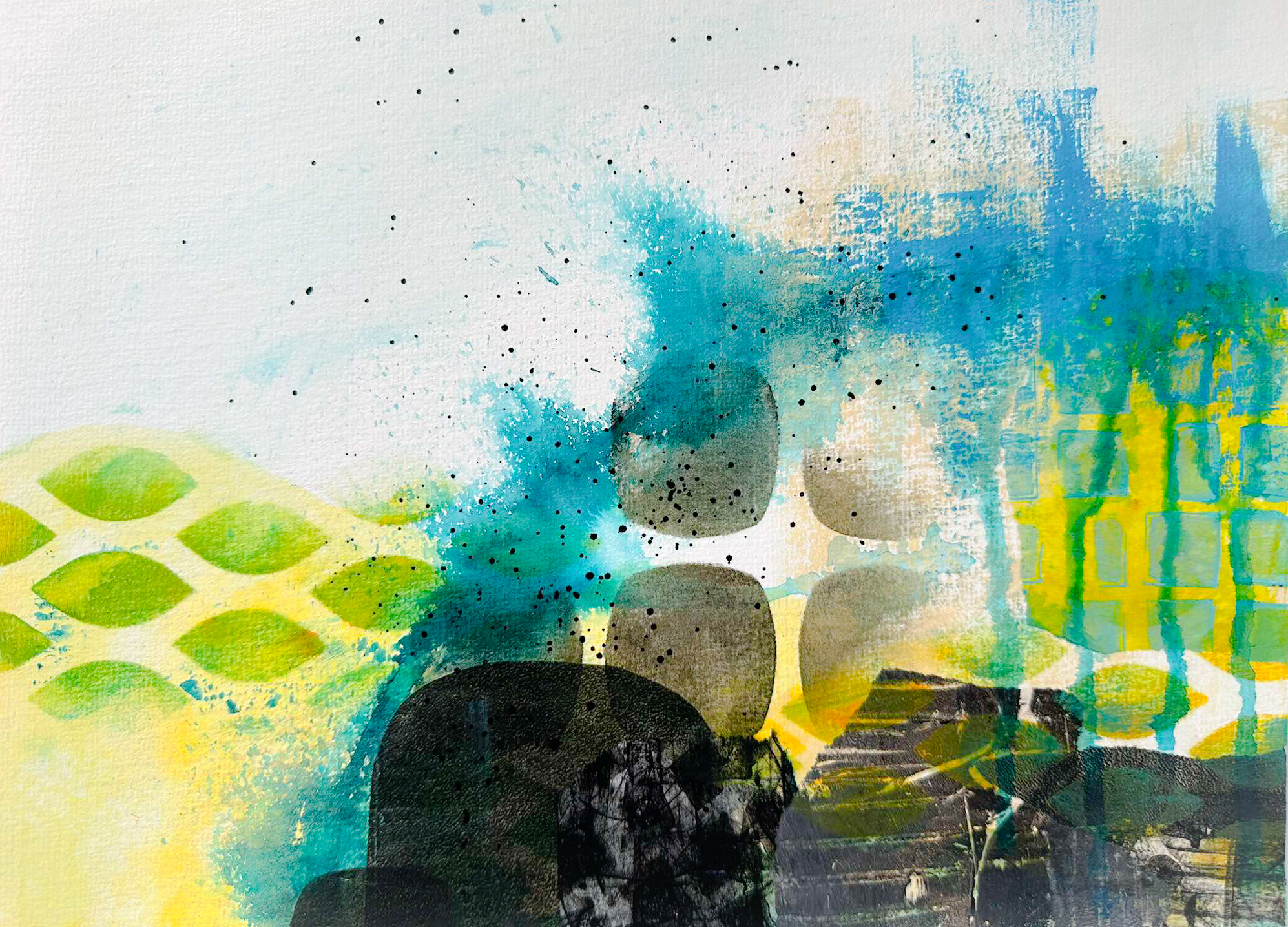
I’m playing with ridge lines, mountains and the landscape generally. Because it’s a familiar subject I’m able to play around with my materials more. These early trial works incorporate gelli prints, acrylic paint, acrylic ink, water soluble pencils, Kuretake watercolours and Ranger Distress Foundry Wax.


I’ve been working in my new Seawhite journal today. It’s A4, with 350gsm watercolour paper and wire-o binding. The paper is lovely to work on; it even coped well when I spilt acrylic ink and had to use a lot of water to rescue the page, with no buckling or damage to the surface of the paper. One page has perhaps 6 layers of gelli printed deli paper in some areas and the paper is sturdy enough to handle it well. The cover is rigid so I can stand the journal up to let the drips run without it falling over. The wire-o binding has its benefits but, overall, I prefer a standard book binding where I can mop ink and water out of the trough between pages.
Do I love it so far?Absolutely. The Drawing Room also has the Seawhite travel journal with 200gsm watercolour paper and a normal book binding. I’ll certainly be trying out those too.


The blank pages of a new journal offer the promise of a fresh start. Maybe this journal will inspire different work. Maybe this journal will magically improve my drawing skills. Maybe this is the journal that will help transform vague ideas into a cohesive series.
Dina Wakley MEdia had two 6×6 journals I loved working in but, sadly, they are both out of production. One was very heavy white watercolour paper, the other heavy kraft stock. I have a couple of the kraft tucked away, but none of the white.
I’ve got lighter weight journals I like working in, but also want something with very sturdy pages. A couple of artists have reviewed the Seawhite journals and said good things about them. I hadn’t seen them in New Zealand – until this week. I found them at The Drawing Room in Christchurch so ordered one straight away. I’m excited to try it out this weekend.


