Tag: mixed media

  • Layers aren’t precious

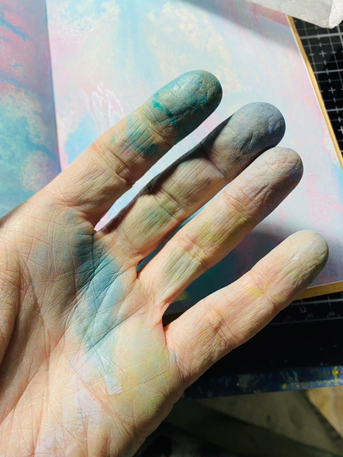
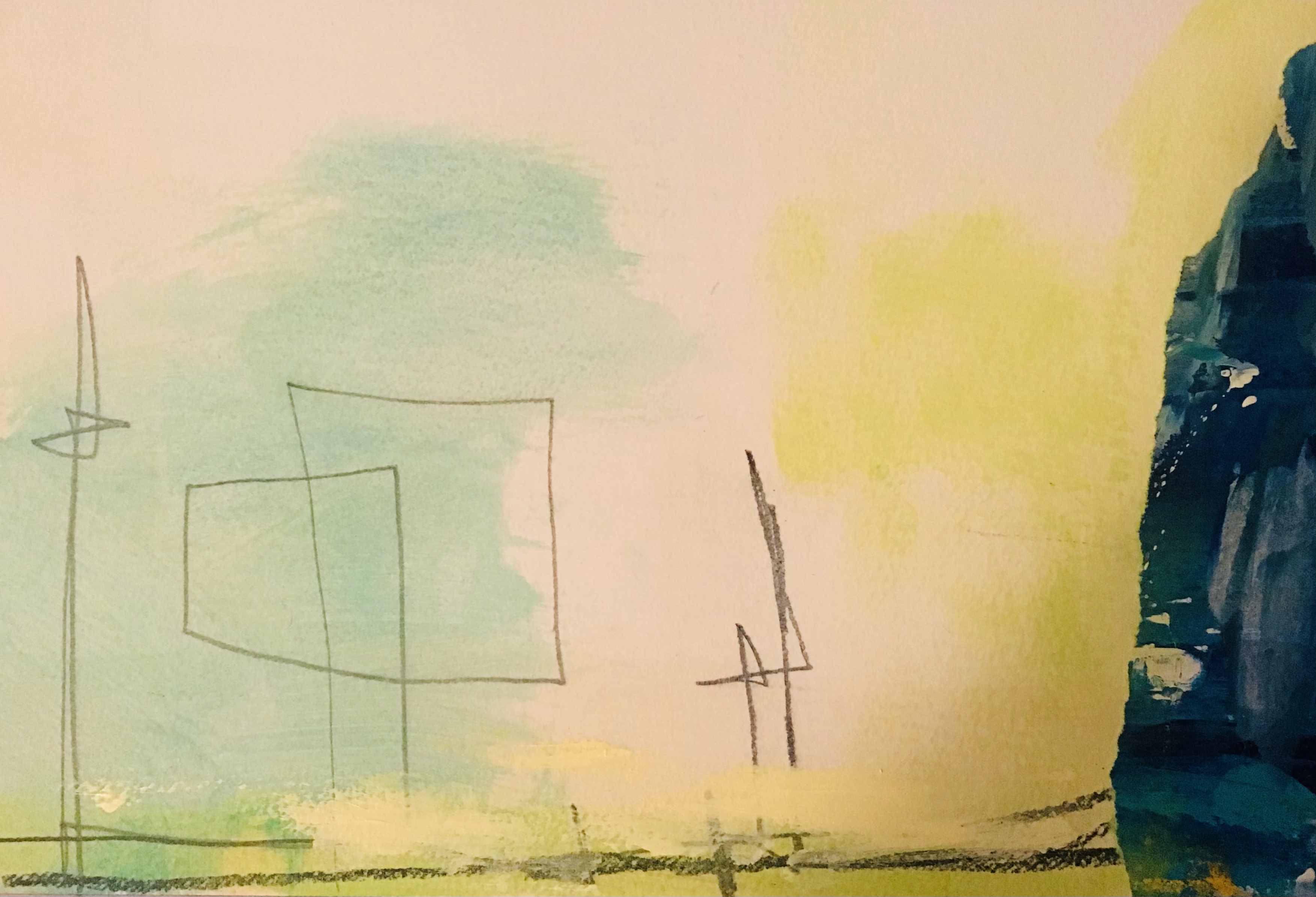
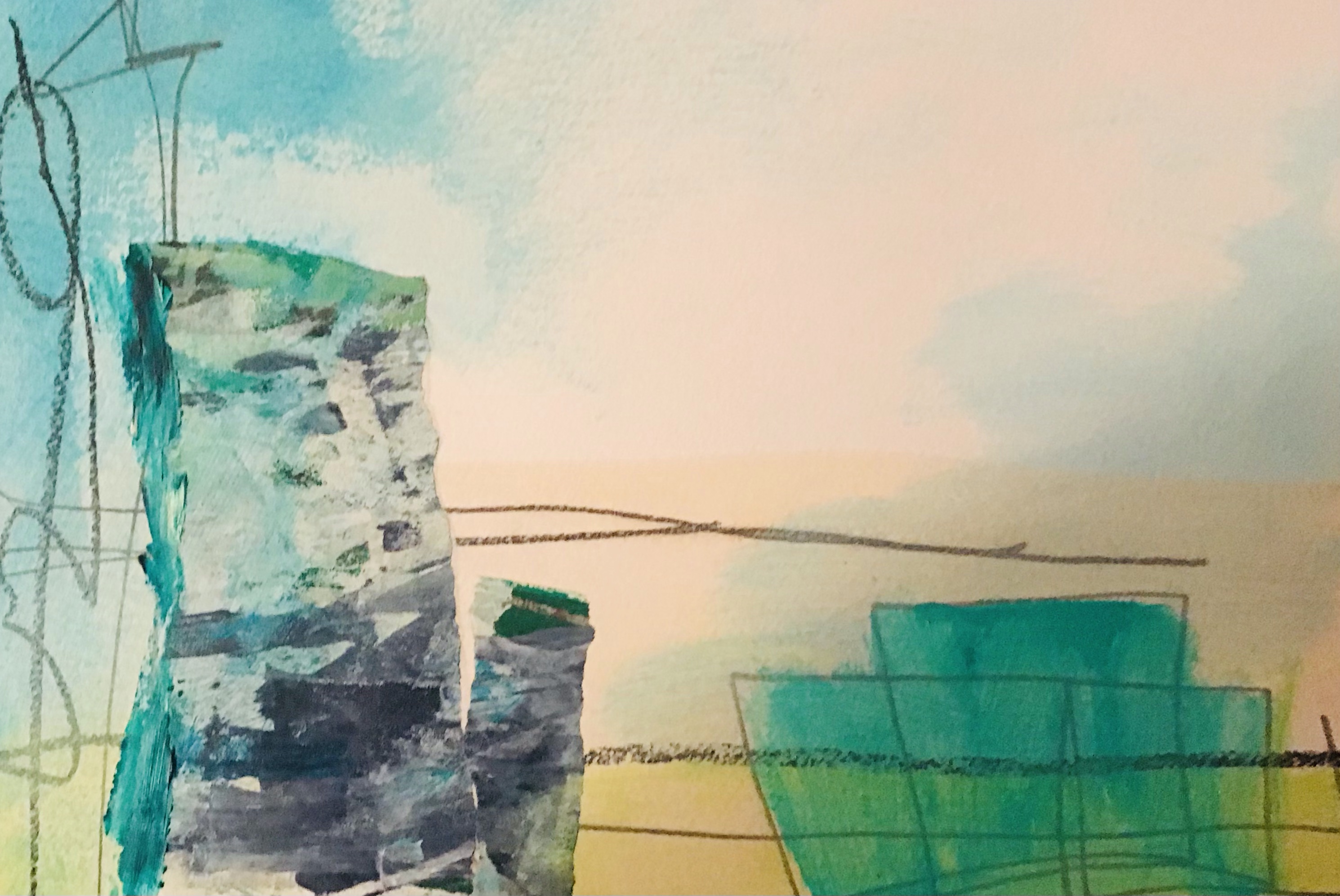
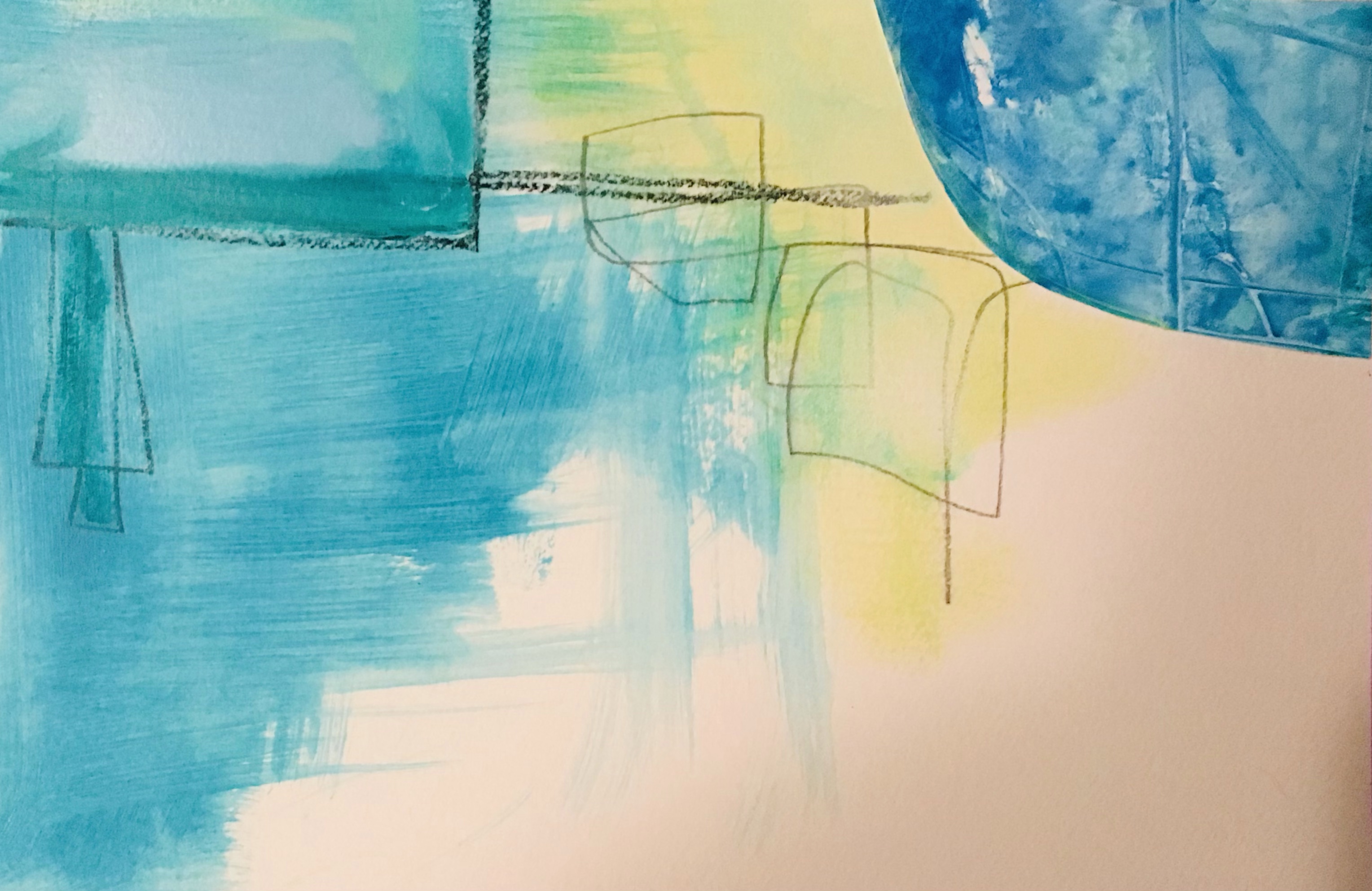
    Most of my art involves layers. Layers of collage, paint, mark making. Hiding things, revealing others, making some areas stand out. The layers are intuitive and unplanned, my hands working back and forth across the substrate.

    I was talking to my friend Penny tonight, who is also an artist. She was talking about an aspect of her process that’s important to her. I commented that, when I’m cutting painted paper for collage, I might cut it multiple times, shaving a few millimeters extra off until it feels just right. The shapes are organic, so you’d think those few millimeters wouldn’t matter – but for me they’re crucial.

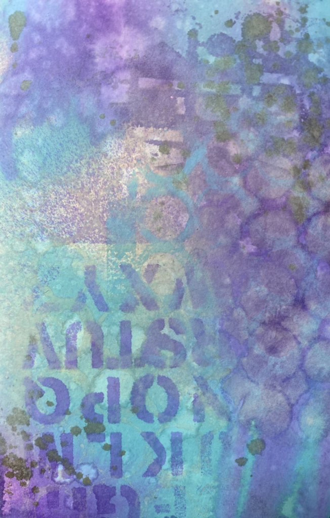
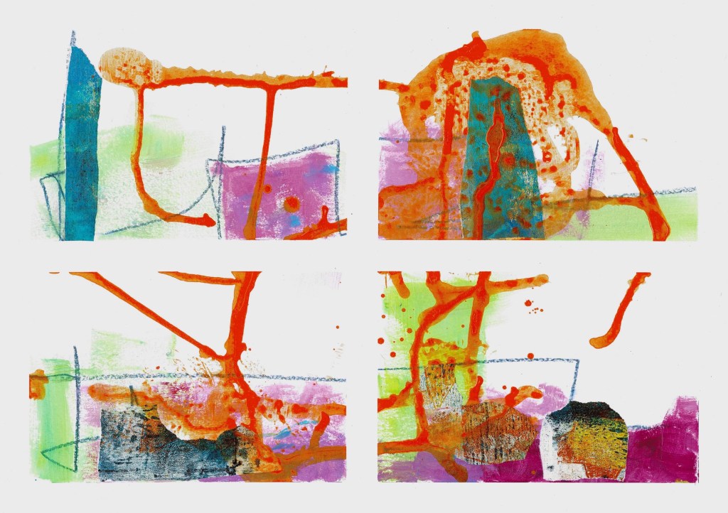
    When I work in layers I’m happy to give up almost any layer, mark, colour if I need to. Nothing is so good it can’t be covered over. I can always paint another one, cut another one. There’s enormous creative freedom in being able to let go. Yesterday I shared online the layer online seen below and said I was going to start covering up most of it. A few people said “don’t”. Too late, it’s gone…

  • Creativity helps

    I’ll skip the details but Tony wasn’t great today. He was home for a bit while I was working from home, so I could attend a bunch of local meetings, but I ended up taking him back because he said he felt “absolutely dreadful”. The rest home staff said they’d call me if he got worse.

    I felt we’d had far worse days at home but until now he’s been remarkably well in their care so think they got a surprise. As I said to one staff member, he was assessed as needing rest home care for good reason! He’s feeling and looking better now but hasn’t really eaten anything today.

    It was an unsettling day, so after dinner I grabbed the new art journal I’ve started and made a bunch of backgrounds. The thing about creating backgrounds is there’s no real thought involved. I grab 3 sprays to lay down some colour, add more colour through a stencil or two, splashes or drips of water to activate the sprays and maybe some dark splatter. It’s about getting my hands busy and distracting my mind. I find it soothing – I believe art is good for the soul (but not so good for the colour of my hands!)

  • Back to the dark side

    Tim Holtz unveiled the latest colour is his Distress line today, Prize Ribbon. Love it! Watching the reveal video, with all the makes, reminded me how much I enjoy using Tim’s products. I’ve been very focussed on the Dylusions and Dina Wakley range for a while now.

    Tony was home for the day from the rest home and had brought his Paint by Numbers with him, so I grabbed a fresh journal and a pile of Distress Oxides sprays and Distress paint. I made a stack of backgrounds, then went back and added splatter with Distress Ink, Distress paint and DWM white gloss spray.

    Once that had all dried I hauled out Tim’s paper dolls, the new wallpaper range, quote stickers and other bits from his range, plus some paper dolls I’d made recently inspired by Niamh Baly on YouTube. The paper dolls used Tim’s etching heads as a starting point.

    Tim Holtz often mentions the dark side … referring to grunge and using browns in your art, rather than bright and cheerful. Although I didn’t go fully to the dark side, I used Walnut Stain, Black Soot, and Ground Espresso on every layout.

    It was fun to do something different, and break out some old favourite supplies – I’ll be sure not to neglect the, for so long from now on.

  • Low tack tape is magic!

    I often use low tack tape around the edges of Fabriano Mixed Media paper then tape it into quarters. I work across the four quadrants as though it’s one sheet, starting with pencil marks, collage, and paint.

    If I work towards a finished image too quickly the work feels stiff and boring. That happened today so I grabbed some Dina Wakley acrylic gloss spray and put puddles onto the sheets of paper, moving it around with a brush or just tipping the sheet.

    I lost my grip on the bottle and poured quite a lot of Tangerine onto one sheet. Eek! I tipped it around a bit, then used a paper towel to mop some up. I thought it was probably a goner, and would end up being cut into pieces for collage.

    But there’s something magic about clean white edges; works that seem blah can suddenly look amazing. I pulled the tape of the 5 large sheets tonight and – go figure – the one with the Tangerine spill is stunning.

    In the photos, the one with the mauve tape still in place is a truer colour, the second is done on my scanner which doesn’t capture colour well.

  • Valuing white space #BlogJune 18

    I was talking with my good friend Penny the other night about white space in our artwork. We often use similar colours and methods but our processes and end results are very different.

    My art journals are about “downloading my head”l. Often colour and writing fills the page to overflowing – chaos and emotion in 2D. But my abstract landscape art is different; it’s generally my calm, peaceful view to the seen world. I don’t aim to record, but to respond.

    Part of that response is a strong need for quiet space, usually white or maybe Titan Buff. I was working on 12 A4 mixed media and, when I sat back, realised I’d put too much colour on too quickly. Tomorrow I’ll look at them in the daylight. Some very strong darks might increase the sense of light, or they might need white paint added back.