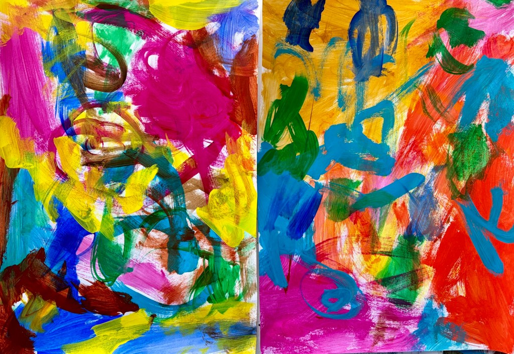
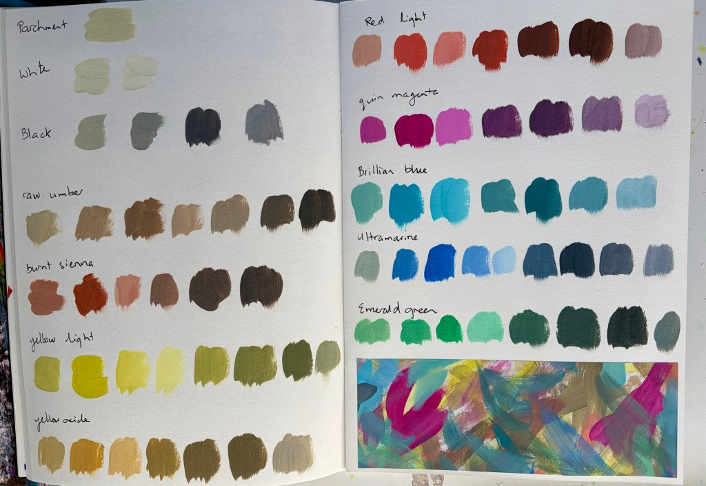
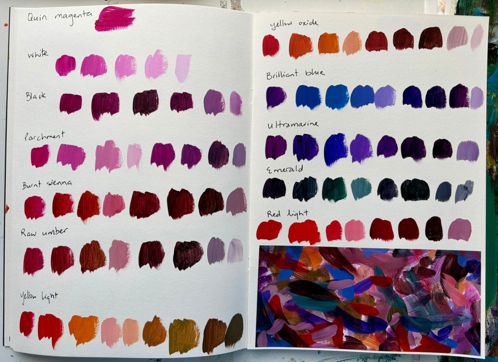
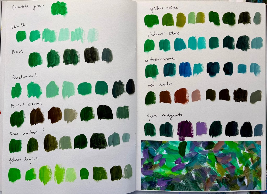
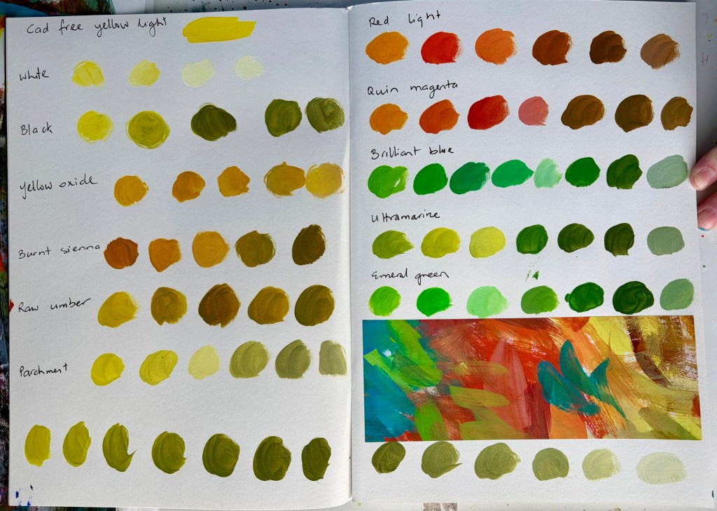
I’m trying out a new colour palette and, inspired by Sandi Hester on YouTube, added a couple of colours I don’t usually reach for.
The colour palette is:
– Cadmium-free yellow light
– Yellow oxide
– Cadmium-free red light
– Quinacridone magenta
– Brilliant blue
– Ultramarine blue
– Parchment
– Burnt sienna
– Raw umber
– Emerald
– White and black
The new colours are emerald, brilliant blue and cad red which, for some reason, I’ve normally avoided.
I’m using one of the Gordon Harris A4 mixed media sketchbooks to colour swatch in. I’ve mixed each colour with each colour, and then added black and white to those mixes to see what it creates.
As I go, I clean my brush off randomly onto copier paper. I glue a section of that paper to the page so I can see what the colours look like together. The rest of the painted paper goes into my collage folders.
When I look through those dozen pages and at the sections of painted papers, you can really see the different feel each colour brings. It’s a great way to see the variety of colours you can create.