Much of my art starts with fluro pink or orange, and is high key. The bright colours bring me joy, and I hope they bring joy to the people who own my art.
Occasionally I’m drawn to a gentler, quieter palette. Sometimes it reflects a particularly calm patch in my own life, other times it’s a search for calm in a chaotic world. This weekend’s works are definitely in the latter category.
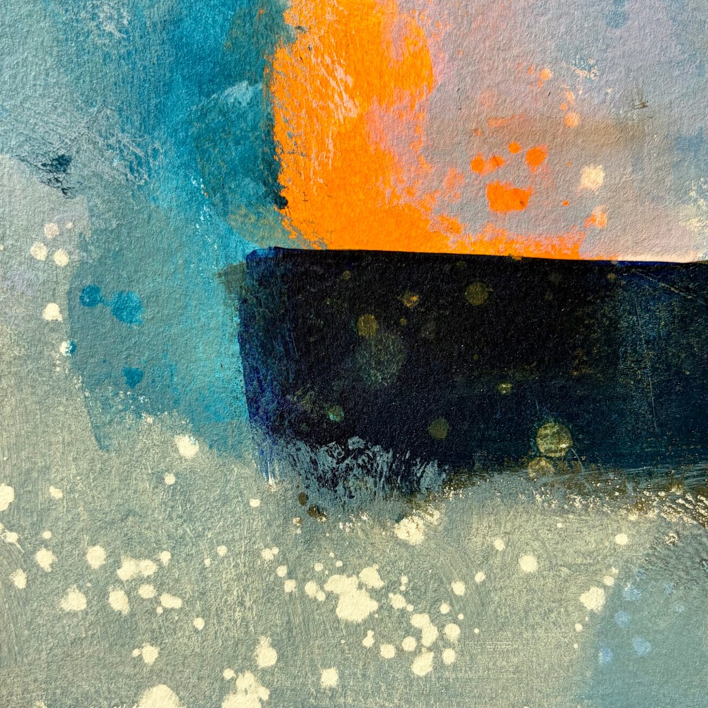
The world is chaotic and not very nice just now … so my art is calmer, more soothing. I used Liquitex quinacridone blue violet, burnt umber, indanthrene blue and parchment, with vivid red orange as my bright contrast.
I seem to be back to the sea wall, cliffs, sea foam, crashing waves … tempestuous? Yes, but the sea is always a moment of calm for me.
Prior to mark making with NeoColour IIPrior to mark making with NeoColour IIPulling the tape off after final mark making is always a revelation
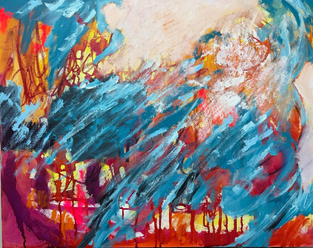
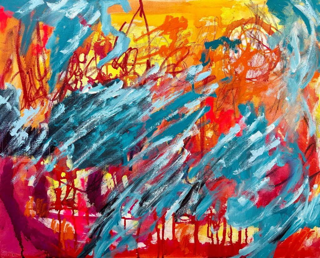
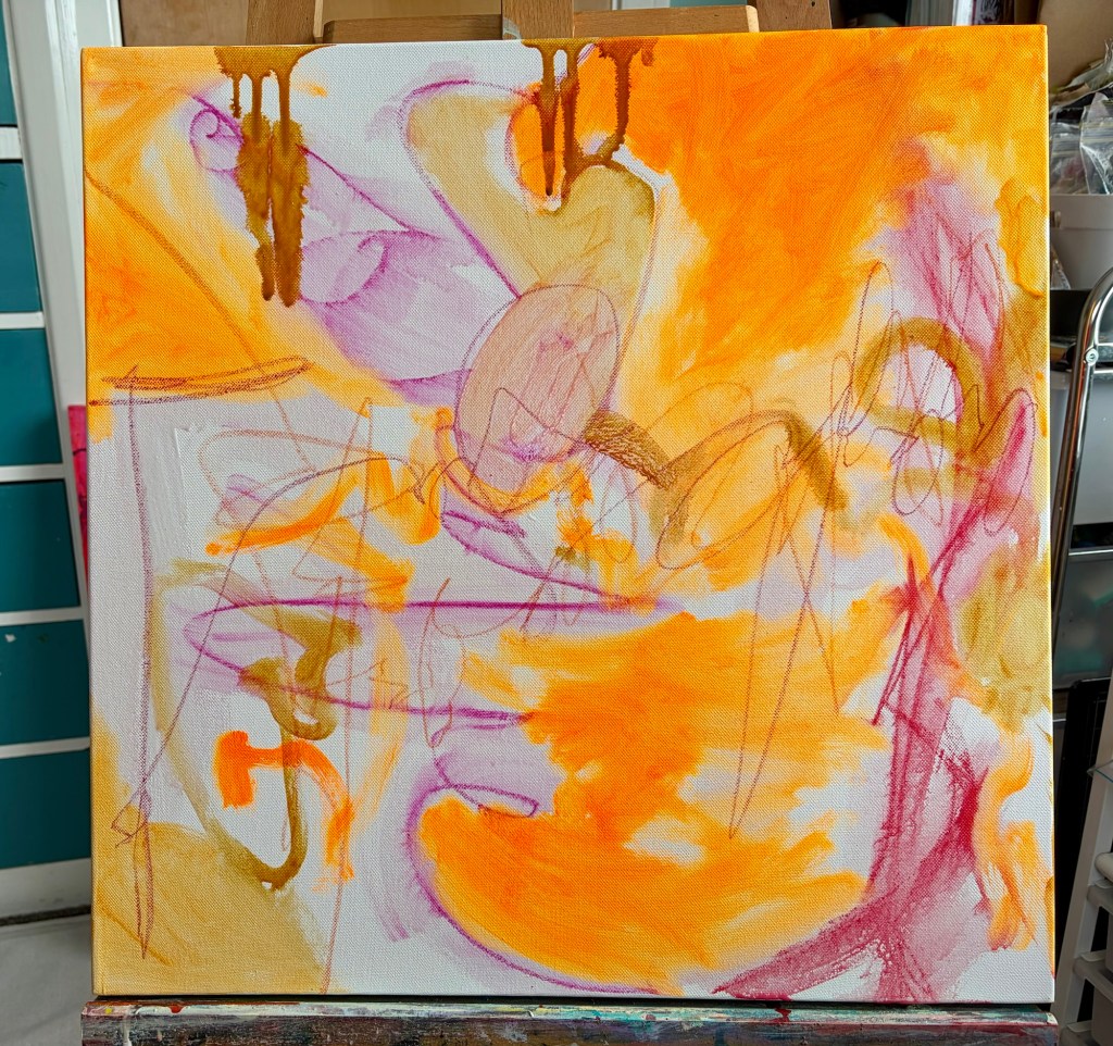
This painting started with fairly angry marks in water soluble crayon and R&F oil drawing stick. I added acrylic ink and paint in yellow, orange and red. I left it to dry, unsure what was needed next.
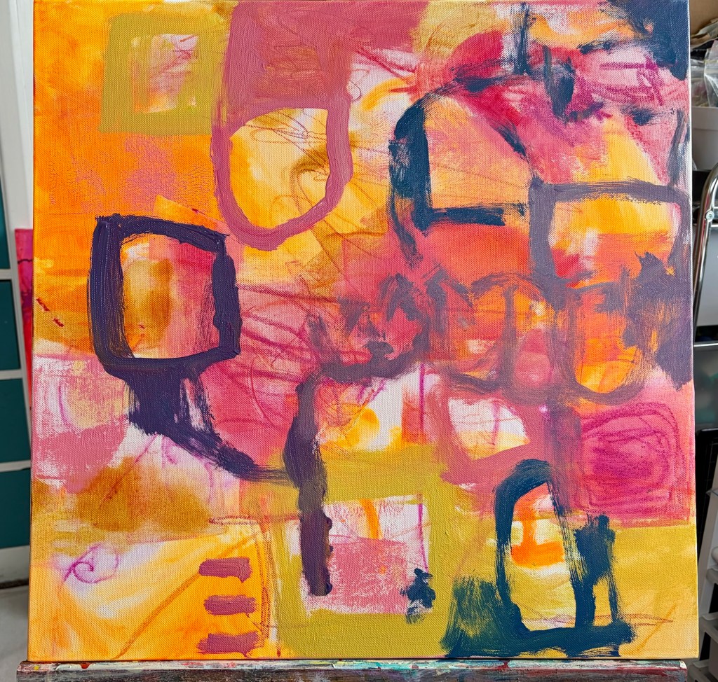
Eventually I added very directional, quite thick, blue and white lines. The paint needed to dry, so it’s been sitting for the last week – the oil drawing stick still hasn’t dried thanks to our winter weather.
As I’ve been looking at it through the week I’ve felt more and more that it’s related to the winter weather, and the rough sea. Today I started calming down the yellow and orange areas, pushing them back so they’re more sky-like. It’s not there yet, but the direction feels clearer.
This is how it was looking at the start of the weekend This is where it’s at as the weekend comes to a close
At the beginning of May, Alan and I were fortunate to purchase 43 hectares of dairy grazing land. There are flat paddocks, steep hills down to a river, some QEII Trust, forest in pines and native trees, quite a few farm buildings but no house. Alan’s out there every day farming, and I pop out sort of in passing.
The reality is I work full-time, go to the gym three days a week, and do my art. By the time I’ve done all that, I really don’t have time to farm as well. But for all that, I love seeing the land and knowing we are its caretakers.
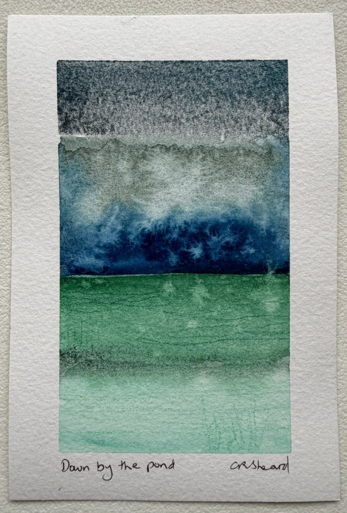
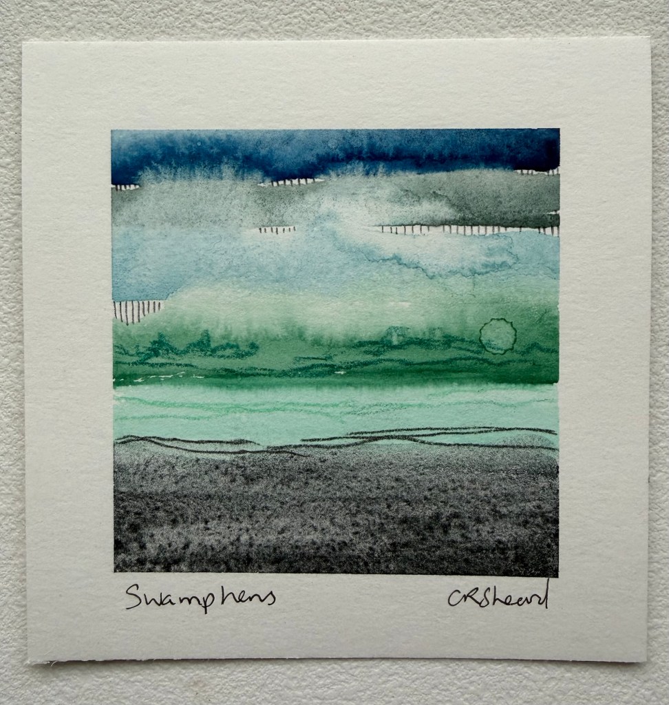
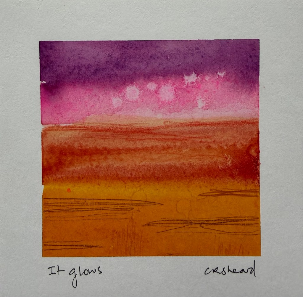
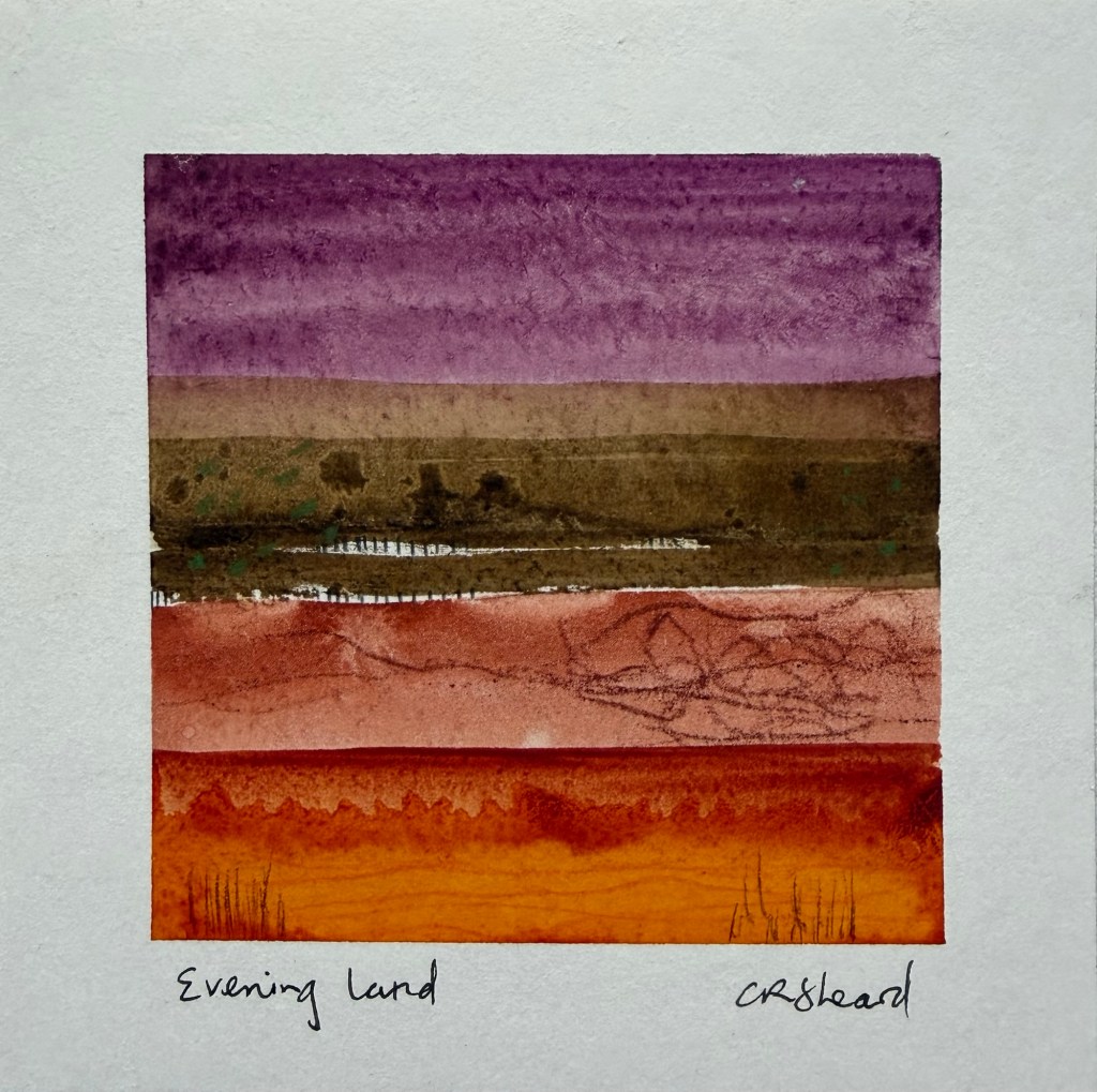
This weekend I decided to make some really small pieces of art as part of a ‘sharing some love & light’ project on BlueSky. I was working really small, 10.5cm square and 10x14cm with watercolour, pencil and NeoColor II crayons. What I realised is the land is very much inspiring what I do even though I’m not there very often.
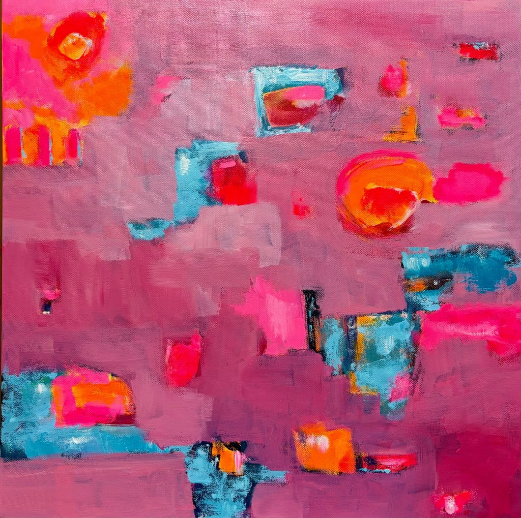
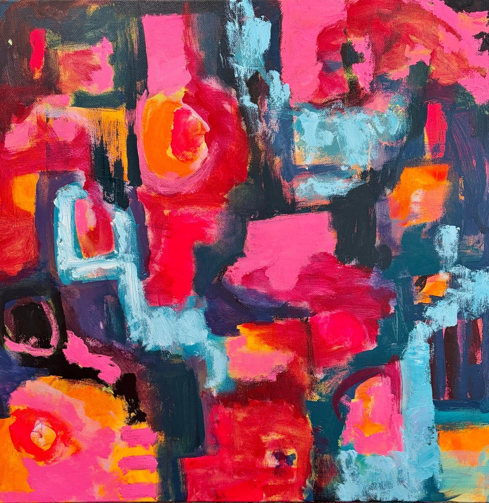
When I started this painting, it was light and bright: fluorescent orange, pale yellow, plenty of white. I really liked it, but I knew it needed more layers and interest. I’ve been finding the world a bit dark and difficult. There’s so much going on, and it can be hard to shut off from the news or even just from the news headlines.
The more I painted, the more all of those feelings came out onto the canvas. By time I’d done my second or third pass, it was looking dark and ugly. It was nothing like the light, bright painting I’d started with. I stopped for the night and decided to let it dry because if I continued, it was going to turn to mud.
What was on the canvas reflected my mood at the time, but what would happen if I painted a light, bright mood instead? Would it impact how I was feeling?
Tonight I got out fluorescent pink, fluorescent orange, blue, and white and started layering back over the top. I simplified the composition, took out fiddly details, and lightened the overall feel. Once I’d redone the pink, I adding very pale blue and some white highlights.
By the time I’d finished, the painting looked better and, to be honest, I felt better too. Does my mood influence my art? Yes, of course it does, but does my art also influence my mood? Absolutely. It’s a good reminder that it’s worthwhile painting out my feelings, but also that I can alter my mood through the art I produce. (The piece probably isn’t finished yet, but I’ll sit with it for a day or two)
The first layerThe second layer and still looking ok The third or fourth layer … looking dark and angryThe current layer – lighter and brighter.
After work today I went to the supermarket to get gravy and flavour sachets for cheap cuts of meat in the slow cooker. There was so much to choose from I got a little overwhelmed.
A woman noticed me staring at the shelves, choosing nothing. I smiled and said Dad was a grocer when I was a kid – you had two of most things to choose from and it was easier.
It’s cold at the moment, so most evenings I sit in the lounge by the gas fire, instead of at my art desk. I’ve been watching art videos. A YouTuber commented that limiting your art supplies on a piece can help, because limiting your choices stops overload.
At the same time, I’ve been experimenting with triadic colour palettes. I find having three colours plus black and white works well. Then, once I get to the very final marks, I’m free to use any colours for small accents. I think one of the reasons a triadic palette works well is because it decreases the need for decision making … put the colours on your palette and whatever you can mix is what you use. Simple!
As I get older, or maybe as the world gets messier, I find things somewhat overwhelming more often. It’s making me think about how I store my art supplies. Currently I have things grouped by type; paints, inks, pencils, pastels, crayons, and so on. I end up grabbing things out of multiple containers and drawers for working on one piece.
Maybe it would be better to store by colour, regardless of the material. That way, I choose my three colours I want to use then pull the appropriate containers out? Except that when I get to the final mark making, I’m still going to be ratting through multiple containers. I can see this needs some thought yet. I’d be interested to hear how others store their art supplies.
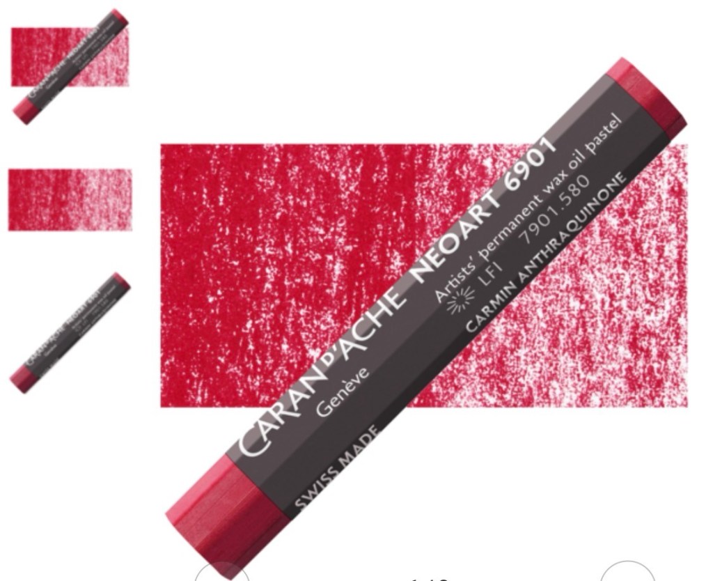
I just bought a dozen of these to try. I love my Caran D’Ache Neocolor I and II so have high hopes.