Blog

  • Sea Pinks

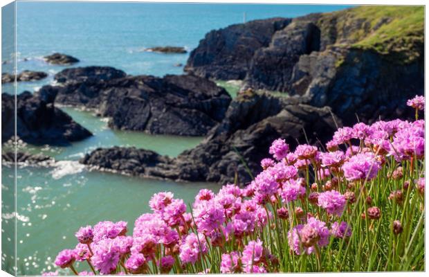
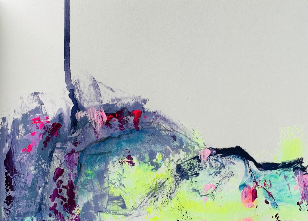
    Over the last week or two my small art journal, where I work out ideas, has been inundated with bright greens or greenish yellows. There’s a lot of hot pink, sometimes on the horizon line or cliff edge, or scattered in the landscape.

    Sandra was looking at my art journal, went off for a few minutes, and came back to show me Sea Pink (Thrift) on to coast of Wales – and they flower in Ireland too. And there’s the answer…much of what I paint is based on memories of the landscape. Mum’s birth mother Angela was Irish; somewhere in my DNA the memory exists of the Sea Pinks flowering in the landscape.

    That might sound far fetched, but think about this. People with Scottish ancestry often feel an affinity with the bagpipes even if they don’t know they have Scottish heritage. They’ll say it is like they know the music from the first time they hear it. Why? Because it’s wired into their ancestral memory, or however you want to describe it. Of course there are examples from all over the world, from all cultures.

    Have I been to Ireland and seen the Sea Pinks in flower? No. Does my soul, my shared ancestral memories, know them? I think so. I’d love to know if Angela liked them.
  • It’s all about texture

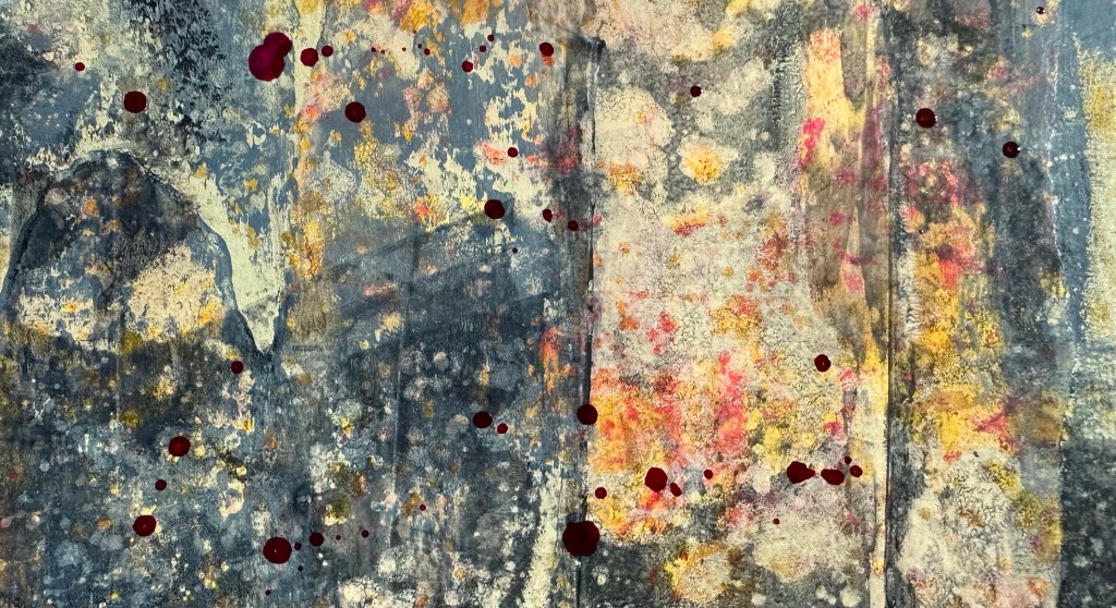
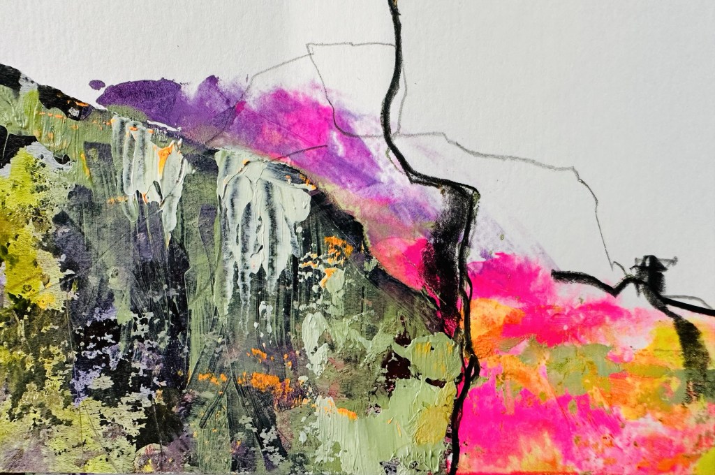
    When I was at The Learning Connection my tutor, in the 4th year, commented that my work was “all about the edges”. Peter was absolutely right, and the edges of the work are still critical to me. In the last couple of years I’ve become increasingly interested in the idea of texture, while keeping the work very flat. When I was a scrapbooker, and scrapbook tutor, I could never get into lumpy things on my pages…

    Pen Kirk and I are working on our next exhibition, titled Shattered Landscapes which opens late October. We’re showing our own work, and joint collaborative works. I’ve been working on a few pieces this afternoon and I’ve been quite focused on creating a sense of texture.

  • Swatching new paints

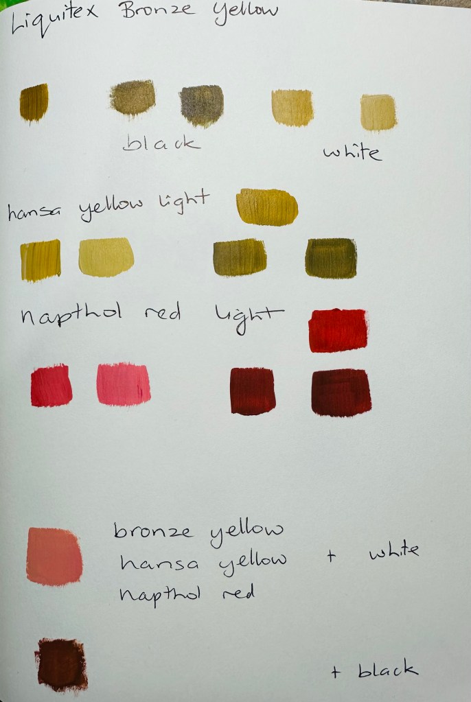
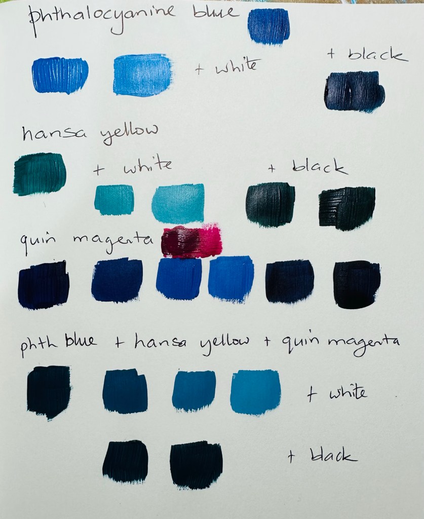
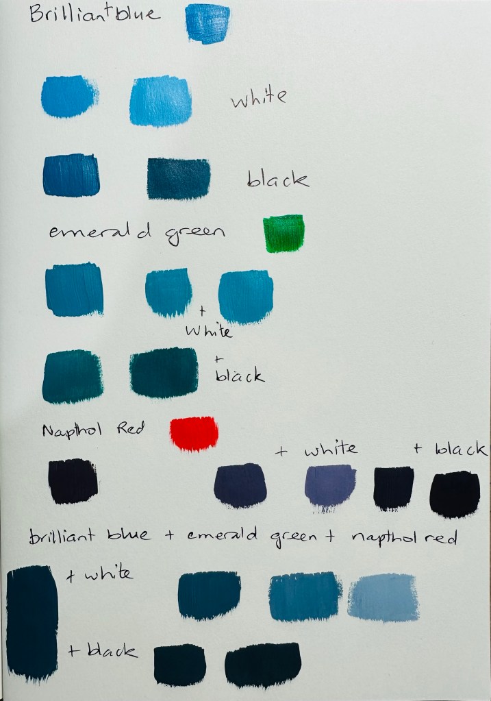
    I was fortunate to win a lovely set of Liquitex heavy body acrylic paints in a raffle run by TWB Framing & Art Supplies. They’re based in Feilding, have good stock at reasonable prices, and are lovely to deal with.

    I don’t always swatch new paints but thought I’d have a play and see what I could come up with. I’m pleased with the lovely soft greys in particular. Now I just have to remember to use them; I might keep my swatch notebook on my desk for a while.

  • New stencils

    I ordered a few new stencils, designed by Elizabeth St Hilaire, from Joggles recently. I’ve got a few sets by Elizabeth and love them all. This time I got the Picasso mask and stencil set, and a few individual stencils. I had a play today, and think I’m going to get a lot of use from these.

  • Stronger contrasts

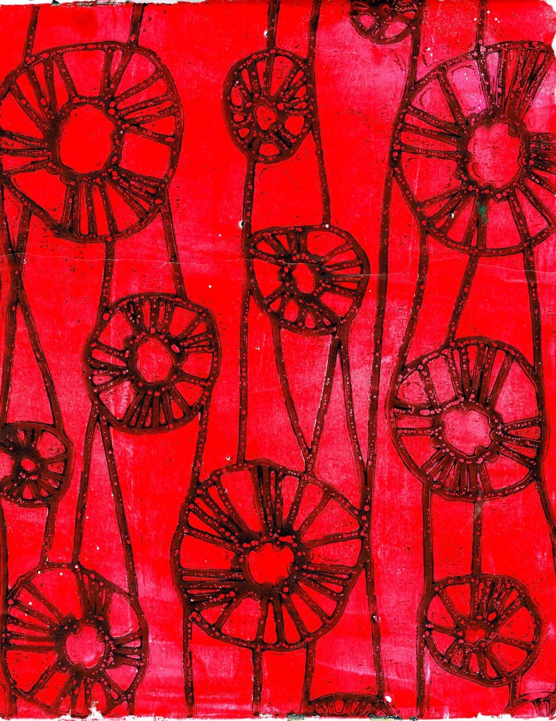
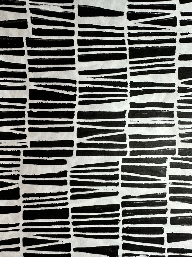
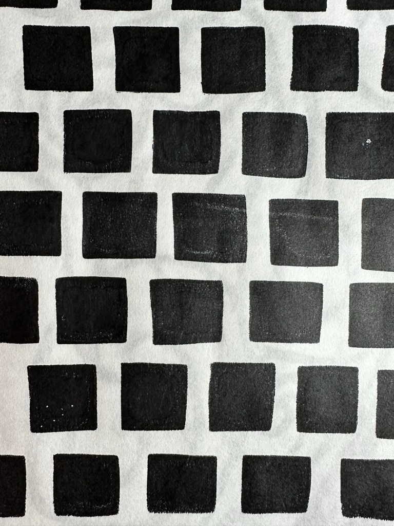
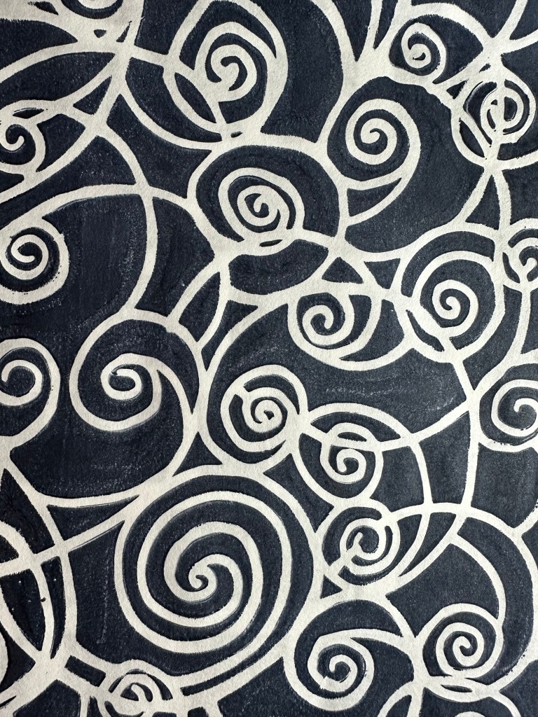
    In my last post I said I’d given away all my gelli prints. During the week I bought some Golden Open acrylics – they’re expensive here in New Zealand but great for gelli printing. I choose a few favourite colours; black, titan buff, red, titan pale green (celadon), dark violet and anthraquinone blue.

    I got out my Elizabeth St Hilaire stencils, plus a few old favs from StencilGirl, and got to work. I wanted some graphic prints, and stronger lines. I made about 50 prints, using a mix of Hahnemuhle Sumi e and Sketch rice paper.