Tag: collage

  • Consistency

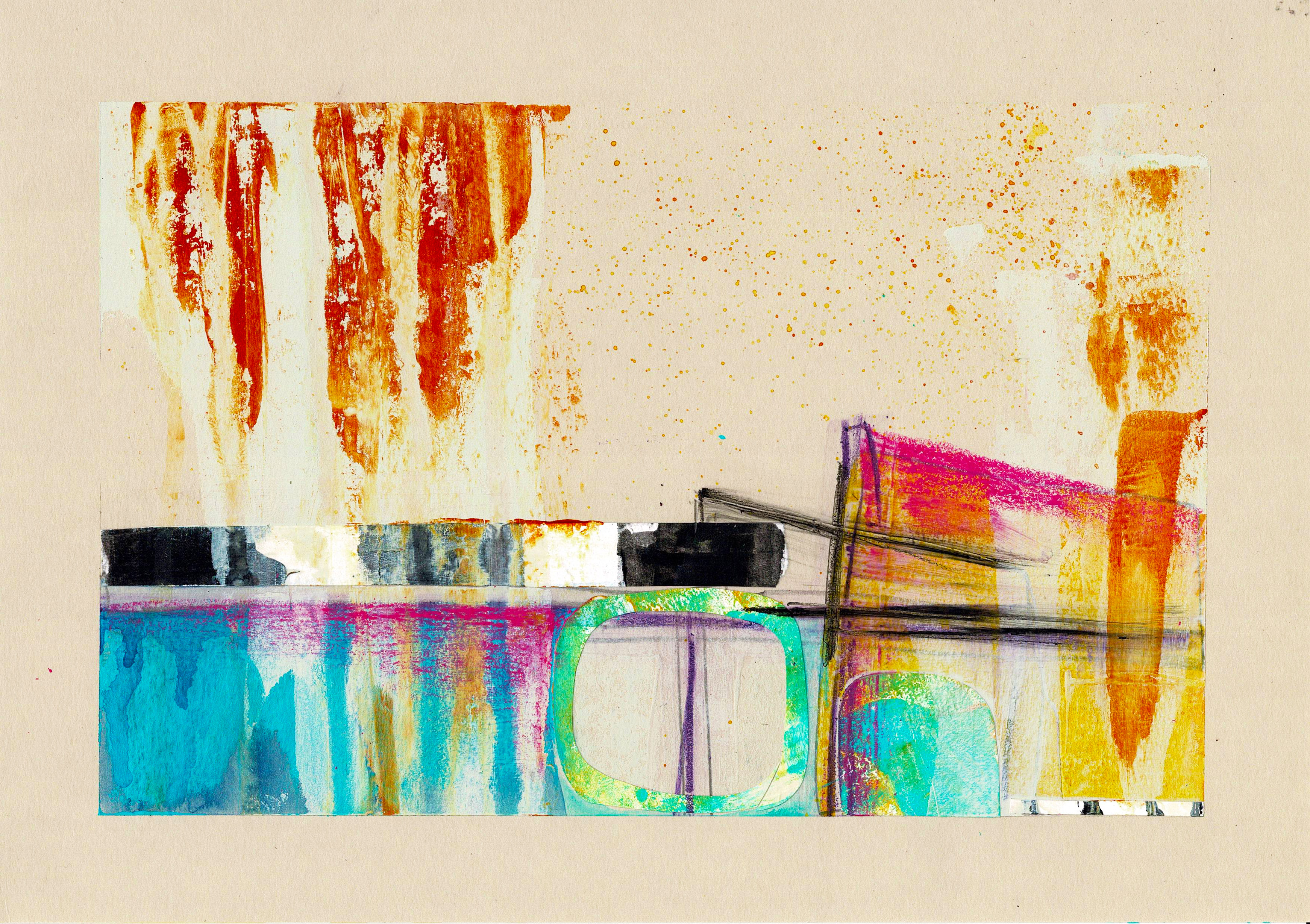
    I’ve been thinking about consistency; consistency in going to the gym and in other personal habits. I’m working in a kraft journal and trying out some ideas. What I’m starting to notice is – despite some new colours / materials and the intention to work differently – there are marks and colour combinations which always come out.

    Black, white, blue, green, turquoise, with a touch of hot pink, orange or fluorescent yellow. The colours of the sea, which I have always loved. But also the colours of the Hokitika Gorge, which I love.

    Cruciform shapes, ovals that are higher on one side with one end cut off, loose squares or oblongs that connect to a line across or up the page. I know where some of it comes from – the cruciform shapes and squares or oblongs relate to memories of the Patea Cool Stores and Freezing Works. The ovals I have no idea about, but when I get scissors and paper in my hand for collage, there they are!

  • A shifting vision

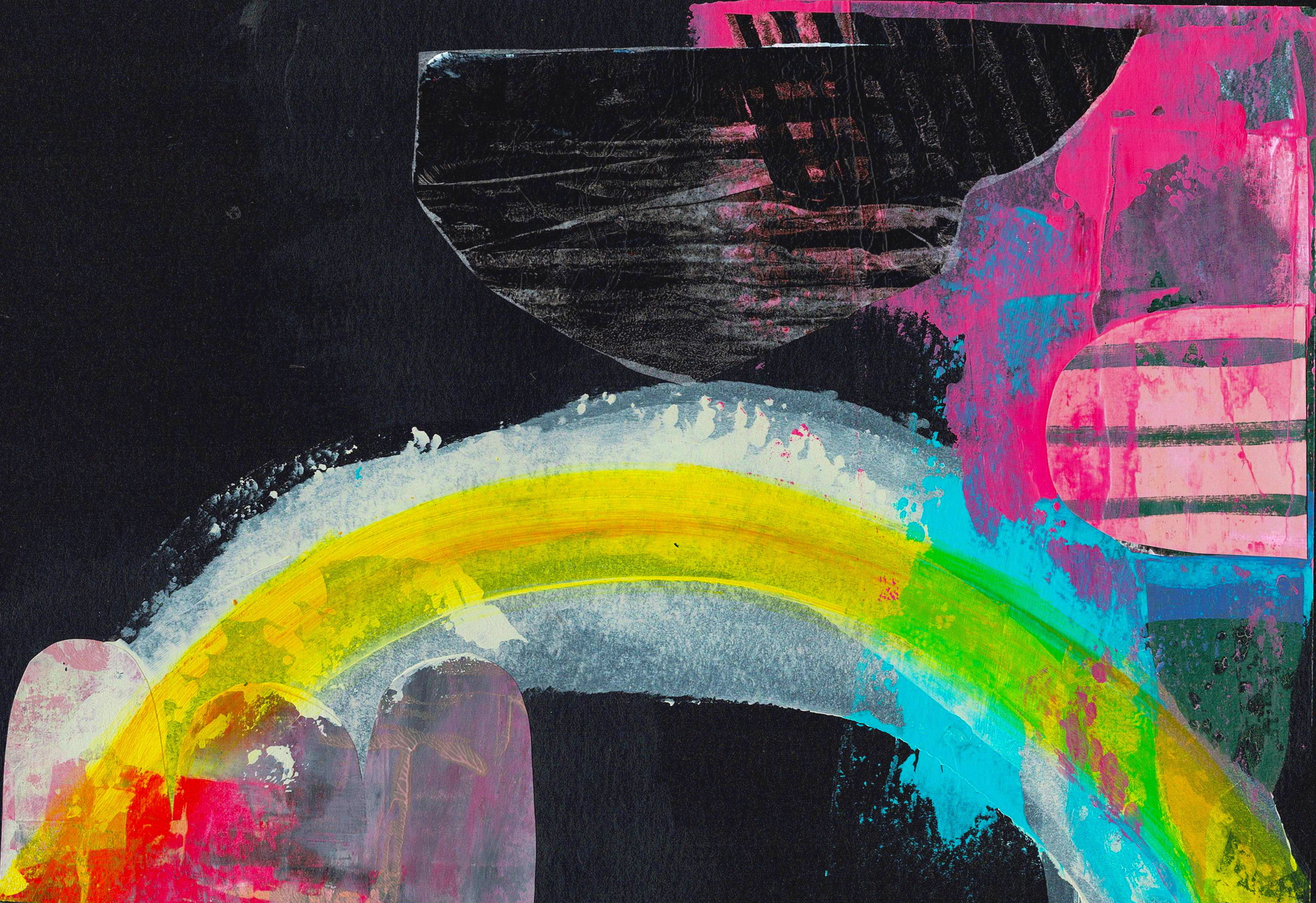
    I’m working on a new series; the last couple of posts have talked about trying out some different ideas and ways of expressing my ideas. This isn’t a new direction, instead it’s a slight shift in how I put on paper – in paint – the things I don’t have words for. Sometimes that’s emotions, other times it’s my memories of the landscape.

    I’ve been working in a kraft journal and on a variety of mixed media papers. My favourite pad of PaintOn mixed media paper has white, cream, black, and a blue grey. I’m using quite a bit of fluro pink from the Golden heavy body range and it’s hard to scan the colour accurately. These works include collage, paint, ink and pencil, so are much more “mixed” than my usual mixed media. I’m ordering more precut mat show kits from the US this week and it’ll be interesting to see how they look with a clean white border.

  • The colour of hope

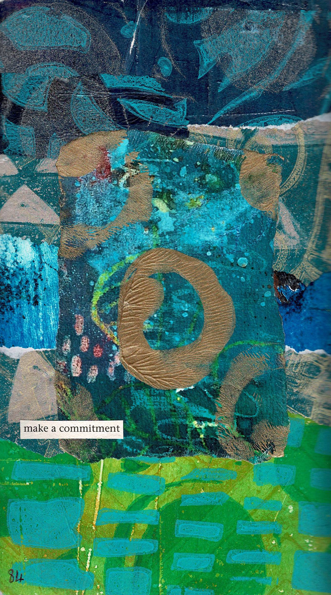
    I’m doing two #100dayprojects, and am up to day 84. One of them is about making a collage a day, and I’ve been playing along with Froyle, as she inspires us to try different colours. This week she asked what colour represents hope for us. My initial thought was orange but, the more I thought about it, that’s not true. I love orange, it’s about fire and passion and danger, not hope.

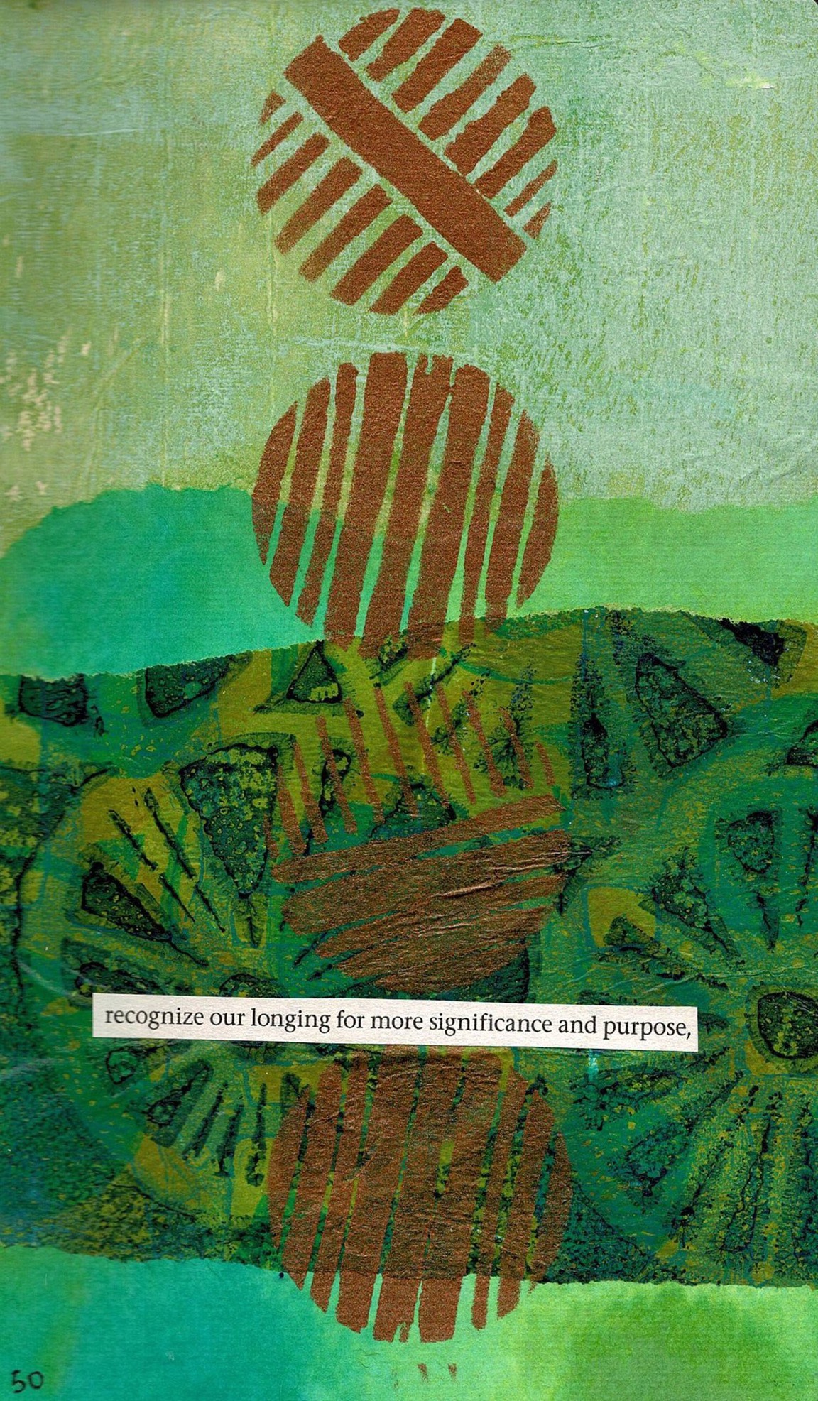
    For me hope is a mix of blues and greens; the colours of nature and the sea. The land and waterways being healthy is what will give me hope for earth. I particularly love the colour of the Hokitika Gorge, and the greens of the land as it meets the blue of the distant hills on the West Coast. When I’m there I create lovely gelli prints inspired by the land around me. When I get home I stop. Not because I’m home, but because – as beautiful as it is – the land around me doesn’t inspire me in quite the same way.

    Here’s the first of this week’s collages inspired by the colour of hope.

  • Circling back

    Circling back

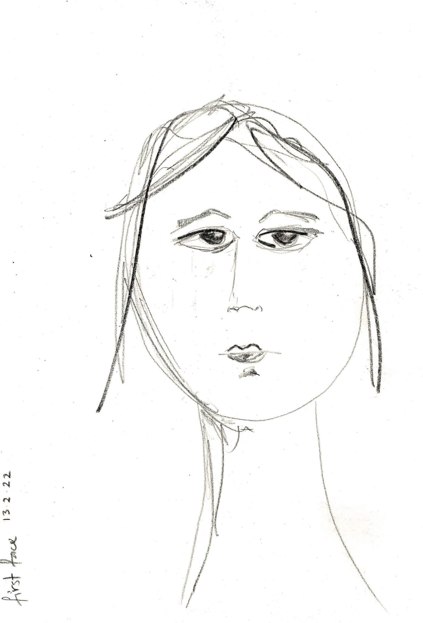
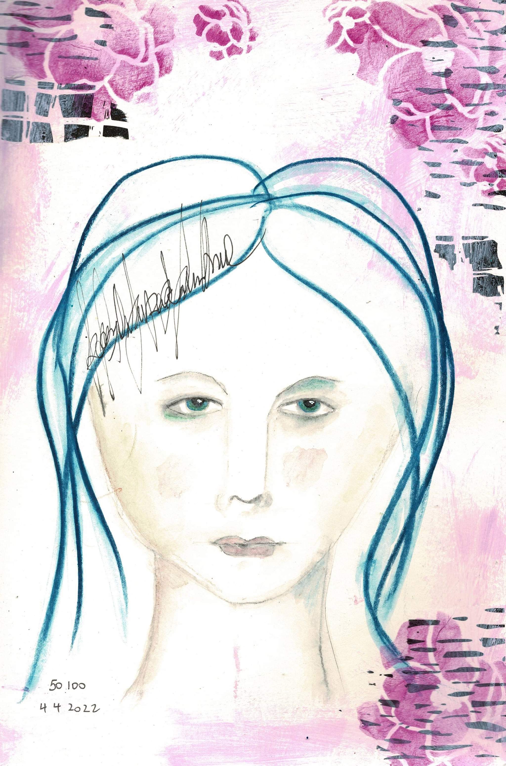
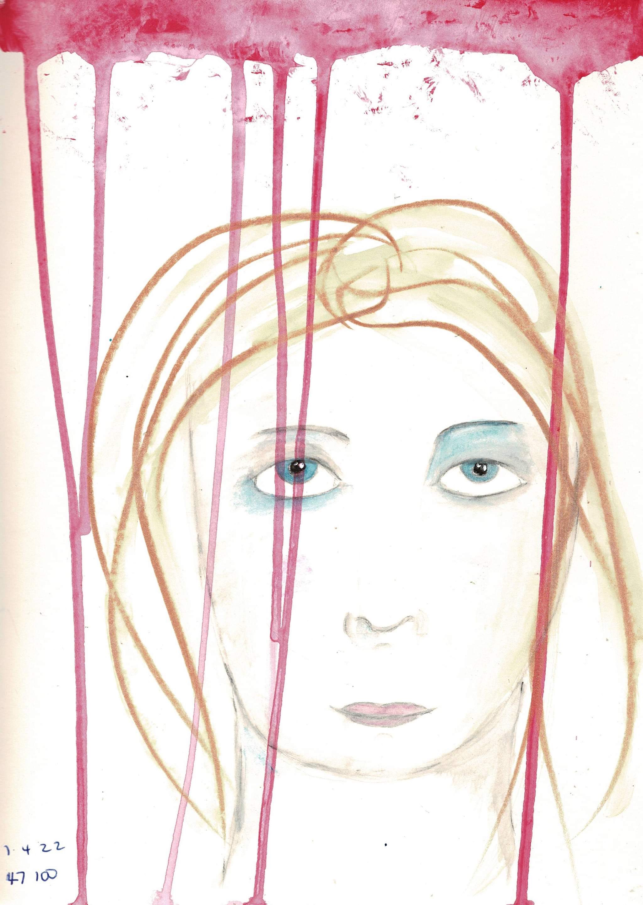
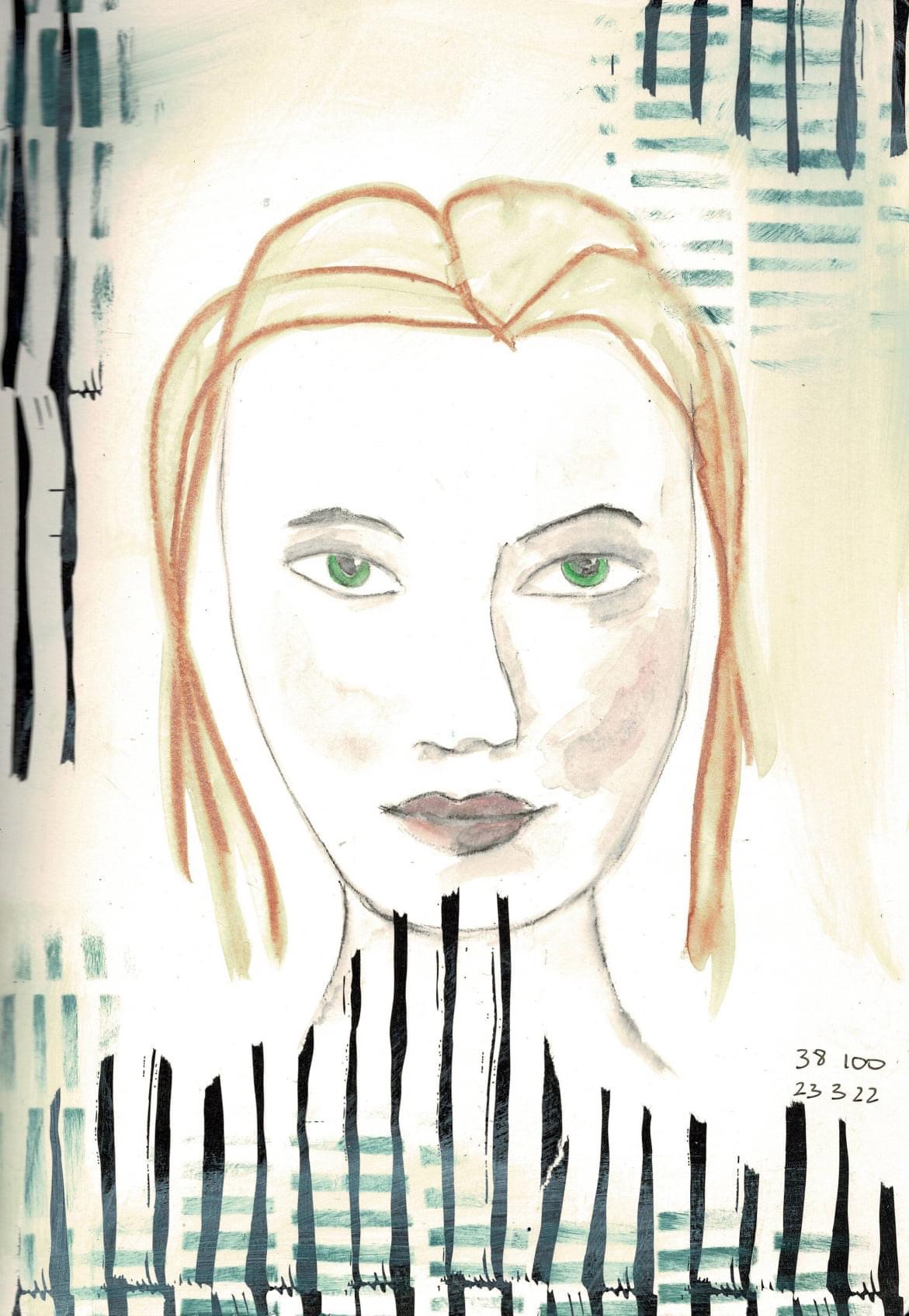
    I’ve been learning to draw faces. Today is day 50 of this #100dayproject. I can draw a recognisable face with no real effort now. What I can’t reliably do is convey a specific emotion, but hopefully in the next 50 days that will come.

    I’m also doing #100daysofcollage with Froyle Art and loving it. We’re doing a different colour each week. These are in a small Dylusions journal, so not overly time consuming. I’m using up some of my stash of gelli print and hand printed papers.

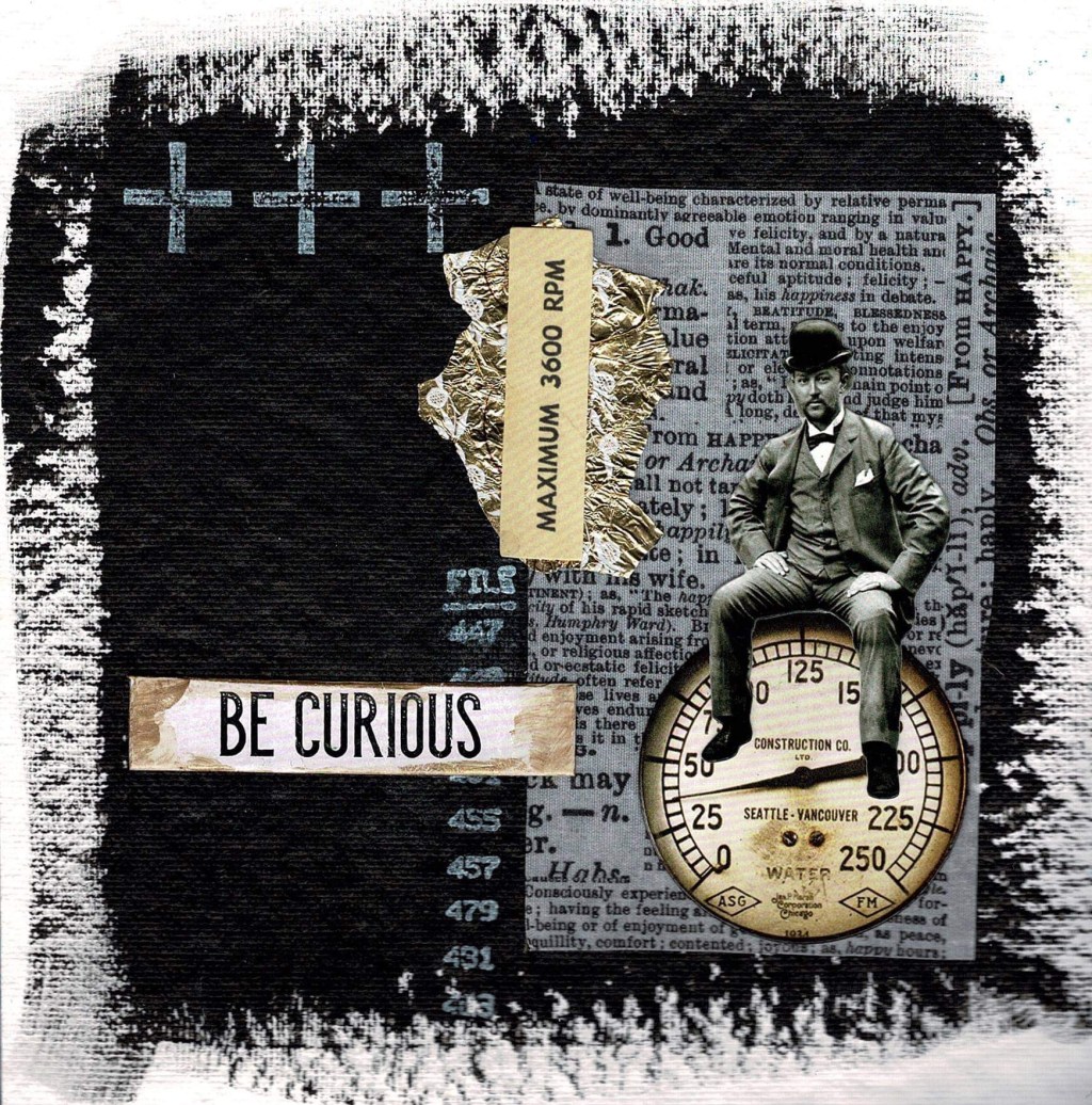
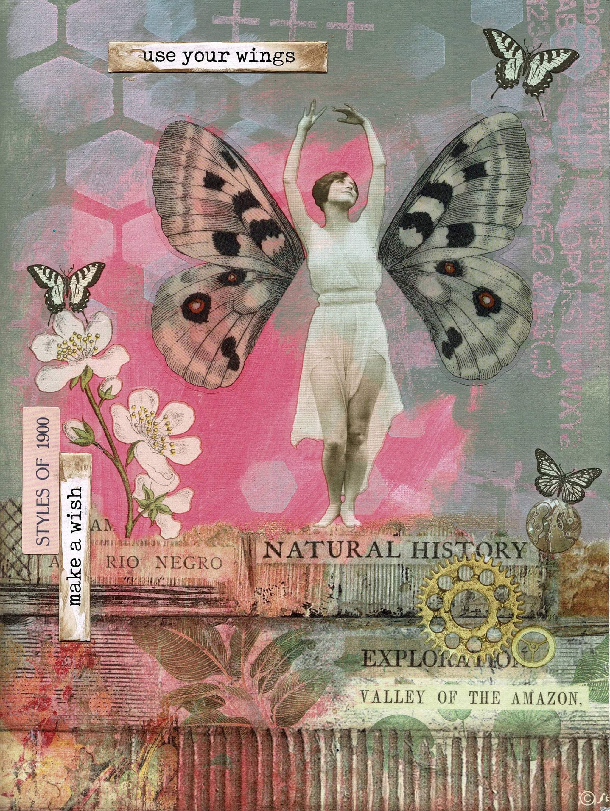
    But I’m also circling back to my earliest art journal love, Tim Holtz and Distress. Sometimes I put it away for a bit, but I always come back. I just got some new paper dolls, transparent wings, and some other bits and pieces. Heaven! Thanks to Fiona at Create for having great stock.

  • Influences

    Is my art original? Yes. Am I influenced by others artists? Absolutely. There’s a core group I’ve followed for years, including Tim Holtz, Teesha Moore, Traci Bautista, Dina Wakley and Dyan Reaveley. Some of them are designers with Ranger, so I’m influenced by both their art and their new products.

    Artists whose work has influenced me include Jasper Johns, Richard Serra, Mark Rothko, Robert Motherwell and Cy Twombly. I was fortunate to study some of them at The Learning Connexion during the four years I studied art.

    Teesha Moore, whose work I love, has been sharing some of her older art journal pages on Instagram. She’s had some health problems, so I don’t think she’s creating much at the moment. I’ve made her style of journal before, and often use her collage style in my journals.

    Tonight I hunted round in the cupboard and found a blank journal I’d made from Fabriano paper, based on a video she did of her process back in 2010. I’ve started colouring the pages using Golden Fluid Acrylics. Once it’s fully dry I’m going to use magazine images and downloaded mixed media papers to create my pages. I’ve just bought some of Denise Lush’s new collage papers and think they’ll be perfect for this project!