Tag: painting

  • A bit of distraction

    A bit of distraction

    This week has been taken up with preparation for Alan’s mother Mary’s funeral. She passed away at 96 after a life well lived. In between all the preparation and time spent with family, I’ve been keeping my hands busy because it’s good for me to have downtime. As one of life’s true introverts, as much as I enjoy seeing family, I need time out.

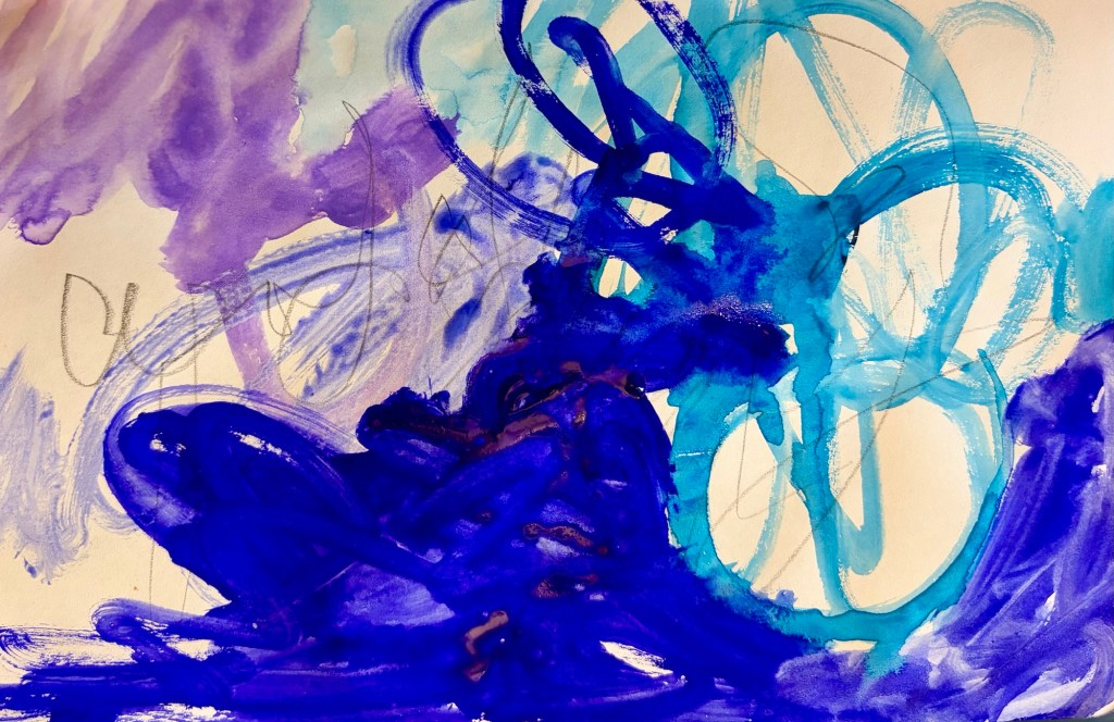
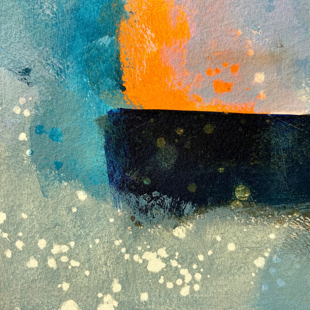
    I’ve been experimenting with gouache. I got a few given to me last year, and bought a few at Christmas time. I love the vivid colors, they’re just beautiful. What I hadn’t appreciated is they re-wet, so it’s easy to end up with mud or pick up previous layers too. I’m not sure I’m going to enjoy them that much overall, despite the colors. I’ve been playing around with really loose mark making. I love Cy Twombly’s work for his expressive paint application and the fact he includes loose handwriting. I’ve been re-reading a book about his work, and I can see his influence in what I’ve been doing this week.
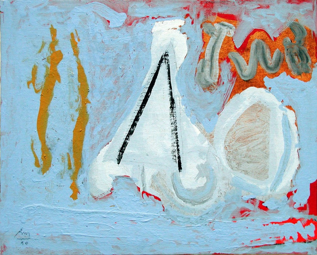
    Compared by reading about Cy Twombly’s work
    A failed gelli print I sprayed gloss acrylic onto & now like!
  • Far less abstract

    Far less abstract

    In my last post, I said I’d realised recent paintings are about the sea and water. The works I’ve been doing on canvas are abstract but, to my mind anyway, have a clear subject.

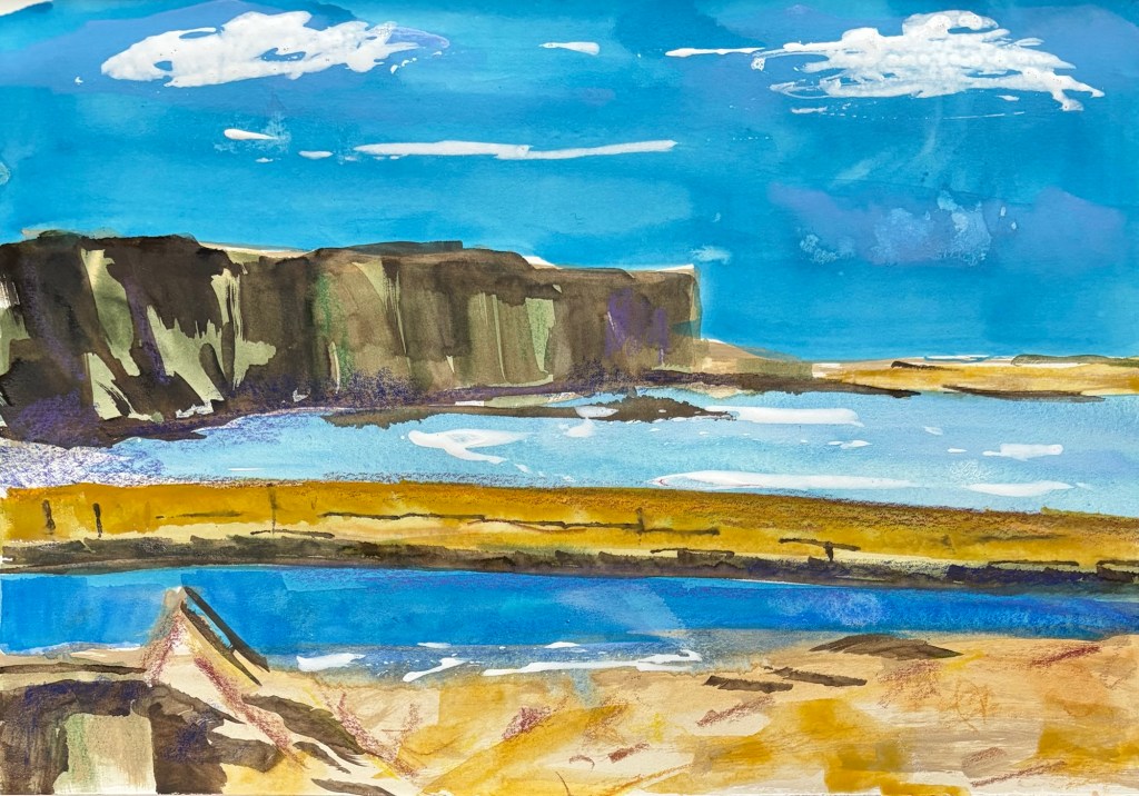
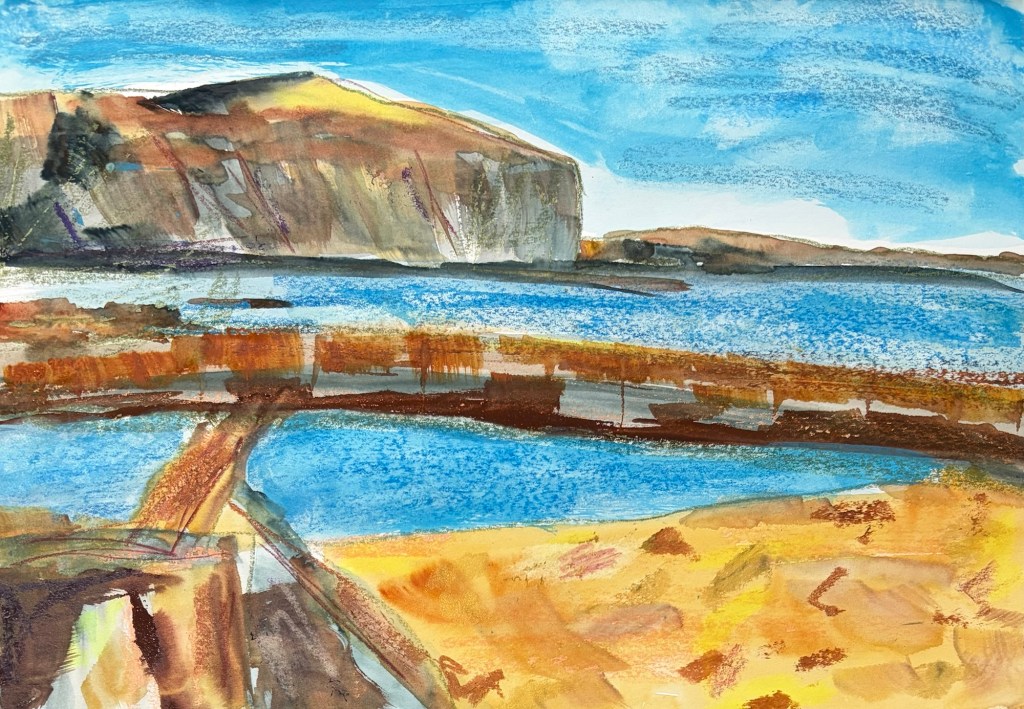
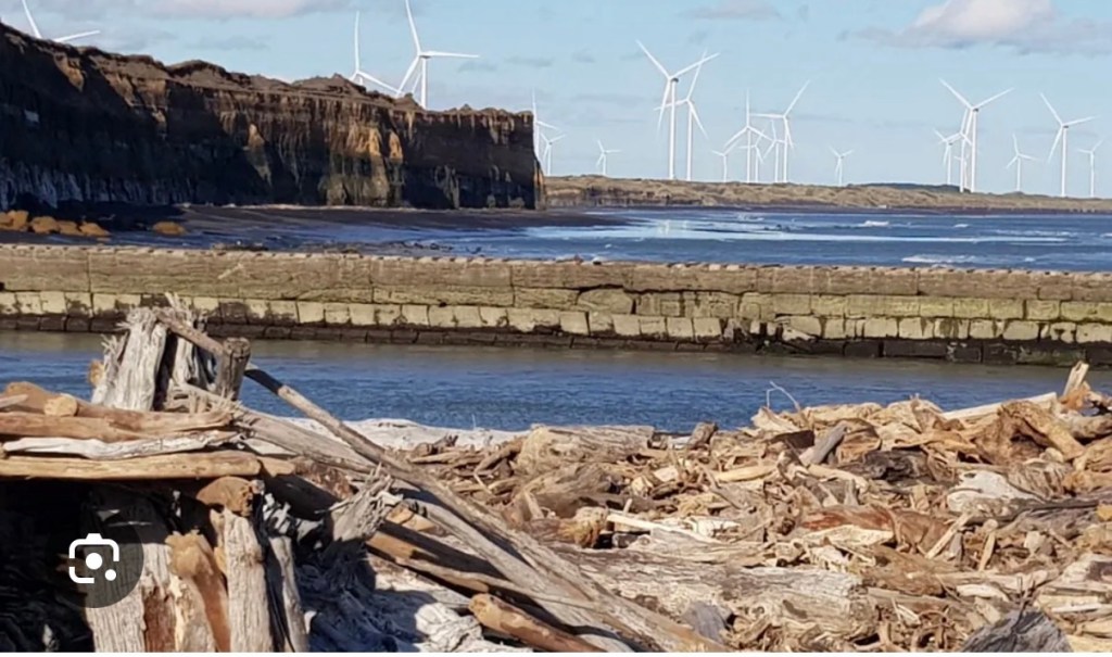
    At the weekend, I started using images of Mana Bay at Pātea Beach. I was playing with the Kuretake Gansai Tambi watercolours, acrylic inks, and Neocolour II water soluble crayons. I follow Orla Stevens on YouTube and a recent video inspired me to work freer in how I mix my mixed media…

    I found myself doing some quite realistic work, or realistic by my standards anyway. It’s interesting to see my brain swap between abstract, semi-abstract and realism. I think the switch happens when a topic has really grabbed me and I’m in the early stages of exploring where I might go with it.

  • The sea is on my mind

    The sea is on my mind

    My paintings usually reflect the land, both seen and remembered. They’re abstract or semi-abstract works about vision, memory, and feelings. They reflect my inner landscape as much as the actual landscape.

    Sometimes I produce work after work without being sure what they’re about. I just keep going, confident I’ll know in time. There have been times when others have recognised the subject before me.

    A long time ago I was showing my sister’s ex-husband a series of works. He said, “so you’re painting the Pātea freezing works and cool stores”. I could see it once he’d named it. He’d worked there as a uni student and recognised the buildings.

    In other cases it’s only by painting and painting and painting that I come to know. A couple of years ago I consistently painted the same general landform and a shape that was clearly a cross or sword. Eventually I knew … long story.

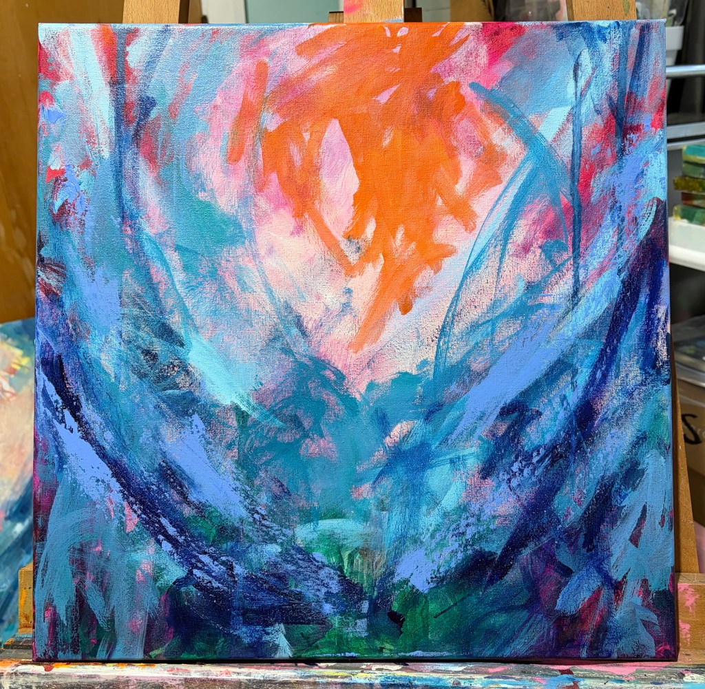
    I started a large canvas a couple of weeks ago and add to it whenever I see/feel something it needs. Today I started a second, smaller canvas, and found myself using the same colour palette and marks. Why? What does it represent?

    It’s the sea! I feel there’s a couple of drivers. I’m working on Bird Flu prep at work, so thinking about sea birds, the shoreline, and impact on sea mammals. We’ve had some big storms, and I’ve been thinking about climate change and the way the sea is changing. My brain’s way of processing it is to get it out onto paint or canvas.

    Early layers on a smaller work
  • A quieter view

    A quieter view

    Much of my art starts with fluro pink or orange, and is high key. The bright colours bring me joy, and I hope they bring joy to the people who own my art.

    Occasionally I’m drawn to a gentler, quieter palette. Sometimes it reflects a particularly calm patch in my own life, other times it’s a search for calm in a chaotic world. This weekend’s works are definitely in the latter category.

    The world is chaotic and not very nice just now … so my art is calmer, more soothing. I used Liquitex quinacridone blue violet, burnt umber, indanthrene blue and parchment, with vivid red orange as my bright contrast.

    I seem to be back to the sea wall, cliffs, sea foam, crashing waves … tempestuous? Yes, but the sea is always a moment of calm for me.

    Pulling the tape off after final mark making is always a revelation
  • Getting the vision clear

    Getting the vision clear

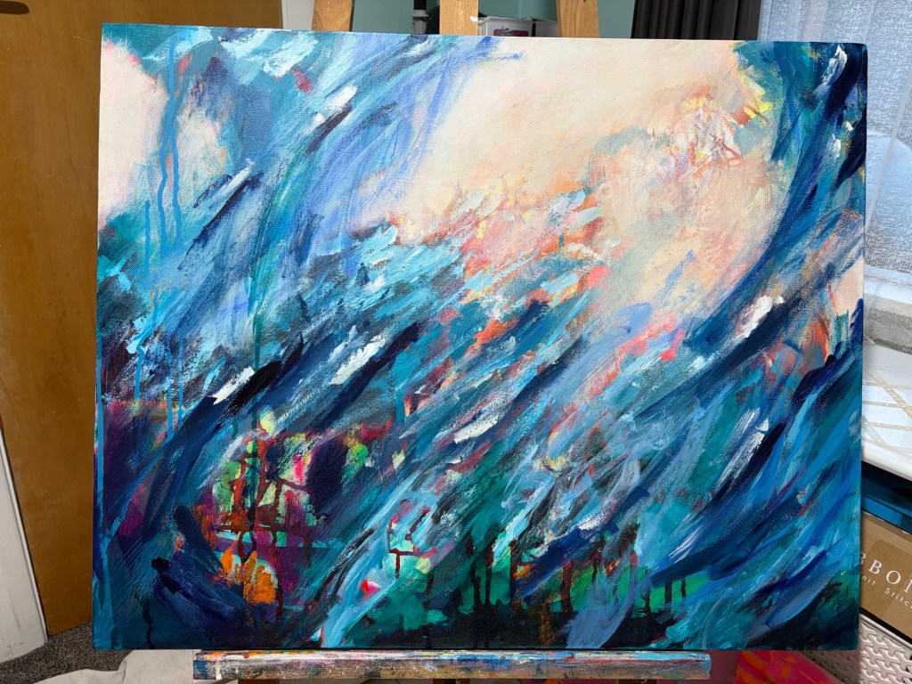
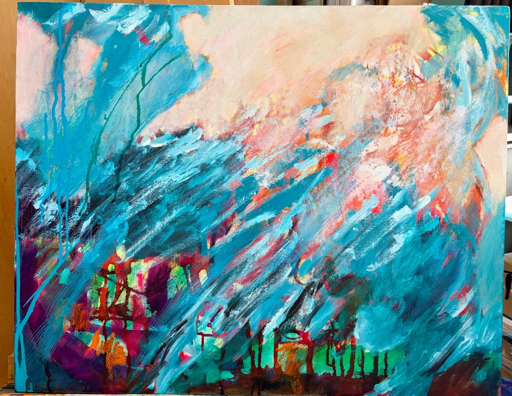
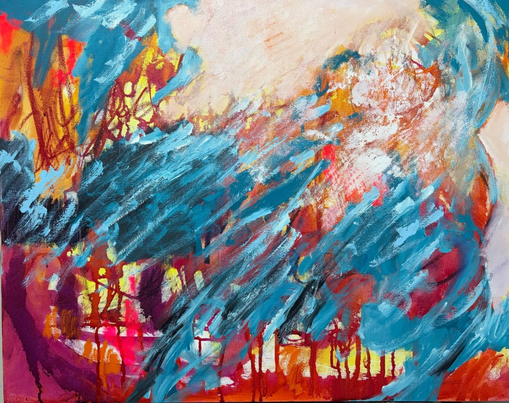
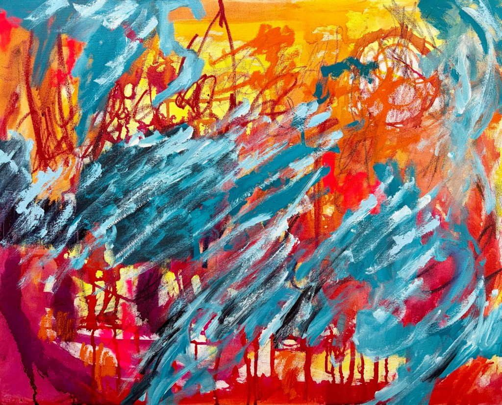
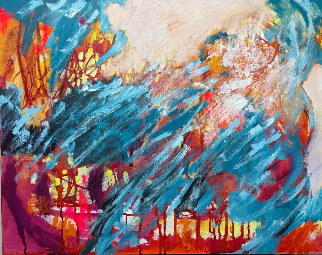
    This painting started with fairly angry marks in water soluble crayon and R&F oil drawing stick. I added acrylic ink and paint in yellow, orange and red. I left it to dry, unsure what was needed next.

    Eventually I added very directional, quite thick, blue and white lines. The paint needed to dry, so it’s been sitting for the last week – the oil drawing stick still hasn’t dried thanks to our winter weather.

    As I’ve been looking at it through the week I’ve felt more and more that it’s related to the winter weather, and the rough sea. Today I started calming down the yellow and orange areas, pushing them back so they’re more sky-like. It’s not there yet, but the direction feels clearer.

    This is how it was looking at the start of the weekend
    This is where it’s at as the weekend comes to a close