Much of my art starts with fluro pink or orange, and is high key. The bright colours bring me joy, and I hope they bring joy to the people who own my art.
Occasionally I’m drawn to a gentler, quieter palette. Sometimes it reflects a particularly calm patch in my own life, other times it’s a search for calm in a chaotic world. This weekend’s works are definitely in the latter category.
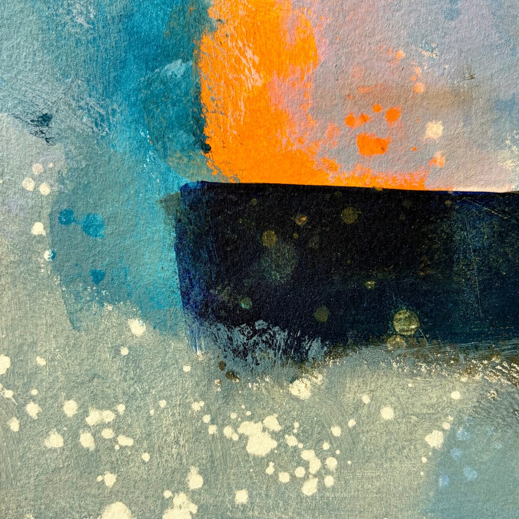
The world is chaotic and not very nice just now … so my art is calmer, more soothing. I used Liquitex quinacridone blue violet, burnt umber, indanthrene blue and parchment, with vivid red orange as my bright contrast.
I seem to be back to the sea wall, cliffs, sea foam, crashing waves … tempestuous? Yes, but the sea is always a moment of calm for me.


Leave a comment