Tag: process

  • Mark making #BlogJune 15

    On Sunday Penny and I “worked large” at Left Bank Art Gallery. I worked quite slowly for me, adding pencil, paint, and collage layer by layer – working across 8 panels at once. Next adding marks with NeoPastels, oil pastels and Inktense and finally a Posca for white splashes. Between each layer I sat and looked and thought … sometimes I work without stepping away at all, but not this time. I think the extra space around me encouraged a different way of working.

    These are cellphone photos in changeable light so not totally representative but good enough for now. The photo without white edges is detail from the main work, which is 50x76cm on Fabriano Artistico paper, so will need flattening a bit.

    I’ve always loved mark making; it’s generally how I add my strongest contrasts. I’m excited about these works, which use the colours of Hokitika Gorge but (to me anyway) have a feel of Mana Bay in Patea as a safe harbour.

  • #cjs20 day 2

    #cjs20 day 2

    Today’s artist at #cjs20 is Marieke Blokland; I hadn’t seen her work before and love it. Although much of her process is similar to mine, the results aren’t so I learned some new thngs and produced quite a different work to normal.

    The first one I started had a background that was too dark so the text didn’t show at all. I started again and am happy with it. But, ugh, my fluro paints have gone off in their jars and they smell revolting!

    day 2 finished

  • The sacrament – and my process

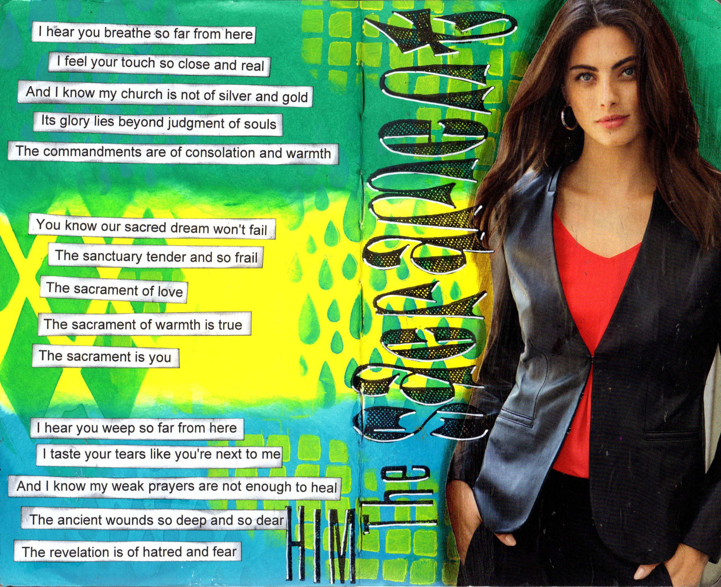
    I was away last weekend and didn’t work in my art journals, but did get plenty of art time to work on more Hokitika Gorge paintings. But I miss the freedom that comes with an art journal, where the process matters more than the outcome. I’m not sure I’ve ever documented my process for a layout like this, so will try to capture it.

     
    Before I do though, this is another song by HIM, with Ville Valo singing. HIM disbanded a while back and Ville has moved on, but I still love their music. The lyrics, often quite dark, really speak to me. Villa reads a lot, including poetry and classics, and his writing frequently includes references to religion and Edgar Allan Poe’s works.

     
    This layout was done in my small Dylusions journal, which means there’s no need to gesso the pages as they’re really strong and colours generally don’t bleed through.

     
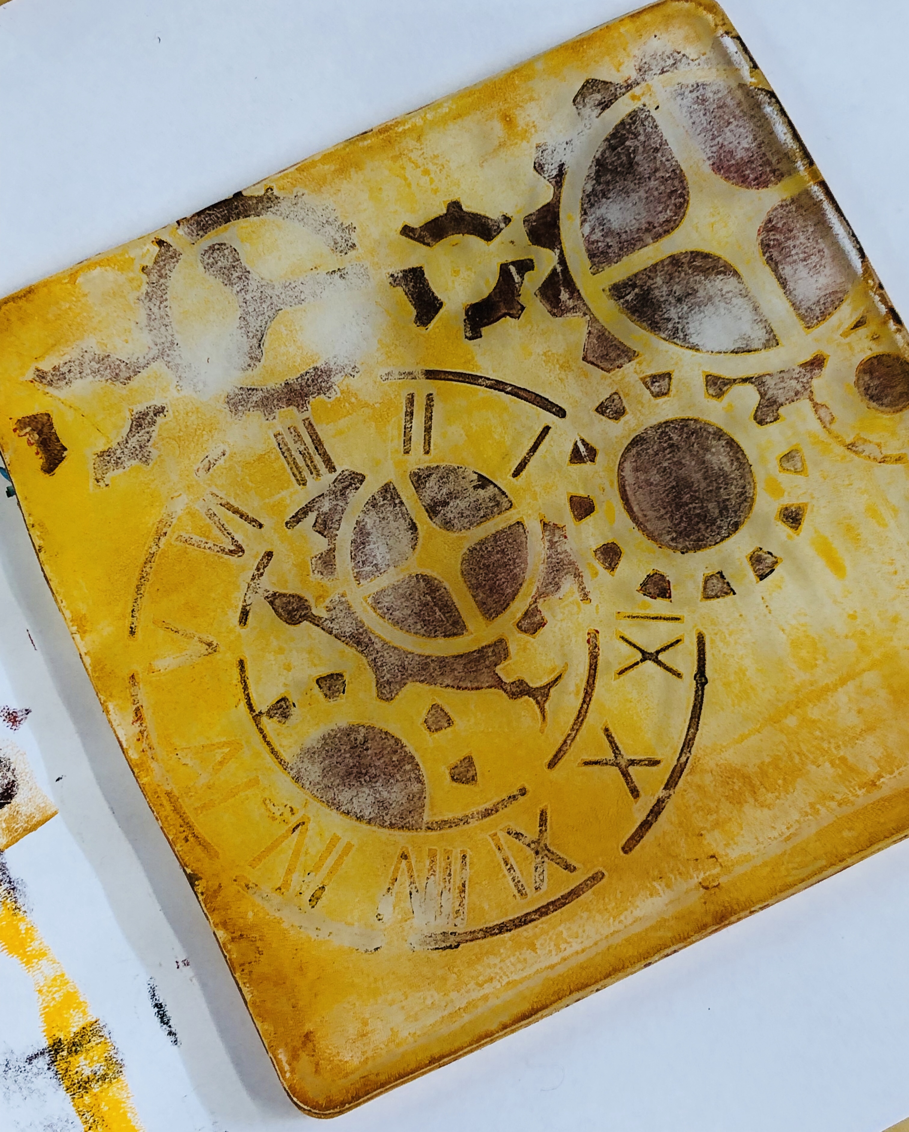
    Using ink blender foams I put down Dylusions paints in Polished jade, Lemon Zest and Vibrant turquoise. Using the same colours and the ink blenders, I stencilled using Dylusions Teardrops, Squares and Diamond in the Rough – I use each colour, and each stencil, in all three sections.

     
    Once that was dry I used Distress Collage Medium to glue down the magazine cut-out, leaving a medium strip of gel medium around it. Next, I blend a shadow in once the gel is dry, using a walnut Pitt Big Brush Pen to outline the collage. The slickness of the gel means you can blend out the pen, which is India Ink, if you work quickly.

     
    I write out my words – often song lyrics or my thoughts – and print double spaced. I insert a line at the top of the Word doc so I know how wide each line can be and adjust my font size to fit; for the small journal 10.5cm works well for me. I roughly cut out each line and use a foam blender and Black soot Distress Ink to ink the edges to take away the harshness of the white paper.

     
    I put them aside and use Archival ink in black to stamp the title with Dylusions Dy’s alphabet stamp set and Stamper’s Anonymous Tim Holtz Tall Text stamps. While the lettering is drying I use Tombow glue to adhere the text strips; I’m not too fussy about lining them up, spacing etc. Once they’re down and the stamping ink is dry, I use a broad tip white Signo pigment ink pen to add highlights to the stamped letters.

    sacrament 20190914

  • Art classes in Greymouth went well

    I taught an art journal class on Thursday night and a gelli print class on Saturday in Greymouth, through Left Bank Art Gallery. The classes were held at CoRe, a fantastic community facility run by Cassandra Struve, one of those people who has so much passion for community development and can see the possibilities then act on them.

    Some of the people who attended didn’t want to be photographed, which is fine, so these photos are entirely representative. People seemed to get a lot out of it and enjoy the processes. I had brunch with Penny Kirk yesterday and spotted a women who had attended the gelli class. I said hi and she told me she’s already turning her gelli prints into cards and will be buying her own gelli plate.

    I’m already talking with Cassandra about running more classes in the new year, taking people to the next level with art journals and printing. As I said to Tony this morning, it’s funny that when you travel away you quite often get more support than at home. Perhaps when you’re local people assume you don’t have much to offer, or figure they can catch you any time?

    Here’s a few photos of the classes and what people created. Enjoy!

  • An iterative process

    Developing a body of work is a strongly iterative process for me. I start with an idea and play with it, refining and revising until I have a huge pile of works, especially if I’m working on paper. Perhaps only 30% of those works will make the final cut.

    The final works often bear no resemblance to the initial ones; sometimes I can only ‘feel’ the linkages, not really see them. But the linkages are there, because each work is a visual representation of the ideas in my head. When I am deeply engrossed in a body of work there are repeating colours, shapes, lines and patterns that appear over and over, often without my being aware of it at the time.

    My process is really about the process, not the final image. A lot of my current works are small – either A6 (4.5×6”) or A5 (9×6”) on beautiful Hahnemuhle watercolour paper. I might have 10 or 20 pieces of paper on the go all at once. I put down colour on each piece in layers, then work back into them making marks, adding patterns or collage – back and forth amongst the pile, strewing them all round me as I work. It’s messy and intuitive.

    Choosing pieces for on the advertising ahead of time is stressful because I don’t know what the final works will be. But choose I must – and I have. Dimmie, who I am exhibiting with, is going to produce the poster etc with her awesome design skills.

    The photos show some of the possible works, and a pile of works I’ve done to date. 

    This slideshow requires JavaScript.

    hokitika gorge works.jpg